Native Screen Flow Components – Complementary Pack
Last updated: January 6, 2026
Overview & Architecture
The Native Screen Flow Components pack adds five free, lightweight components that you can drag & drop into any Flow Screen. They are designed to integrate with the Top Screen Flow that launches the Native Planner, giving admins extra knobs to pre‑filter the Planner view, drive navigation, and create automation‑friendly entry points.
The typical pattern is:
- Top Screen gathers filter values (avatars, picklists, lookups, etc.).
- Planner waiting‑screen/orchestrator reads those values from flow variables.
- The Planner component uses them in its
whereClause,groupBy, or custom metadata to shape the final schedule view.
This approach keeps your Planner Lightning page clean while giving Flow the power to:
- Offer role‑based or dynamic filter sets.
- Store user preferences (e.g., default group filter) in a custom object and hydrate the flow when it starts.
- Chain automated actions (e.g., open/refresh planner every morning with yesterday‑to‑today range).
Common Use‑Cases & Patterns
🔹 User Picker (Navatar Group)
Let schedulers click one or more user avatars to instantly filter the Planner to tasks owned by those users.
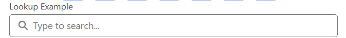
🔸 Record Filter (Lookup)
Expose a Lookup to Accounts, Projects or any object. When a record is selected the flow sets a variable (e.g., vSelectedAccountId) that feeds the Planner’s filter_accountId attribute.
🔹 Status & Priority (Picklist)
Drop a Native Flow Picklist twice—one for Status__c, another for Priority__c. Pass both values into the Planner query so dispatchers can stack filters without leaving the flow.

🔸 Auto‑Launch + Refresh (Timer)
Use Native Flow Timer to wait a few milliseconds after a screen loads, then navigate automatically to the next screen where the Planner lives. Great for kiosk use‑cases or when you need to fetch dates from a record first.
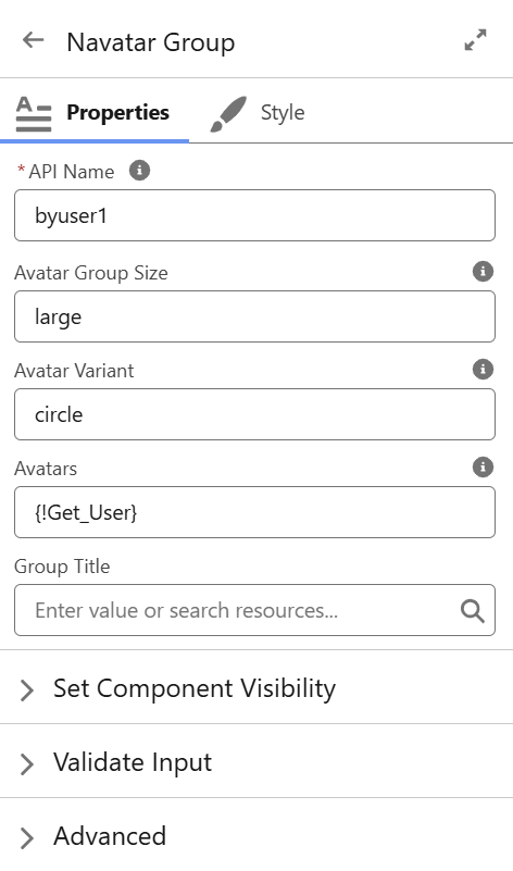
1. Navatar Group
A horizontally scrolling avatar bar that lets users pick one or more people (or other photo‑enabled objects) to drive user‑centric filtering.
- API Name – Flow variable reference to store selected IDs.
- Avatar Group Size –
small | medium | large. - Avatar Variant –
circle | square. - Avatars – Record Collection (e.g., Get Records > User).
- Group Title – Optional heading displayed above the avatar row.
Tip: Bind the component’s output collection to a text variable (vSelectedUserIds) and feed it straight into your Planner custom filter so only tasks owned by those users appear.
2. Native Flow Picklist
A stylable dropdown for choosing a single value (or optionally multiple if "Navigation: None" is used and you handle Next via another button).
- API Name – Variable to store the chosen value.
- Label – Field label shown above the picklist.
- Choices – Either hard‑coded choices or a Picklist Choice Set.
- Navigation –
Next | None.
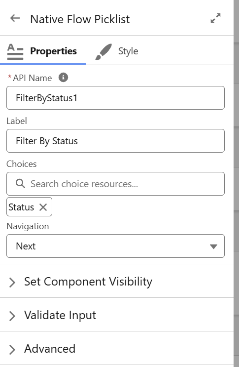
Pattern: Add multiple Picklists on one screen (Status, Priority, Region). Use a single Native Flow Button set to "Next" to navigate forward only when all are selected.
3. Native Flow Button

Universal action component for Flow screens—renders as a Salesforce button, avatar button, or visual picker tile.
| Config | Description / Options |
|---|---|
| API Name | Variable that reflects the user selection (single or collection). |
| Mode | Collection | Unique (multi‑select vs radio). |
| Type | Button | Avatar | Visual Picker |
| Group | Wrap items inside an "slds-button-group" style ("Yes") or free layout ("No"). |
| Collections | Record collection used to build the buttons. |
| Variant | Neutral | Brand | Destructive | Success (plus Circle | Square if Avatar Type) |
| Align | Center | Left | Right |
| Navigation | Next | Back | Finish | None |


Great for compact "filter chips" (Mode: Collection + Type: Button) or image‑rich menu tiles (Type: Visual Picker).
4. Native Flow Lookup
A Lightning lookup field embedded directly in a Screen Flow.
- API Name – Stores the selected record’s Id.
- Label – Display label.
- Collection – Record Collection (for narrow pick‑lists) or leave blank for global lookup.
- Operator –
equals | not equal | starts with | contains(controls how the value is applied in your SOQL filter). - Navigation –
Next | None.

Example: Filter Planner by Project__c where ProjectId = {!vSelectedProjectId}.
5. Native Flow Timer
Invisible component that waits a set amount of time, then automatically clicks the defined navigation button.
- API Name – Variable to store whether the timer has fired (boolean).
- Delay – Milliseconds to wait before firing.
- Navigation –
Next | Back | Finish | None. - Repeat –
True | False(loop back and fire again if you revisit the screen).
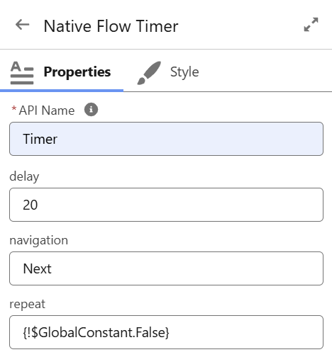
Pause 20 ms, auto‑open Planner. Combine with a second Timer on the Planner screen (Delay=60000, Navigation=Back) to refresh every minute.
6. Native Image Management Component
The Native Image Management Component is a powerful, Mobile and Desktop Lightning Web Component designed for uploading, categorizing, viewing, and managing images related to Salesforce records. It is ideal for rental assets where visual documentation is key (e.g., condition photos for vehicles, equipment, properties, tools, or generators).
This flexible component supports rich configuration to adapt to various use cases, allowing enforced image requirements, custom categorization, gallery views, and integration with related records.
Configuration Attributes
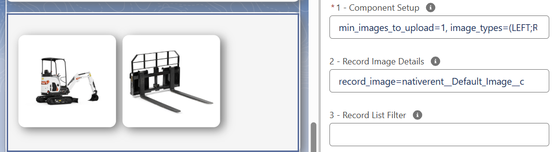
1. General Display & Upload Settings
| Attribute | Description | Default / Options |
|---|---|---|
| title | Component title displayed at the top. | Any string (e.g., title=Asset Images) |
| show_upload_button | Flag to show/hide the upload button. | true / false |
| min_images_to_upload | Set a minimum number of required images. | 1 |
| image_types | Define custom categories (semicolon-separated in parentheses). | e.g., (LEFT;RIGHT;BACK;FRONT) |
| image_title_mode | Display titles by filename or sequential number. | filename | number |
| show_description | Toggle visibility of description input field. | true / false |
| first_default_image | Automatically set the first uploaded image as default. | true / false |
| hide_default_image_checkbox | Hide the default image selection checkbox (can be combined with first_default_image). | true / false |
| view_mode | Display mode: default (standard list), images (gallery view), or fieldset api (images with fields). | default | images | fieldset api |
| view_size | Number of images to display per row in gallery/fieldset mode. | 3 |
2. Record Binding & Image Sizing
| Attribute | Description | Default / Options |
|---|---|---|
| record_image | Field API name to save the default image link on the parent record. | e.g., Default_Image__c |
| related_to | Related object API name for child images. | e.g., Rentable__c |
| related_field | Field on the child image record that links back to the parent. | e.g., Rentable__c |
| related_image | Field on the related record to save the default image link. | e.g., Image_Link__c |
| filter_logic | Logic for additional filters on image records. | and | or |
| image_width | Width of displayed images (in pixels or %). | 150, image_width=max-content, |
| image_height | Height of displayed images. | 100%, image_width=fit-content |
3. Records List Filter
Additional SOQL WHERE clause to filter displayed images.
Example: Active__c = True
Component Configuration Example with no Title:Config #1: title= , min_images_to_upload=1, image_types=(LEFT;RIGHT;BACK;FRONT), image_title_mode=number, first_default_image=true
#2: record_image=nativerent__Default_Image__c

Component Configuration Display Images Example:Config #1: show_description=true, view_mode=images, view_size=4
#2: #3:
This component provides a highly customizable image management experience as part of Native Rent's flexible Lightning Web Components, enabling rich visual asset documentation without custom code.