INDEX
A Comprehensive Guide to Configuring the Planner Component
This guide provides an in-depth understanding of the configuration options for a planner component, which can be used to create various scheduling and planning interfaces. We will explore the various fields and values involved in the setup process and provide examples for each configuration option.
Configuration Options Details and Use Cases
Component Planner Type
- Values (Picklist): GANTT, SCHEDULER, GRID, MATRIX, KANBAN
- Description: Choose the visual layout and behavior of the child-record planner component.
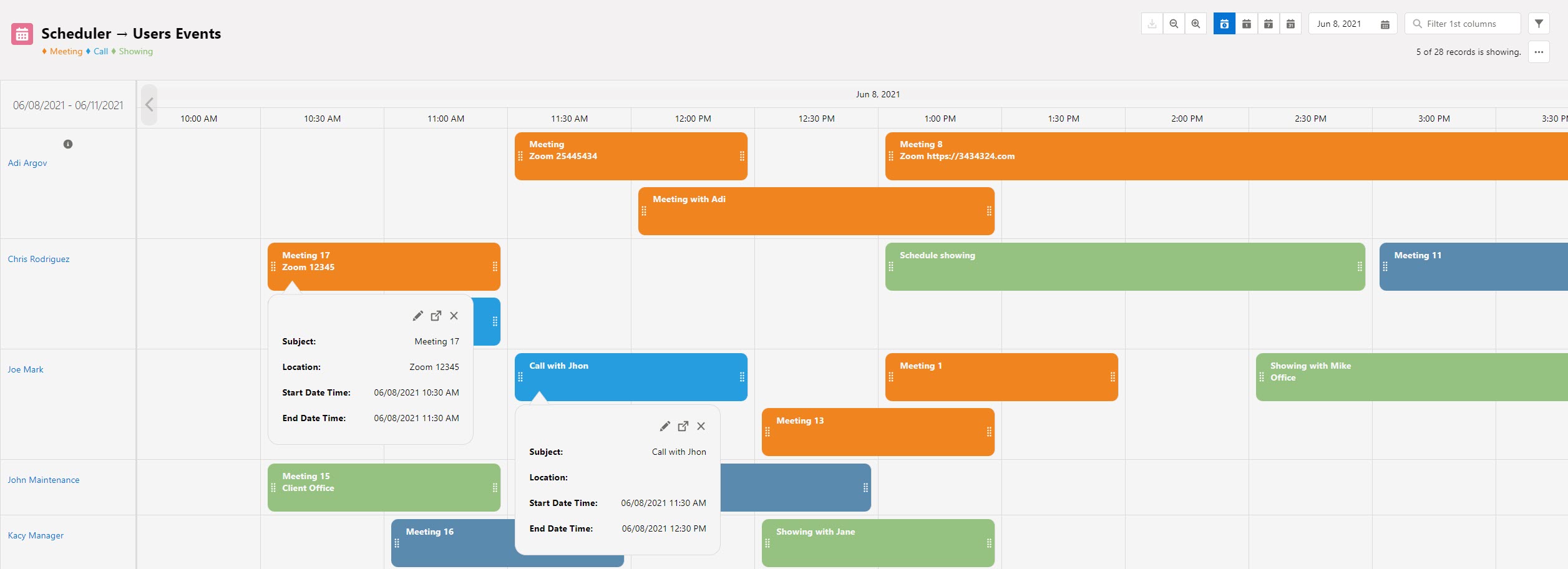
- Scheduler
- Classic date/time timeline. Child records are displayed along a horizontal calendar and can stack or overlap on the same parent row.
- Best for: Bookings, appointments, events, resource scheduling
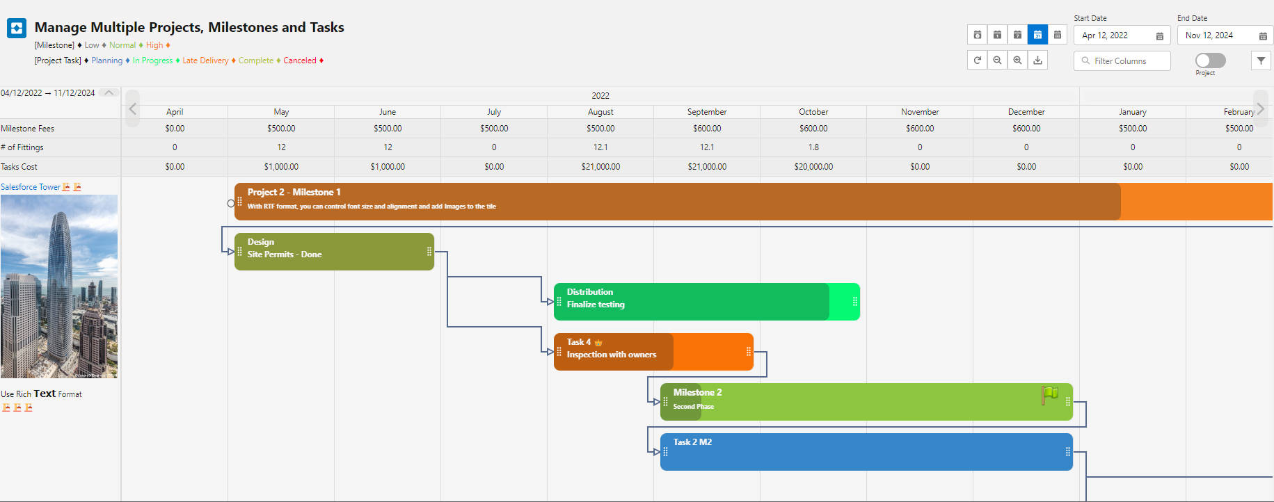
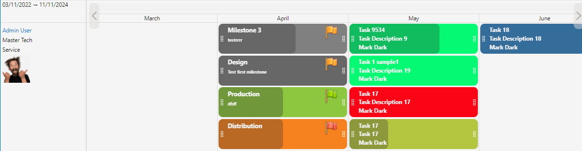
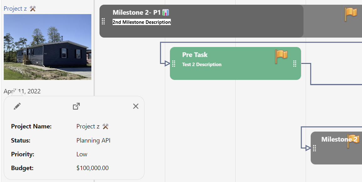
- Gantt
- Date/time timeline with dependency lines between related records (e.g., predecessor → successor).
- Best for: Project management, task dependencies, milestones
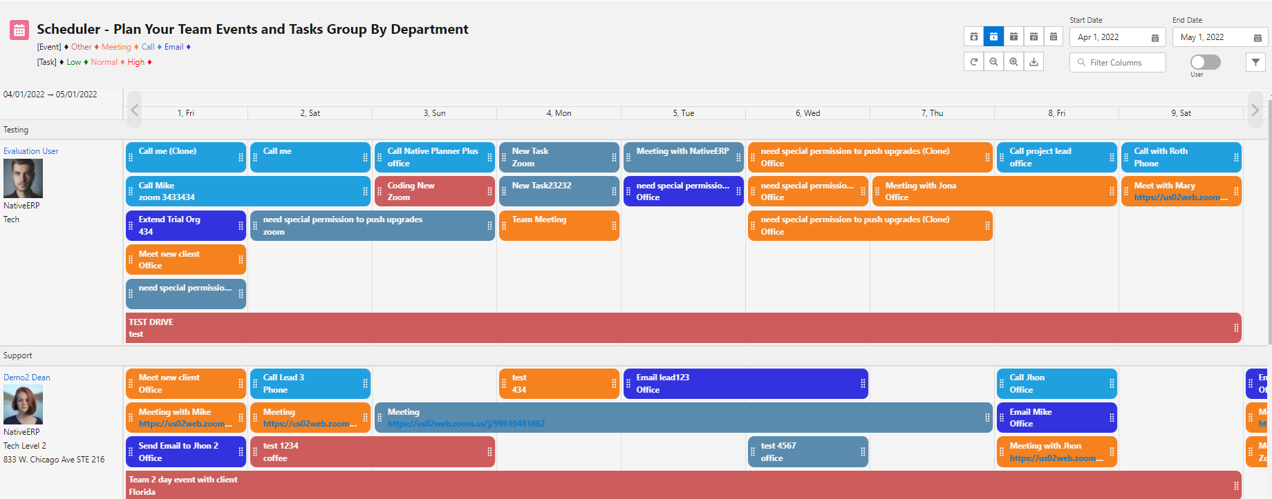
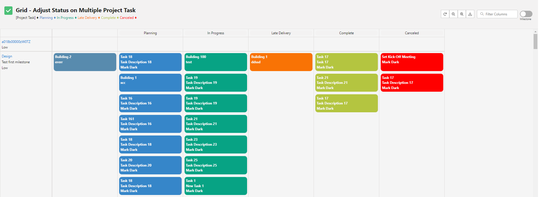
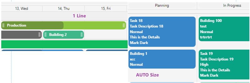
- Grid
- Columns are created from unique values of a chosen child field (e.g., Status, Stage, Priority). Records are stacked within each column.
- Best for: Status tracking, simple swimlane boards, drag-and-drop updates
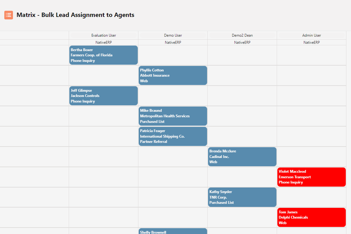
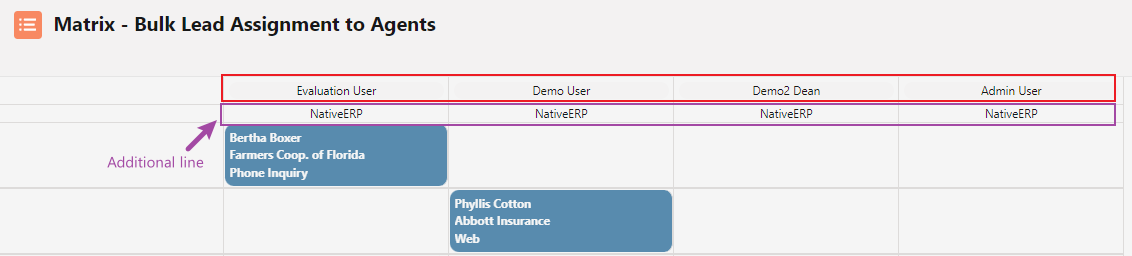
- Matrix
- Two-dimensional grid: one axis uses a child field (e.g., Status), the other axis uses a lookup/target object (e.g., Assigned User, Account). Perfect for assignment matrices.
- Best for: Resource assignment, lead routing, workload distribution
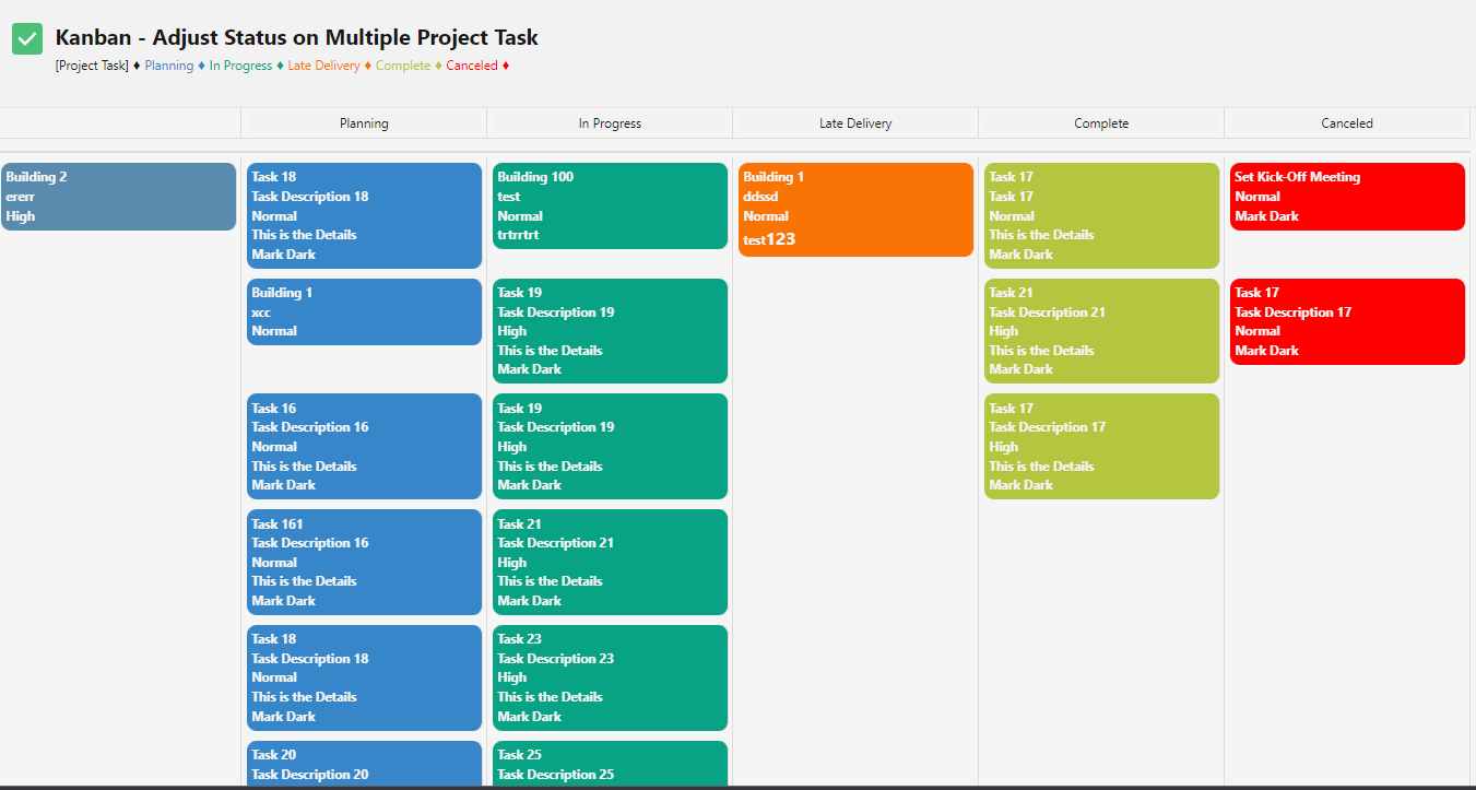
- Kanban
- Card-based board with columns from a child field (usually Status). Optimized for workflow management and limiting work-in-progress.
- Best for: Task management, issue tracking, sales pipelines, agile workflows
- Tip: Choose the type that best matches your process. You can change it anytime — the same child records will simply be rendered differently.
Component Planner Height
- Values: Integer
- Description:
Sets the fixed height of the planner component in pixels. Use
-1for Auto Height (component automatically expands to show all records without a scrollbar). - Acceptable values:
250to2000(fixed height in pixels)
-1→ Auto Height (recommended for most use cases) - Use Case
- Control vertical space on Lightning pages, dashboards, or embedded layouts. Use a fixed height when space is limited; use
-1to ensure all child records are visible without scrolling inside the component.
- Control vertical space on Lightning pages, dashboards, or embedded layouts. Use a fixed height when space is limited; use
- Example
600→ fixed height of 600px-1→ auto-expands to fit all records
Component Load More Scale:
- Description: Number of parent records to load at once (Use to Improve load times in case of big objects).
- Use cases:
- Improve performance by limiting the number of records loaded at once, reducing the initial load time of the component.
- Examples:
- Setting the Component Load More Scale to 10 will load 10 parent records simultaneously
Component Show Color Legends
- Values: Picklist (YES / NO)
- Description: Controls whether a color legend is displayed at the top or bottom of the planner component when colors are applied via the Child Color Matrix.
- Use Case
- Help users quickly understand what each color represents (e.g., High = Red, In Progress = Yellow, Completed = Green).
- Improve readability and accessibility in dashboards shared with team members or managers.
- Keep the view clean when colors are self-explanatory (set to NO).
- Example 1 – Show legend (recommended)
YES
Displays a compact legend automatically generated from your Child Color Matrix.
- Example 2 – Hide legend
NO
No legend appears — useful when screen space is limited or colors are already obvious to users.
- Tip: Always use
YESwhen onboarding new users or sharing the component with stakeholders who may not know the color meanings.
Component Title
- Values: Text
- Description: Defines the main title displayed at the top-left of the planner component.
- Use Case
- Provide clear context so users instantly know what the component shows (e.g., "Q4 Project Timeline", "Open Opportunities by Stage").
- Example
Active Tasks by Status→ displays this text as the component heading
- Tip: Keep it short and descriptive. Leave blank to hide the title completely.
Component Title Size
- Values: Integer (px)
- Description: Controls the font size of the component title in pixels.
- Use Case
- Make the title stand out on dashboards or reduce its size to save vertical space.
- Examples
12→ small, discreet title18→ default / medium size24→ large and prominent title
- Tip: Values between 14 and 28 work best in most layouts.
Component Icon
- Values: Text (Salesforce Lightning Design System icon name)
- Description: Displays a standard Salesforce icon next to the component title.
- Use Case
- Improve visual recognition and make dashboards more intuitive (e.g., calendar icon for events, task icon for tasks).
- Examples
EVENT→ shows the Event iconTASK→ shows the Task iconOPPORTUNITY→ shows the Opportunity icon
Component Icon Size:
- Description: Icon size can be customized to Small, Medium, or Large.
- Use cases:
- Adjust the size of the icon next to the chart to fit the design requirements or preferences.
- Use a large icon to make the chart more prominent.
- Use a small icon to save space on the dashboard or page layout.
- Examples:
- Setting the Component Icon Size to "SMALL" will display the icon in a small size.
Component Holidays Color
- Values: Text (Color name, hex code, or JSON array)
- Description:
Highlights holidays, non-working days, or special dates on the timeline (Scheduler/Gantt views). You can:
- Use a simple color → automatically applies to all records from the standard Salesforce Holidays object
- Or pass a custom JSON array for full control (including TODAY highlight, recurring events, custom colors per holiday)
- Simple mode – use Salesforce Holidays object
- Just enter a color name or hex code
- All holidays from the org-wide Holidays table will appear in that color
- Advanced mode – custom JSON array
- Supports one-time events, recurring events, TODAY highlight, and per-event coloring
- Use
TODAYasActivityDateto always highlight the current day - Supported fields:
Id, Name, ActivityDate, IsAllDay, StartTimeInMinutes, EndTimeInMinutes, IsRecurrence, RecurrenceType, RecurrenceEndDateOnly, color - Recurrence types:
RecursDaily, RecursEveryWeekday, RecursWeekly, RecursMonthly, RecursYearly
- Use Case
- Prevent scheduling on public/company holidays
- Visually distinguish regional holidays for global teams
- Highlight today or important milestones with custom colors
- Example 1 – Simple (use org Holidays object)
Redor#ff6666
→ All holidays from the Holidays object appear in red
- Example 2 – Highlight today only
[{
                            "Id":"today001",
                            "Name":"Today",
                            "ActivityDate":"TODAY",
                            "IsAllDay":true,
                            "color":"#e3f2fd"
                          }]
- Example 3 – Multiple custom holidays (one-time + recurring)
[
                           {"Id":"h1","Name":"Christmas","ActivityDate":"2025-12-25","IsAllDay":true,"color":"#d32f2f"},
                            {"Id":"h2","Name":"Team Meeting","ActivityDate":"TODAY","StartTimeInMinutes":540,"EndTimeInMinutes":600,"IsRecurrence":true,"RecurrenceType":"RecursWeekly","color":"#4caf50"},
                            {"Id":"h3","Name":"Summer Break","ActivityDate":"2025-08-01","IsAllDay":true,"IsRecurrence":true,"RecurrenceType":"RecursYearly","color":"#fff176"}
                          ]
- Tip: Use the simple color mode for standard holidays. Switch to JSON when you need TODAY highlighting, per-event colors, or holidays not stored in the Salesforce Holidays object.
Component Matrix Timeline Sobject
- Values: Text (Salesforce object API name)
- Description: Specifies which Salesforce object is used to build the horizontal axis (columns) when the planner is in Matrix mode.
- Use Case
- Create assignment or resource matrices (e.g., Tasks by User, Leads by Owner, Shifts by Employee).
- Visualize workload distribution across teams, roles, accounts, or any lookup-related object.
- Special option – include empty column
- Append
#to the object name to add an “Unassigned / Blank” column for records where the lookup is empty.
- Append
- Example 1 – Tasks by User
User
→ Columns = individual Users (from the Task.OwnerId lookup)
- Example 2 – Opportunities by Account (with unassigned)
Account#
→ Columns = Accounts + a dedicated “No Account” column at the start
- Tip: Most commonly used with lookup or master-detail fields on the child object that point to User, Account, Contact, or custom objects.
Component Matrix Timeline Field
- Values: Text (Field API name from the object defined above)
- Description: Optional secondary field from the Matrix Timeline Sobject to display as a sub-label under each column header (e.g., Department, Role, Location).
- Use Case
- Add extra context to matrix columns without cluttering the main header.
- Help users quickly identify the right person/resource when multiple records share the same name.
- Example 1 – Show Department under each User
- Matrix Timeline Sobject =
User
Matrix Timeline Field =Department
→ Column shows: “John Doe”
Engineering
- Matrix Timeline Sobject =
- Example 2 – Show Company under Account
- Matrix Timeline Sobject =
Account
Matrix Timeline Field =BillingCity
→ Column shows: “Acme Corp”
San Francisco
- Matrix Timeline Sobject =
- Tip: Leave blank for simple matrices. Use text, picklist, or short formula fields for best readability.
Component Matrix Initial Filter
- Values: Picklist (No / PageID / UserID / User fields)
- Description: Automatically filters the Matrix timeline columns (e.g., Users, Accounts) to show only records relevant to the current context or logged-in user — ideal for personal dashboards and record pages.
- Available options
No→ No automatic filtering (shows all records from the Matrix Timeline Sobject)PageID→ Shows only the record that matches the current record page ID (perfect when the component is placed on a record detail page)UserID→ Shows only the column for the currently logged-in userUser fields→ Dynamically matches any field on the Matrix Sobject to the corresponding field on the current user (e.g., Department, Location, ManagerId)
- Use Case
- Build "My Tasks by Owner", "My Team Workload", or "My Open Opportunities" views without requiring users to apply manual filters.
- Show only relevant assignees on a record page (e.g., only the Account’s owner or team members).
- Example 1 – Personal dashboard (most common)
UserID
→ Matrix shows only the current user’s column — great for "My Tasks" or "My Shifts"
- Example 2 – Record detail page
PageID
→ On an Account record page, only that Account appears as a column
- Example 3 – Department-based view
User fields
→ Automatically shows only users in the same Department/Region/Office as the current user
- Tip:
Use
UserIDfor personal views andPageIDwhen embedding the component on a record page. Combine with Component Matrix Timeline Field to show additional context (e.g., Role, Location).
Component Matrix Initial Filter Field
- Values: Text (two field API names separated by comma)
- Description:
Only used when Component Matrix Initial Filter is set to
User fields.
Defines which field on the parent record must match which field on the User object to include that user as a column. - Format:
Parent_Field_API_Name__c, User_Field_API_Name - Use Case
- Show only users from the same Department, Region, Company, or Manager as the current record or logged-in user.
- Example 1 – Match by Department
Department__c, Department
→ Only users with the same Department as the parent record appear as columns
- Example 2 – Match by Company
Company__c, Company
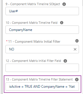
Component Matrix Timeline Filter Statement
- Values: Text (SOQL WHERE + optional ORDER BY clause)
- Description: Applies a custom filter (and sort) to the records from the Matrix Timeline Sobject before building the columns.
- Use Case
- Show only active users, specific roles, or records matching business rules.
- Example
IsActive = TRUE AND Profile.Name = 'Sales Rep'
→ Only active Sales Reps appear as columns(IsActive = TRUE) ORDER BY Name ASC
→ Shows active users, sorted alphabetically
- Tip: Wrap complex conditions in parentheses and add
ORDER BY FieldNameat the end if needed.
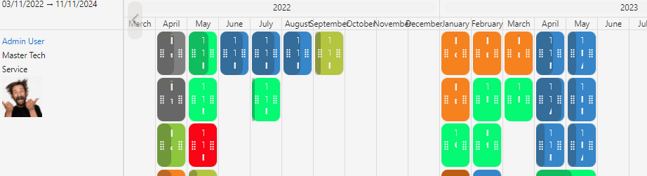
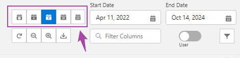
Component Timeline Zoom Scale
- Values: Integer (default: 250)
- Description: Sets the default column/tile width in pixels when the component loads. Users can still zoom in/out with + / – buttons.
- Use Case
- Fit more columns on screen (smaller values) or make items more readable (larger values).
- Examples
150→ Compact view (good for many columns)300→ Spacious view (better readability)
Component Buttons And Opt-Out Timeline
- Values: Comma-separated list from:
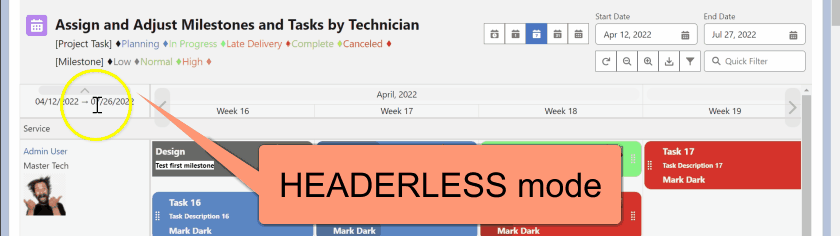
HOUR, DAY, WEEK, MONTH, YEAR, HEADERLESS, DATELESS, ARROWLESS, HIDETITLE, FULLSCREEN, NOHYPERLINK, NOGLOBALFILTER, NOEXPORT, EXPORTCONFIG - Description: Hide or disable specific timeline controls and buttons to simplify the interface.
- Common options
HEADERLESS→ Removes entire top header (date picker + view buttons)DATELESS→ Hides date navigation pickerARROWLESS→ Removes left/right date arrowsHIDETITLE→ Hides component title and iconFULLSCREEN→ Adds fullscreen toggle buttonNOHYPERLINK→ Disables click-through on parent record namesNOGLOBALFILTER / NOEXPORT→ Hides those buttonsEXPORTCONFIG→ Enables export of current config (PSV format)HOUR, DAY, WEEK, MONTH, YEAR→ Removes that timeline scale
- Use Case
- Create clean, focused views (e.g., weekly task board with no hour scale and no header clutter).
- Example
HOUR, HEADERLESS, HIDETITLE, FULLSCREEN
→ Pure weekly view, no hour scale, no header/title, with fullscreen option
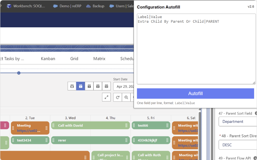
- Tip: Use Planner Autofill Chrome extension to restore or copy configurations easily.
Available on Chrome Web Store
Component Default Timeline
- Values: Picklist – HOUR, DAY, WEEK, MONTH, YEAR
- Description: Sets the initial timeline scale when the component loads.
- Use Case
- Ensure users land on the most relevant view (e.g., WEEK for project tasks, DAY for shift scheduling).
- Example
WEEK→ Opens in weekly view by defaultDAY→ Ideal for detailed daily planning
- Tip: Combine with Component Buttons And Opt-Out Timeline to lock users into a single scale if needed.
Component Smart Timeline:
- Values: STATIC, DYNAMIC, RANGE/STATIC, RANGE/DYNAMIC, RANGE/PADDING
- Description: Defines the timeline and excludes days and component timeline coverage
- Static: displays the timeline according to the Start Date in config line #20 and uses config lines #19-21 for the number of columns in each scale and excludes days from config line 29.
- Dynamic: provides the same timeline as static but includes existing record dates, even if they are excluded in line 29.
- Range options:ignore the Start Date and set the timeline according to the records found.
- Range/Padding: uses config lines #19-21 as a day/week/month buffer to add to the start and end dates of the records.
- Use Case:
- The Component Smart Timeline feature provides administrators with flexibility in defining the timeline based on their needs. This feature can be used in project management tools to create a flexible timeline for resource allocation, ensuring that the timeline adjusts automatically based on the tasks' start and end dates.
- Example:
- An administrator may set the timeline to "RANGE/DYNAMIC" in a project management tool, ensuring the timeline adjusts automatically based on the tasks' start and end dates. This allows users to allocate resources more efficiently, as they can see the timeline adjust in real-time as new tasks are added or existing tasks are updated.
Component Date Format:
- Values:AUTO, EN, EN_GB, DE, SV, FR, ES, NL, PT, JA, HE, SK, CS, FI, HU, EL
- Description: Changes the date format and language to the local language selected.
- Use Case:
- The Component Date Format feature is helpful in global organizations where different users may prefer to view dates in their localized format. By setting the date format to their preferred language, users can quickly understand the dates used in the planner without requiring manual translation.
- Component Format to 'Auto', allowing the Planner to automatically adjust language and format based on the signed-in user's settings.
- Examples:
- i. An administrator may set the date format to "FR" to display dates in the French format in a global organization with a large French-speaking user base. This allows users to quickly understand the dates used in the planner, reducing the risk of confusion or misinterpretation.

Component Datetime Format
- Values: L, LL, LLL, LLLL, DD-MM-YY, 'W' or 'ww', DM, DD, WM, WD, MN, MS, any standard date format
- Description: Changes the formatting of the DateTime fields in the title and popup.
- Utilize 'W' or 'ww' to switch the week view format to show the week number instead of specific dates. Use 'WD' to display week numbers in the Day view. For example, 'LL, W, WD' displays a shortened date format for datetime and shows week numbers in both week and day views. Add DM to change the DAY format to include month and day (e.g., Fri, 5 May).
- Use WM to start the Weekly view on Monday instead of Sunday (or Tuesday if Monday is the default starting day). Alternatively, use DD in the Component Datetime Format to start the day timeline scale on Mondays.
-
Formats:
-
DAY:
- DD: Start of week (except hour scale, per user request).
- WD (top): Start of week and format "(W) MMMM, YYYY".
- DM (bottom): Format "ddd, D MMM".
-
WEEK:
- WM: Start of week.
- W (bottom): Format "Week w".
-
MONTH:
- MN: Month labels displayed as numbers 1–12.
- MS: Month labels in a 3-character abbreviated form (e.g., Mar, Apr, May)
-
DAY:
-
Use Case:
- The Component Datetime Format feature is useful in applications where users need to view dates and times in a specific format. By setting the DateTime format, users can quickly understand the date and time used in the planner without manual translation.
-
Example:
- An administrator may set the DateTime format to "LLL, W, WD" to display the date, time, and week number in a calendar application. This helps users quickly understand the date and time, reducing confusion or misinterpretation.
-


Component Start Date:
- Date Values: 2023-04-29, TODAY, TODAY-#, TODAY+# ,THISMONTH, LASTMONTH, or NEXTMONTH
- Description: Specifies the date from which the component should start.
- Use Case:
- The Component Start Date feature is useful in scenarios where the timeline needs to be adjusted to start from a specific date. This can be useful for project management applications that display timelines for specific periods, such as a week or a month. By setting the start date to a specific date or relative to the current date, users can easily visualize tasks assigned during a specific time period.
- For example, if today is 7/19/2024 and set on LASTMONTH, the planner will start on 6/1/2024.
- Example:
- An administrator may set the start date to "TODAY -7" in a project management application to display tasks assigned from 7 days ago. This allows users to view tasks assigned during the previous week without manually adjusting the timeline.
Component End-In Days:
- Values: Integer (minimum value of 1)
- Description: Specifies the number of days to show on the component from the start date.
- Use Case:
- The Component End-In Days feature allows administrators to limit the timeline display to a certain number of days. This can be useful in scenarios where the focus is on short-term planning or improving component performance by loading fewer days. For example, setting the end-in days to "10" will show tasks assigned up to 10 days after the start date
- Examples:
- An administrator may set the end-in days to "5" to limit the timeline display to tasks assigned within the next 5 days in a project management tool. This will allow users to focus on immediate tasks and improve the component's performance by loading fewer days.
- Note: that this configuration is ignored when Config line #18 is set on the RANGE setting and is used as the number of days to add as a buffer when #18 is set on RANGE/PADDING
Component End-In Weeks:
- Values: Integer (min 1)
- Description: Specifies the number of weeks to show on the week scale from the start date.
- Use Case:
- The Component End-In Weeks feature is useful when displaying a timeline with a week scale range for better planning. By setting the number of weeks to show, users can quickly understand the duration of the tasks displayed on the planner, helping them plan and prioritize their work.
- Example:
- An administrator may set the end-in weeks to "7" to display tasks for the next 7 weeks in a project management tool. This allows users to see upcoming tasks and their duration on a weekly basis, making it easier to plan and allocate resources accordingly.
- Note: that this configuration is ignored when Config line #18 is set on the RANGE setting and is used as the number of days to add as a buffer when #18 is set on RANGE/PADDING.
Component End-In Months:
- Values: Integer (minimum 1)
- Description: Specifies the number of months to display on the timeline, starting from the start date.
- Use Case:
- This component is useful when displaying a timeline for a fixed period of time. For example, when creating a planner for a project that lasts for a year, the End-In-Months value can be set to 12 to display tasks for the next 12 months
- Example:
- An administrator may set the End-In Months value to "12" to show tasks for the next 12 months on the planner. This ensures that users can view all tasks within the next year, providing a clear and comprehensive overview of project progress
- Note: that when Config line #18 is set to the RANGE option, the End-In-Months configuration is ignored. Instead, the number of days to add as a buffer is determined by the value specified in Config line #18
Component End-In Years:
- Values: Integer (min 1)
- Description: Specifies the years to show in the year scale range, starting from the start date.
- Use Case:
- The Component Year Scale Range feature is useful for visualizing long-term projects with a multi-year timeline. By setting the year scale range, users can focus on the relevant years and tasks for their projects without manual filtering or scrolling.
- Examples:
- An administrator may set the year scale range to "3" to display tasks for the next three years in a long-term project management tool. This helps users focus on the relevant timeframes for their tasks and reduces the risk of missing important deadlines.
- Note: This configuration is ignored when Config line #18 is set on the RANGE setting and is used as the number of days to add as a buffer when #18 is set on RANGE/PADDING.
Component Start Time:
- Values: Picklist
- Description: Determines the starting hour/time in the hour scale.
- Use Case:
- The Component Start Time feature helps schedule applications where it's necessary to display business hours. By setting the start time to the opening hour, users can easily see when the business opens and how long it will be open
- Example:
- An administrator may set the start time to "8:00 AM" for a scheduling application that displays business hours. This allows users to set new records within business hours quickly.
- Note: that this configuration is ignored when Config line #18 is set on the RANGE setting and is used as the number of days to add as a buffer when #18 is set on RANGE/PADDING.
Component End Time:
- Values: Picklist
- Description: Sets the end hour/time in the hour scale.
- Use Case:
- The Component End Time feature is useful for applications that require a specific end time for scheduling purposes. By setting the end time, users can ensure that tasks or appointments do not extend beyond the designated end time, preventing scheduling conflicts or overlapping tasks.
- Example:
- An administrator may set the end time to "7:00 PM" in a scheduling application that requires appointments to end by 7:00 PM. This ensures that appointments do not extend beyond the designated closing time, preventing conflicts or overlapping appointments.
- Note: that this configuration is ignored when Config line #18 is set on the RANGE setting and is used as the number of days to add as a buffer when #18 is set on RANGE/PADDING.
Component Time Scale:
- Values: Picklist: 15, 30, 60
- Description: Specifies the timeframe per grid. Options include 15, 30, and 60 minutes.
- Use Case:
- Adjusting the granularity of time slots in a calendar application.
- Examples:
- Setting the time scale to "30" will result in 30-minute time slots.
- Note: that this setting can create multiple columns. For example, when set to 15, the planner will display four columns per hour or 48 columns for 12 hours in a day. This may slow down the component when used in a wide time frame like RANGE or if Config #28 is bigger than three days.
Component N Days in Hour Scale:
- Values: Integer (minimum 1)
- Description: Specifies the number of days shown under the hour time scale.
- Use Case:
- Displaying multiple days in an hourly view for better scheduling
- Example:
- Setting the N days in the hour scale to "3" will show three days in the hourly view.
- Note: that this setting may affect the number of columns displayed, impacting performance when viewing large date ranges
Component Opt-Out Days:
- Values: Text
- Description: Specifies the days to be excluded from the timeline.
- Use Case:
- Excluding non-working days from a project management timeline.
- Example:
- Setting opt-out days to Saturday, Sunday will remove weekends from the timeline.
- Note:If using a language other than English, use the appropriate day names in that language.
Component Hide Path Arrows:
- Values: Picklist: Yes, No
- Description: Specifies whether to show the arrow at the end of the path between child records in a Gantt-type UI.
- Use Case:
- Simplifying the visual appearance of a project timeline.
- Examples:
- Setting "Hide Path Arrows" to "Yes" will remove the arrows between child records.
Component Margin Scale:
- Values: Integer (0-10)
- Description: Specifies the child tile padding between each other. Options range from 0 to 10.
- Use Case:
- Adjusting the space between tasks in a project timeline for improved readability.
- Example:
- Setting the margin scale to "3" will add some padding between child tiles, while setting it to "0" will have the tiles touch each other.
Component Bar Height:
- Values: Picklist (1-8) or Auto
- Description: Controls the number of bar heights. The number is the number of lines that can fit in the title.
- * Gantt Ui cann't be used with Auto setting, please select 1-8.
- Use Case:
- The Component Bar Height feature provides administrators with the ability to customize the height of task bars in a project timeline. This feature can be used to fit more information into the timeline by increasing the number of lines that can fit into each bar. For example, an administrator may set the bar height to "5" to fit more information into each task bar, allowing users to see more details at a glance.
- Example:
- An administrator may set the bar height to "Auto" in a project timeline, ensuring that the height of the task bar automatically adjusts based on the amount of content in the title. This allows users to see more information without having to scroll or zoom in, improving the overall user experience
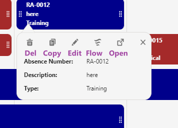
Component Popup Configuration
- Values: Comma-separated list from the options below (case-insensitive)
- Description: Fully customize the behavior, appearance, and buttons shown in child/parent record popups.
- Available options
CLONE→ Show Clone button (child records)HOVER→ Show extra tile fields when hovering over a record tileDELETE→ Show Delete button (child records)FLOW→ Show Flow launch button (uses Flow names defined in config lines #67 & #89)NOEDIT→ Hide Edit button on child popupsNOLINK→ Disable clickable links in Gantt dependency linesNOPARENTEDIT→ Hide Edit button on parent record popupsPARENTCLONE→ Enable Clone for parent recordsPARENTDELETE→ Enable Delete for parent recordsPARENTFLOW→ Show Flow button on parent popupsNORECORDPAGE→ Remove “Open Record” buttonNOBACKDROPSHADOW→ Remove shadow behind popupBACKGROUNDCOLOR:color→ Set popup background (e.g.,BACKGROUNDCOLOR:#caf0f8orBACKGROUNDCOLOR:lightcyan)BORDERWIDTH:#→ Set border thickness in pixels (e.g.,BORDERWIDTH:2)BORDERCOLOR:color→ Set border color (e.g.,BORDERCOLOR:black)WIDTH###→ Force popup width in pixels (e.g.,WIDTH800)
- Use Case
- Create clean, branded, action-specific popups (e.g., read-only views, quick clone/delete workflows, corporate-colored modals).
- Example 1 – Standard actions with Flow
CLONE, DELETE, FLOW, HOVER
→ Users can clone, delete, launch a Flow, and see hover details
- Example 2 – Branded, clean popup
HOVER, NOEDIT, NORECORDPAGE, NOBACKDROPSHADOW, BACKGROUNDCOLOR:#f0f8ff, BORDERWIDTH:1, BORDERCOLOR:#007bff
→ Light-blue background, blue border, no shadow, no edit or record-page links
- Example 3 – Minimal parent-only actions
NOPARENTEDIT, PARENTCLONE, PARENTDELETE
- Tip: Combine as many options as needed (comma-separated, no spaces required). Test the look on different screen sizes.
Component Flow Screen API:
- Values: Text
- Description: The Component Flow Screen API is used to define the Flow API name to activate when clicking on blank space within the User Interface (UI). The feature allows administrators to trigger specific flows when users interact with empty spaces on the UX, enhancing efficiency and user experience.
- Flow Screen variables include PlannerId = { ParentId }, PlannerTarget = { Timeline Empty Blocks value } (text value, can be converted in the flow) and PlannerPageId = the page recordId when using the Planner on the record page
- Use Case:
- Triggering a specific flow when users click on empty spaces in a scheduling application. By setting the Component Flow Screen API, administrators can streamline the user experience, allowing users to create new records or access specific functionalities directly from the scheduling interface without navigating to a separate page or screen.
- Example:
- An administrator may set the Flow Screen API to "NewAppointmentFlow" in a scheduling application. When users click on an empty space, the "NewAppointmentFlow" is launched, enabling users to create new appointments quickly and efficiently. The planner will provide two variables, the parent Id and the date/column value of the clicked space, allowing users to schedule appointments at the desired time and location with ease.
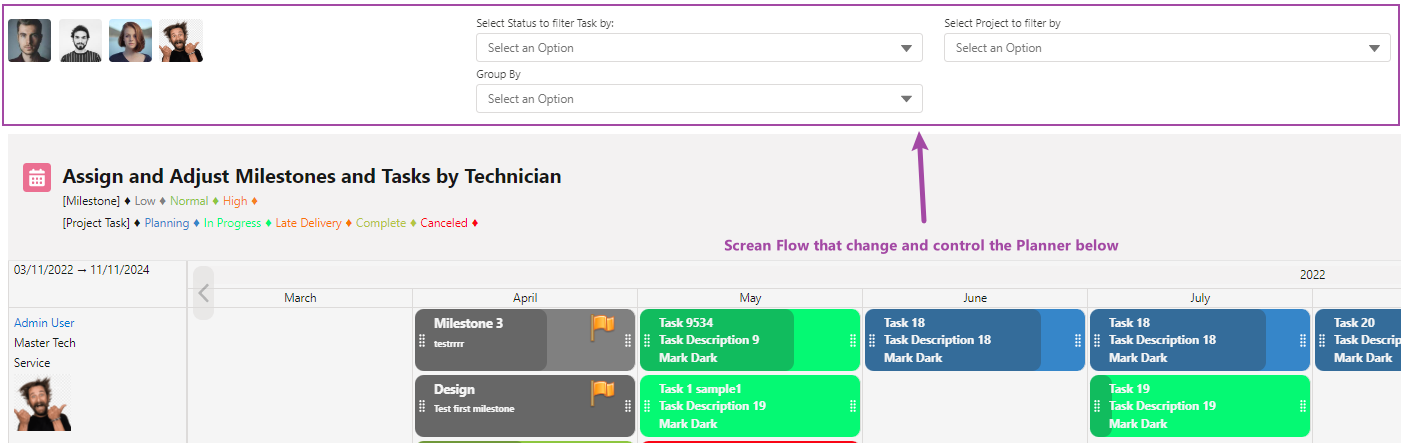
Component Flow Screen Top API:
- Values: Text
- Description: Sets the Screen Flow API name to display on top of the component and control component configuration. Screen Flow variables with output checked can be used to change the component configuration. The complete list of variables is available on the AppExchange document Variables list can be modified using Screen Flow
- PlannerPageId = the page recordId when using the Planner on the record page
- Make sure to pass the entire configuration syntax. Ex. Case_Status__c = 'Open'
- Youtube How to quick video .
- Use Case:
- The Component Flow Screen Top API feature can be used to add a flow for managing component settings in an application. For example, in a project management application, the flow screen top API can be set to "TimelineSettingsFlow" to allow users to customize the timeline view. This feature enables administrators to provide users with a flexible and customizable experience that meets their specific needs
- Example:
- An administrator may set the flow screen top API to "TimelineSettingsFlow" in a project management application to allow users to modify the timeline view. By using Screen Flow variables with output checked, users can customize the component configuration, such as changing the default timeline scale or hiding certain elements of the timeline view. This will provide users with a more flexible and personalized experience, improving their productivity and satisfaction with the application.
- Use Case:
- The Parent Filter By Use Case utilizes the Parentfilterby variable in the Screen Flow to provide advanced filtering options in an application. This feature allows users to efficiently filter and view data based on specific criteria, such as filtering tasks with a particular status in a project management application. By providing users with an intuitive and customizable filtering experience, this feature enhances their ability to access relevant information quickly and easily.
- Example:
- An administrator may implement the Parent Filter By Use Case in a project management application, allowing users to filter tasks based on their status. By setting the Parentfilterby variable in the Screen Flow to "Status = 'Ready'", the Planner component will display only tasks with the status "Ready". This feature empowers users to easily view and manage tasks that match their chosen criteria, improving efficiency and the overall user experience within the application.
Parent sObject:
- Values: Text
- Description: Sets the parent sObject source of records to be displayed. This can be used to create components that are dependent on a specific sObject type or for displaying records related to a parent record.
- Use Case:
- The Parent sObject feature can be used to display a project timeline based on a parent record. For example, in a project management application, the parent sObject can be set to "User" to show tasks assigned to specific users. This feature enables administrators to create more targeted and specialized components that display records specific to the parent sObject, improving the usability and functionality of the application.
- Examples:
- An administrator may set the parent sObject to "Opportunity" in a sales application to show related tasks or events associated with that opportunity. By setting the parent sObject to a specific sObject type, users can quickly access and view records related to that specific parent sObject, improving their productivity and efficiency within the application.
Parent Must-Have Childs:
- Values: Picklist: Yes, No
- Description: Sets the filter for Parents without Child records. When set to "Yes," the component will only display Parents that have at least one related Child record.
- Use Case:
- The Parent Must-Have Child's feature is useful in scenarios where it's important only to display Parents that have related Child records. For example, in a project management application, it may be useful only to show projects with tasks assigned to them. In this case, the Parent Must-Have Child's picklist can be set to "Yes" to filter out projects without assigned tasks. This improves the user experience by only displaying relevant and actionable information..
- Example:
- An administrator may set the Parent Must-Have Childs to "Yes" in a project management application to only show projects that have tasks assigned to them. This would exclude any projects with no related tasks, ensuring that the user only sees projects requiring their attention. Conversely, if the picklist is set to "No," all Parent records will be displayed regardless of whether they have related Child records.
Parent Initial Filter:
- Values: Picklist: No, PageID, UserID, User fields
- Description: This feature allows the component to use the PageID to filter records based on the current record page or logged-in user ID, or any $user field that can be compared to the parent record. This can be used to display records that are relevant to the current user or record page.
- Use Case:
- The Parent Initial Filter feature can be used to display a timeline filtered based on the current user. For example, an administrator may set the parent initial filter to "UserID" to show tasks assigned to the logged-in user. This feature enables administrators to create more targeted and personalized components that display records specific to the user or record page, improving the user experience and application functionality.
- Example:
- In a project management application, an administrator may set the parent initial filter to "UserDepartment" to show tasks assigned to users in a specific department. By using this feature, users can quickly access and view records that are relevant to their current context, improving their productivity and efficiency within the application.
Parent Initial Filter Field:
- Values: Text
- Description:: Specifies the field to be used as an initial filter for the parent sObject with the Page Record Id or Logged-in User (Config # 38). This can be used to narrow down the records that are displayed based on a specific field value. You can use both the object field and the user field to match, for example, the "Case_Department_c, Department" field to filter case records that are related to the department of the currently logged-in user. Additionally, the '!' can be used before the field name to implement a "Not Equal to" filter. For instance, '!Id' would display all records except those matching the current ID.
- Use Case:
- The Parent Initial Filter Field feature can be used to filter records based on a specific field value or to exclude specific values. For example, in a project management application, an administrator may want to filter tasks based on the task owner or exclude tasks assigned to a specific owner. By setting the parent initial filter field to "OwnerId" and #40 to USERID, only tasks assigned to the selected owner will be displayed. To exclude tasks assigned to the logged-in user, '!OwnerId' can be used. This feature helps to improve the usability of the application by displaying only relevant records to the user.
- Examples:
- Filtering tasks assigned to the logged-in user. Set the parent initial filter field to "OwnerId" and #38 to USERID. This configuration ensures that only tasks assigned to the currently logged-in user will be displayed, making it easier for users to focus on their tasks.
- Excluding tasks assigned to the logged-in user. Set the parent initial filter field to "!OwnerId" and #38 to USERID. This configuration ensures that tasks assigned to all other users are displayed, which could be useful for a manager to see tasks assigned to their team members.
- Use Case 2:
- Filtering records in a project management application based on the record detail page. An administrator may want to filter tasks based on the current record detail page, allowing users to view tasks relevant to a specific project or record.
- Example 2:
- Filtering tasks related to the current record detail page. Set the parent initial filter field to "Id" and #38 to PAGEID to filter the parent object based on the current record detail page. This feature helps improve the application's usability by displaying only relevant records to the Record Page.
Parent Left-Side Fields:
- Values: Text (field api names from the Parent Object, RTF format and lookup fields are allowed)
- To disable the Hyperlink on first field of parents: Add NOHYPERLINK to Config #16.
- Description: Sets the field names to be used as a label on the first column on the left. These fields are displayed on the left side of the component, providing additional information related to the records displayed.
- Use Case:
- The Parent Left-Side Fields feature can be used to display additional information related to the records displayed on the timeline. For example, in a project management application, the parent left-side fields can be set to "Name, Email" to display the name and email of the user assigned to a task or event. This feature enhances the usability of the component by providing users with additional context and information related to the records displayed on the timeline.
- Example:
- An administrator may set the parent left-side fields to "Account.Name, Account.Phone" in a sales application to display additional information related to the opportunities or accounts displayed on the timeline. By customizing the fields displayed on the left side of the component, users can quickly access and view relevant information related to the records displayed, improving their productivity and efficiency within the application.
Parent Popup Fields:
- Values: Text, Field API Name, Field_API_NAME^label, LookupFiel.ReleatedObjectFieldName, LookupField@Fieldset, LookupField@FieldsetName#FieldName
- Description: Determines the field names and labels to be used in the popup box when clicking on the Parent first line (hyperlink). These fields can be edited if the read-only setting is set to "no" in config# 92, like Name, Status__c, Completion__c, or ServiceAppointment.Description, ServiceAppointment.Status (comma-separated and space). Customize labels in popups by overwriting the default label using the format "Field_Name^Label".
- * The popup feature allows you to work with related sObjects using lookup fields. It's essential to utilize the lookup field instead of the .Name attribute unless you intend for users to rename the related object. For instance, to display the owner's name in the title, you can use Owner.Name. However, in the popup, you should use OwnerId. This will show the owner's name and enable users to change the owners associated with records without altering the user's name in the user record itself.
- Fieldset popup configuration the format is: LookupField@FieldsetName OR LookupField@FieldsetName#FieldName LookupField is a lookup field to X object in the parent object. FieldsetName is the fieldset API name on the X object.FieldName is not required, only if you like to search/display by other fields than Name. For example, Parent_Project__c@Test_Fieldset#Company By default, if the # is not provided, the display field is Name.
- Use Case
- Displaying and editing details of a parent record in a popup window with custom labels. By configuring the Parent Popup Fields and overwriting the default labels when necessary, users can view and edit relevant details of a parent record directly in a popup window without navigating away from the current view.
- Examples
- "Project_Name^Task, Start_Date^Begin, End_Date^Finish, Status" will display these fields with custom labels in the popup window, allowing users to view and edit the task name, start date, end date, and status of a parent record.
- Use Case 2
- Improving user productivity by quickly accessing essential information with personalized labels. Configuring the Parent Popup Fields to display the most relevant fields and overwriting the default labels when needed allows users to access and update important information quickly, streamlining their workflow and increasing efficiency.
Parent Search Fields:
- Values: Text
- Description: Sets the fields to be used only for the quick filter and the advanced filter but not to be displayed. This can be used to create targeted filters that are specific to the parent sObject type and improve the efficiency of record searches within the application.
- Use Case:
- The Parent Search Fields feature can be used to quickly filter users in a project management application based on their department or division. For example, an administrator may set the parent search fields to "Department, Division" to enable filtering based on these fields. By setting specific search fields, users can quickly and easily find relevant records within the application, improving their productivity and efficiency.
- Example:
- An administrator may set the parent search fields to "Account Name, Contact Name" in a sales application to enable quick filtering based on these fields. It is important to note that fields used elsewhere in the application will automatically be added to the search, so it is important to choose fields that are specific to the search requirements.
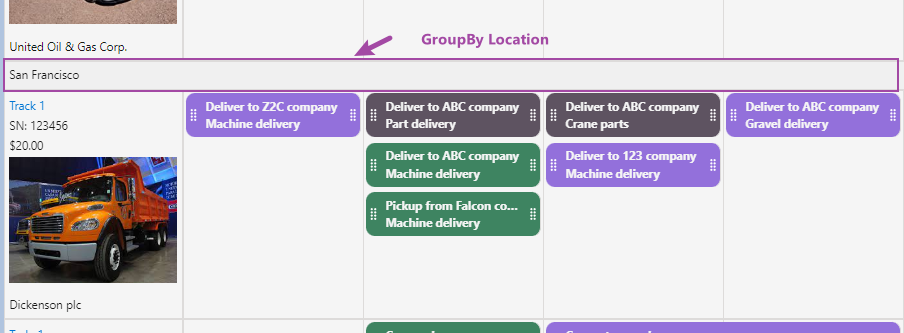
Parent Group-By Field
- Values: Text (Field API Name)
- Description: Groups parent records into collapsible sections based on the value of a chosen field (e.g., Status, Priority, Product Family, Owner).
- Optional color customization:
After the field name, add a JSON-like color map:
FieldAPI__c, [Service=lightgreen,Support=#ffb703] - Use Case
- Organize large lists of parent records (Projects, Accounts, Opportunities) into logical, expandable groups for faster navigation and cleaner visuals.
- Example 1 – Group by Status with colors
Status__c [In Progress=#2196f3,Completed=#4caf50,On Hold=#ff9800"]
→ Parents are grouped and each section header is color-coded
- Example 2 – Simple grouping (no colors)
Product_Family__c
→ All Assets grouped under their respective product families
- Tip: Works best with picklists, text, or lookup fields that have a limited number of unique values.
Parent Relationship Field
- Values: Text (Field API Name on the child object)
- Description: Allows child records to link to parent records using any field (not just the standard lookup/ID field). Useful when the actual relationship is stored on a different field.
- Use Case
- Support complex or indirect relationships such as:
- Service Crew → Crew Member records
- Case → Case Team Members
- Contact → Custom "Primary Contact" field on Opportunity
- Any many-to-one scenario where the foreign key is not the default lookup
- Support complex or indirect relationships such as:
- Example
- Child object has a field
Crew__cpointing to a Crew custom object
→ Set this field toCrew__cinstead of the usual Account/Campaign/Opportunity lookup
- Child object has a field
Parent Filter Statement
- Values: Text (SOQL WHERE clause)
- Description: Applies a custom filter to the parent records before they are loaded into the planner. Only parents matching the condition will appear.
- Use Case
- Show only relevant parents (e.g., Active Accounts, Open Opportunities, High-Priority Projects) without requiring users to apply manual filters.
- Build focused dashboards or record-specific views.
- Example 1 – Simple text/picklist filter
Status__c = 'Active' AND Priority__c = 'High'
→ Only active, high-priority parent records are displayed
- Example 2 – Multi-select picklist (INCLUDES)
Licenses_Type__c INCLUDES ('Sales','Service')
- Example 3 – Standard picklist (IN)
StageName IN ('Closed Won','Closed Lost')
- Example 4 – Dynamic merge from Flow screen element
Status__c = 'Active' AND Job_Title__c IN ('{!Engineer_Job_Title}'.replace(';', "',''))
or more safely:
Status__c = 'Active' AND Job_Title__c IN ('"+SUBSTITUTE({!Engineer_Job_Title}, ";", "' , '")+"')
- Example 5 – Specific record IDs
Id = '001xx000003DI8e' OR Id = '001xx000003DI9f'
- Tip:
Do not include the word
WHERE. Use exact API names and proper quoting. Test complex conditions in SOQL Builder first.
Parent Sort Field:
- Values: Text
- Definition: This field is used to sort Parent records, such as by Name.
- Use Case:
- Ordering parent records based on a specific field. In an application, you can use the parent sort field to arrange parent records according to a particular field, making it easier for users to navigate and locate specific records.
- Example:
- Use "CreatedDate" to sort parent records. By setting the parent sort field to "CreatedDate", users can view parent records in chronological order based on their creation date, enabling better organization and quick access to relevant information.
Parent Sort Direction:
- Values:ASC, DESC
- Definition: Determines the sort direction of Parent records, with options being ASC or DESC.
- Use Case:
- Sorting parent records in ascending or descending order. By setting the parent sort direction, you can organize parent records to best suit your needs, making it easier to analyze and manage data within your application.
- Example:
- Use "ASC" to sort parent records in ascending order. Setting the parent sort direction to "ASC" will order parent records from the lowest to the highest value, allowing users to identify records that meet specific criteria or need attention quickly.
Parent Flow API:
- Values: Text
- Description: Specify the Screen Flow API name to start when clicking on the FLOW icon on the Parent popup. Make sure to create a PlannerTarget and PlannerId variables with Input checked, and the Planner will provide the record Id (PlannerId = { ParentId })
- Note:Config # 34 "Component Popup Configuration" needs to include FLOW to display the flow button in the popup box.
- In case of providing a Flow name without a popup field, clicking on the record will activate the flow.
- Use Case
- Initiating a Screen Flow process from a Parent record. This allows you to create a complete process and open possibilities to starting a process related to the record.
- Examples
- Use "CreateCaseFlow" to launch a Screen Flow. This allows the collection of additional information and the creation of a case related to the record clicked
- Use Case 2
- Automating task creation from a Parent record. You can initiate a Screen Flow process that generates tasks related to the Parent record, improving workflow efficiency and automation.
Child sObject:
- Values: Text
- Definition: Specifies the Child sObject source of records, like Event.
- Use Case:
- Displaying related child records for a given parent record. By specifying the child sObject, you can display related child records associated with a particular parent record, making it easy to view and manage related records.
- Example:
- Use "Task" as the child's sObject. In an application where tasks are related to a parent record, set the child's sObject to "Task" to display and manage tasks associated with the parent record.
Child Initial Filter:
- Values: No, PageId, UserId, User fields
- Definition: : Determines using PageID or UserID to filter by Record Page or Logged-in user Id. Options include No, PageID, and UserID.
- Use Case:
- Filtering child records based on the page's context or the logged-in user. In an application, you can use the Child Initial Filter to display relevant child records based on the current page's context or the logged-in user, ensuring that users only see the information relevant to them.
- Example:
- Use "UserID" to filter child records. By setting the Child Initial Filter to "UserID," you can display child records associated with the logged-in user, providing a personalized view of the data.
Child Initial Filter Field:
- Values: Text
- Description: Specifies the field to be used as an initial filter for the Child sObject with the Page Record Id or Logged-in User (Config # 47). This can be used to narrow down the displayed records based on a specific field value. You can use both the object field and the user field to match, for example, the "Case_City_c, City" field to filter case records that are related to the City of the currently logged-in user.
- Use Case:
- Filtering records based on a specific field value in a project management application. An administrator may want to filter tasks based on the task owner. By setting the child's initial filter field to "OwnerId" and #47 to USERID, only tasks assigned to the selected owner will be displayed. This feature helps improve the application's usability by displaying only relevant records to the user.
- Examples:
- Filtering tasks in a project management application based on the record detail page. Set the child initial filter field to "Id" and #47 to PAGEID to filter the child object based on the current record detail page. This feature helps improve the application's usability by displaying only relevant records on the Record Page
- Use Case 2:
- Filtering case records based on the city of the currently logged-in user. In a customer support application, an administrator may want to filter cases related to the City of the currently logged-in user. By setting the child's initial filter field to "Case_City_c" and #47 to USERCITY, only case records related to the city of the logged-in user will be displayed.
- Example 2:
- Filtering cases in a customer support application based on the city of the logged-in user. Set the child initial filter field to "Case_City_c" and #47 to USERCITY to filter case records related to the City of the currently logged-in user. This feature helps improve the application's usability by displaying only relevant case records to the user, allowing them to focus on cases specific to their city.
Child Custom Relationship:
- Values: No, Yes
- Definition: : Indicates whether to use a custom relationship with the parent sObject for the child sObject. Options include YES and NO.
- Use Case:
- Connecting child records to parent records when there is no direct relationship. Implementing a custom relationship can help establish connections between child and parent records when a direct relationship doesn't exist, improving data organization and accessibility.
- Example:
- Using a custom relationship. Set the Child Custom Relationship to "YES" when creating a custom relationship between the child and parent's sObjects.
Child Custom Relationship Field:
- Values: Text
- Description: Defines the lookup field to be used as a relationship in situations where the specified parent has no direct relationship with the child. For example, OwnerId.
- Use Case:
- Connecting child and parent records through a custom field. In complex data models, there might be situations where a direct relationship between parent and child records doesn't exist. Using a child custom relationship field allows you to create connections between these records through a custom field.
- Examples:
- Use "Project_Manager__c" to connect child and parent records. In a project management application, you can set the child custom relationship field to "Project_Manager__c" to connect tasks and their project managers, even when there is no direct relationship between them.
- Additional Use Case
- Creating indirect relationships between objects in a sales application. In sales applications, you might want to relate opportunities with specific sales team members or regions, even when there is no direct relationship between them. The child custom relationship field can be used to create these connections, making tracking and managing opportunities based on team members or regions easier.
- Example
- Salesforce Polymorphic Field Support: Use the planner with specific use cases for record relationships, such as retrieving all "WhatId" fields in the Event Object in the extra child related to cases shown in the child object. Example custom relationship field: WhatId@case.
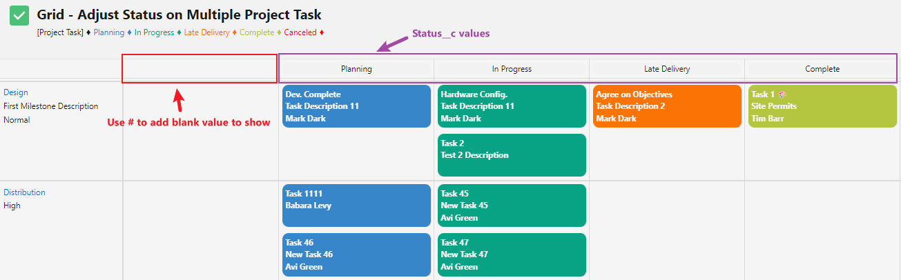
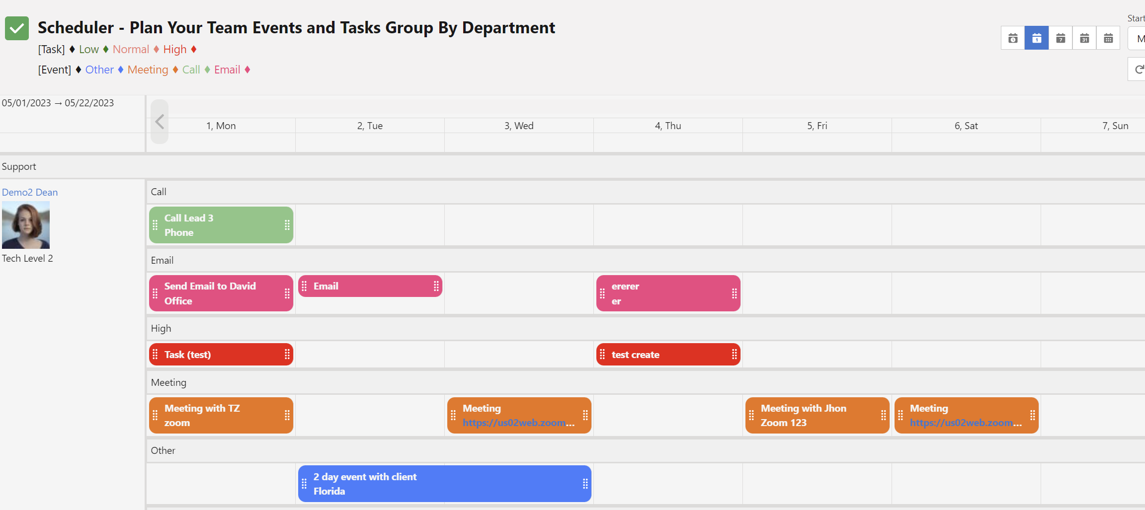
Child Grid Timeline Field
- Values: Text
- Description: Specifies the child field used to build the horizontal timeline (or swimlane headers) when the child grid is in Grid or Kanban mode. The unique values of this field become the columns/headers.
- Display picklist labels instead of API names:
Append%to the field API name to show the picklist label instead of the stored API value.
Example:Status__c%→ displays "In Progress", "Completed", etc.
Without the % → displays the raw API value (e.g., "in_progress"). - Customize column header appearance:
Use the format:FieldAPIName:bgColor:fontSize:fontColor
All parts after the field name are optional (partial customization is allowed):Status__c:#3686C9:20:black→ blue background, 20px font, black textStageName:#28a745::white→ green background, default size, white textPriority__c::18:→ only increase font size to 18px
- Use Case
- Visualize task or project progress across statuses in a project management app — instantly see how many tasks are To Do, In Progress, or Done.
- Example 1 – Task status timeline
Status__c%:#3686C9:18:white
Shows human-readable status labels with a branded blue header and white text.
- Use Case 2
- Monitor a sales pipeline by stage — sales teams can quickly spot bottlenecks (e.g., too many deals stuck in "Negotiation").
- Example 2 – Opportunity stages
StageName:#10B981:20:white
Displays stages like "Prospecting", "Proposal", "Closed Won" with green headers and large, readable text.
- Tip: You can combine both features — e.g.,
Status__c%:#6366F1:18:shows picklist labels with a custom purple header and 18px font.
Child Grid Timeline Filter
- Values: Text
- Description: Defines which values from the Child Grid Timeline Field should be shown or hidden as columns in Grid/Kanban mode.
- Default behavior (exclude listed values):
Simply list the values to hide, separated by commas.
Example:In_Progress, Completed→ these columns will not appear. - Include-only mode (show only listed values):
Prefix the list with!
Example:!Not_Started, In_Progress→ only these two columns will be shown; everything else is hidden. - Handle empty/blank values:
Use#to explicitly include or exclude records where the timeline field is empty.
Example:#!Prospect, Customer - Direct, #→ shows only Prospect, Customer - Direct, and blank records. - Use Case 1
- Focus the timeline on active or relevant items by removing irrelevant statuses (e.g., hide archived or cancelled records).
- Example 1 – Hide early-stage tasks
Not_Started, On_Hold
Removes "Not Started" and "On Hold" columns so the team can concentrate on in-progress and completed work.
- Use Case 2
- Hide completed or closed items to keep the board clean and focused on pending work.
- Example 2 – Show only active statuses
!Not_Started, In_Progress, Review
Displays only these three columns and hides everything else (including Completed, Cancelled, blank, etc.).
- Example 3 – Include blank values in an include-only filter
!Customer - Direct, Prospect, #
Shows only Direct customers, Prospects, and records with no value; all other channels are hidden.
- Tip: Values are case-sensitive and must match exactly (including spaces and punctuation). Use the same format as displayed when the
%symbol is used on the Timeline Field.
Child Custom Matrix Relationship:
- Values: YES, NO
- Definition:Indicates whether to use a Matrix sObject to create a custom relationship with the parent sObject in the Matrix Chart type. Options include YES and NO.
- Use Case:
- Visualizing parent and child records in a matrix chart with custom relationships. By enabling the Child Custom Matrix Relationship option, you can create custom relationships between parent and child sObjects in a Matrix Chart, providing a flexible way to visualize data and connections between records.
- Example:
- "YES": Selecting "YES" for the Child Custom Matrix Relationship will allow the creation of a custom relationship between the parent and child sObjects in the Matrix Chart, enhancing the chart's utility and adaptability.
Child Custom Matrix Relationship Field:
- Values: Text
- Description: Specifies the Matrix sObject to create a custom relationship with the Child sObject, such as events and Matrix sObject User.
- Use Case
- Connecting a Matrix sObject to the Child sObject to align data placement in the right column. By establishing a custom relationship between Matrix sObject and Child sObject, you can ensure that data is displayed in the appropriate column, making it easier for users to understand and manage the information.
- Examples
- "Assigned_User__c": Using this custom relationship field, you can link the Assigned User (Matrix sObject) to the corresponding Child sObject, such as tasks or events, to display the user responsible for each task or event in the correct column.
- Use Case 2
- Enhancing data visualization and organization by connecting related sObjects. By creating custom relationships between Matrix sObject and Child sObject, you can structure data in a more meaningful way, improving data visualization and organization within the application.
- Example 2
- "Project__c": In a project management application, you can use this custom relationship field to connect the Project (Matrix sObject) to its associated tasks or events (Child sObjects), allowing users to view and manage tasks and events organized by their respective projects.
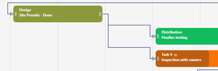
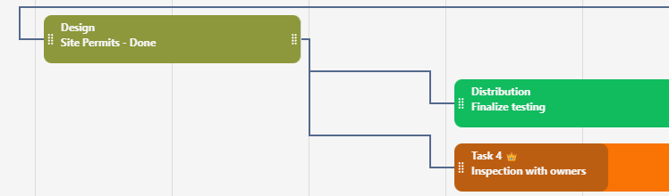
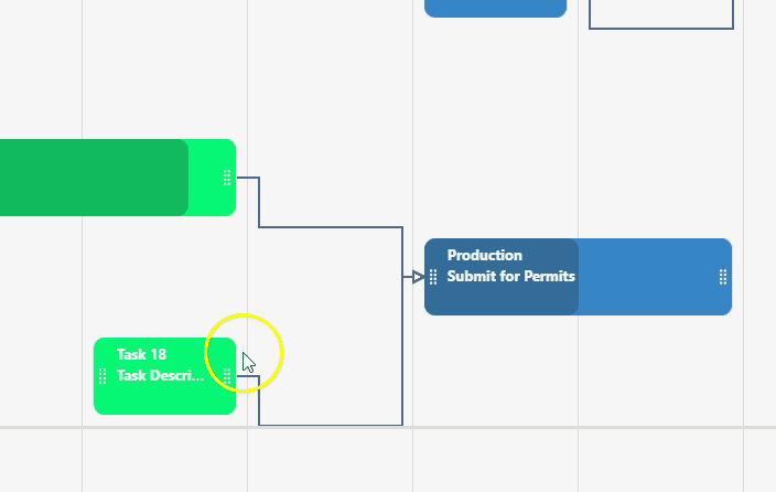
Child Link Field:
- Values: Text
- Description: This field is used as a link or path reference between records in the Gantt chart, supporting both predecessor and successor relationships. It helps to establish and visualize dependencies between tasks or records, enabling one-to-one, one-to-many, and many-to-one relationships.
- Use Case
- Displaying dependencies between child records on a Gantt chart. Using the Child Link Field, you can show the relationships and dependencies between tasks in a project, making it easier for users to understand the project structure and manage tasks efficiently.
- Examples
- "Predecessor_Task__c, Successor_Task__c": By setting the Child Link Field to "Predecessor_Task__c, Successor_Task__c", you can display the dependencies between tasks in a project based on their predecessor and successor tasks.
- Use Case 2
- Storing predecessor and successor IDs in text fields to link between the child and extra child records. Using text fields to store the predecessor and successor IDs allows for creating more complex dependencies, including links between child records and extra child records, providing a comprehensive view of task relationships within a project.
- Example 2
- "Predecessor_ID__c, Successor_ID__c": By setting the Child Link Field to "Predecessor_ID__c, Successor_ID__c", you can store the predecessor and successor IDs in text fields, enabling the visualization of dependencies between child records and extra child records on a Gantt chart. This enhanced view of task relationships allows for improved project management and decision-making.
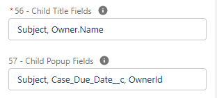
Child Title Fields:
- Values: Text
- Description: Specifies the field names to be used as a label displayed on the child records (separated by a comma and space), like Name, Status__c, and Completion__c. Text in RTF format can be used to display images and format the text.
- Custom Labels for Titles: Add a custom label before the field using the format name__c!Name
- Use Case
- Showing key information about child records on the Gantt chart or other visualizations. Child Title Fields allow users to quickly identify essential details about each record, making navigating and analyzing project data easier.
- Examples
- "Task_Name, Priority, Stage" will display the task name, priority, and stage as labels on the child records, providing users with an overview of the task's key details.
- Use Case 2
- Customizing child record labels to match specific business requirements. By configuring the Child Title Fields to display relevant information, administrators can tailor the visual representation of the data to serve the needs of their organization better.
- Example 2
- "Project_ID, Task_Type, Deadline" will show the project ID, task type, and deadline on the child records, focusing on information that may be critical for a particular organization or team.
- Example RTF format with Image, font size and color change
- <span style="width:100%;"><img style="float: right;" src="' + CASE( Priority__c , "High", "https://nativeplannerplustestdrive-dev-ed.file.force.com/sfc/servlet.shepherd/version/renditionDownload?rendition=ORIGINAL_Png&versionId=0688b00000Ps3dy&operationContext=CHATTER&contentId=05T8b00001LxkFS", "Normal", "https://nativeplannerplustestdrive-dev-ed.file.force.com/sfc/servlet.shepherd/version/renditionDownload?rendition=ORIGINAL_Png&versionId=0688b00000Ps4Dc&operationContext=CHATTER&contentId=05T8b00001Lxl29", "Low","https://nativeplannerplustestdrive-dev-ed.file.force.com/sfc/servlet.shepherd/version/renditionDownload?rendition=ORIGINAL_Png&versionId=0688b00000Ps3dx&operationContext=CHATTER&contentId=05T8b00001Lxktq","") +'"></img><p><span style="font-size:14px;">'+Name+'</span></p><p><span style="font-size:10px; color:red;">'+Description__c+'</span></p></span>
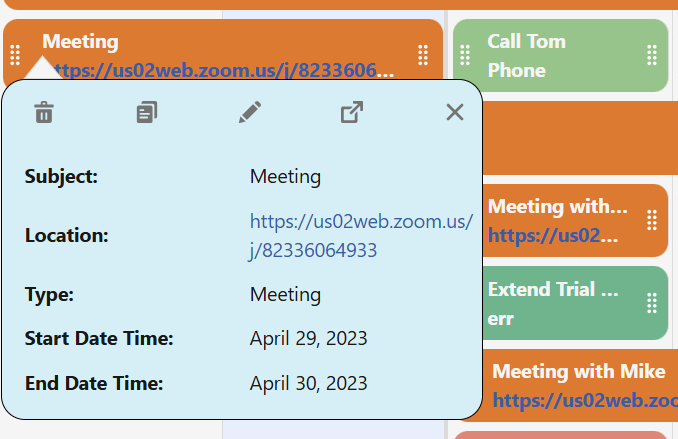
Child Popup Fields:
- Values: Text, Field API Name, Field_API_NAME^label, LookupFiel.ReleatedObjectFieldName, LookupField@Fieldset, LookupField@FieldsetName#FieldName
- Description: Determines the field names and labels to be used in the popup box when clicking on a child record. These fields can be edited if the read-only setting is set to "no" in config# 92, like Name, Status__c, Completion__c, or ServiceAppointment.Description, ServiceAppointment.Status (comma-separated and space). Customize labels in popups by overwriting the default label using the format "Field_Name^Label".
- * The popup feature allows you to work with related sObjects using lookup fields. It's essential to utilize the lookup field instead of the .Name attribute unless you intend for users to rename the related object. For instance, to display the owner's name in the title, you can use Owner.Name. However, in the popup, you should use OwnerId. This will show the owner's name and enable users to change the owners associated with records without altering the user's name in the user record itself.
- Fieldset popup configuration the format is: LookupField@FieldsetName OR LookupField@FieldsetName#FieldName LookupField is a lookup field to X object in the child/extra object. FieldsetName is the fieldset API name on the X object.FieldName is not required, only if you like to search/display by other fields than Name. For example, Parent_Project__c@Test_Fieldset#Company By default, if the # is not provided, the display field is Name.
- Use Case
- Displaying and editing details of a child record in a popup window with custom labels. By configuring the Child Popup Fields and overwriting the default labels when necessary, users can view and edit relevant details of a child record directly in a popup window without navigating away from the current view.
- Examples
- "Task_Name^Task, Start_Date^Begin, End_Date^Finish, Status" will display these fields with custom labels in the popup window, allowing users to view and edit the task name, start date, end date, and status of a child record.
- Use Case 2
- Improving user productivity by quickly accessing essential information with personalized labels. Configuring the Child Popup Fields to display the most relevant fields and overwriting the default labels when needed allows users to access and update important information quickly, streamlining their workflow and increasing efficiency.
- Example 2
- "ServiceAppointment.Description^Description, ServiceAppointment.Status^Status" will display the description and status fields of a Service Appointment record in the popup window with custom labels, enabling users to review and update these details without leaving the current view.
Child Summary Fields:
- Values: Text
- Description: The summary field is displayed on the timeline, providing summary values per column (number, currency), like Amount_c and Total_cost_c. It is used to summarize numerical data from child records on the timeline.
- Customize the summary field by specifying the field name, background color, font size, and font color using the format name__c:bgcolor:fontsize:fontcolor.
- Example: Cost__c:Red:22:white sets the Cost__c summary field with a red background, 22px font size, and white font color.
- Example: Cost__c::14 changes only the font size to 14px.
- Use Case
- Summarizing numerical data from child records on the timeline. By using Child Summary Fields, users can easily view aggregated data from child records, which can help in analyzing and making informed decisions based on the summarized data.
- Examples
- "Total_Hours, Budget" will display the total hours and budget summary for each column, enabling users to track and manage project resources effectively.
- Use Case 2
- Comparing key metrics across different projects or groups. Child Summary Fields can be used to compare important numerical values across multiple projects or groups, making it easier to identify trends, potential issues, or areas of improvement.
- Example 2
- "Revenue, Expenses" will display the revenue and expenses summary for each column, allowing users to compare financial performance across different projects or groups and make strategic decisions based on the insights.
Child Group-By Field:
- Values: Text
- Description: This field allows for a secondary level of data organization within the primary groups formed by the Parent Group-By Field. It provides additional granularity and specificity within the broader categorizations.
- Customize colors for grouped records using FieldAPI and key-value pairs in Config.
- Example: Status__c, [Completed=green,Paused=yellow,Canceled=#ff0000] to visually differentiate records based on status.
- Use Case
- Sub-categorizing events in an event management application based on their type. In such an application, while the main grouping might be by month or location, the child group-by field can further categorize events within these primary groupings according to their specific types such as seminars, webinars, or workshops. This layered approach allows for a cleaner and more detailed overview of scheduled activities.
- Examples
- If you have already grouped tasks in a project management app by "Priority" using the Parent Group-By field, you can use the Child Group-By field with the value "EventType" to further categorize these tasks as "Meeting", "Review", or "Testing" within each priority group. This way, for all high-priority tasks, team members can see which ones are meetings, which ones are reviews, and so on. In an event scheduling application where the primary group (using Parent Group-By Field) is "Location" (e.g., Hall A, Hall B, Auditorium), you can use the Child Group-By field with "EventType" to differentiate between "Seminars", "Workshops", and "Product Launches" happening in each location. This allows attendees to quickly identify the kind of events happening in each location.
Child Start Field:
- Values: Text
- Description: Specifies the field to be used as the start date of the specified child sObject (Date or DateTime field can be used), like Start_Date__c.
- Use Case
- Displaying the beginning date of the tile in a chart or timeline. The Child Start Field allows users to visualize the starting date of tasks or events, helping them understand the sequence and duration of activities within a project or process.
- Examples
- "Start_Date__c": Using the custom field "Start_Date__c" as the Child Start Field to display the beginning date of tasks in a project management application.
- Use Case 2
- Coordinating service appointments and resources. By defining the start field for service appointments, users can efficiently allocate resources and schedule services, ensuring smooth operations and minimizing conflicts.
- Example 2
- "ServiceAppointment.SchedStartTime": Setting the Child Start Field to "ServiceAppointment.SchedStartTime" in a field service management application to display the scheduled start time of service appointments.
Child End Field:
- Values: Text
- Description: Specifies the field to be used as the end date of the specified child sObject (Date or DateTime field can be used), like "End_Date__c".
- Use Case
- Displaying the completion date of a task or event in a Gantt chart or timeline. Using the Child End Field, you can visualize the end dates of tasks or events in a project management tool, making tracking progress and identifying potential bottlenecks easier.
- Examples
- "End_Date__c" can be set as the Child End Field to display the completion date of tasks or events in a Gantt chart or timeline.
- Use Case 2
- Analyzing the duration of various stages in a sales process. By specifying the Child End Field for different stages in a sales pipeline, you can gain insights into the duration of each stage and identify areas for improvement in the sales process.
- Example 2
- "Close_Date__c" can be set as the Child End Field to display the closing date of an opportunity in a sales pipeline, allowing for a better understanding of the time taken to close deals.
Child Filter Statement:
- Values: Text
- Description: Defines a filter statement to be used with the specified child sObject, such as "Status__c = 'Active' AND Priority__c = 'High'". The Child Filter Statement allows users to filter child records based on specific criteria, enhancing the data presentation and analysis process.
- To retrieve archived records, simply append #ALLROWS to the end of your filter statement.
- To filter Picklist use the following syntex: multi-picklist: Licenses_Type__c INCLUDES ('Sales', 'Service') OR for Picklist use: StageName IN ('Closed Won','Closed Lost') If need to extract Flow Screen element to retrive multi values use: "Status__c = 'Active' AND Job_Title__c IN "+"('"+SUBSTITUTE({!Engineer_Job_Title}, ";", "' , '")+"')"
- Use Case
- Filtering child records based on certain criteria. Using the Child Filter Statement, you can apply filters to the child records to display only those that meet the specified conditions, making it easier for users to focus on the most relevant information.
- Examples
- "Status__c = 'In Progress' AND Priority__c = 'Urgent'" will display only the child records with the status "In Progress" and the priority "Urgent", helping users to concentrate on urgent tasks that are still in progress.
- Use Case 2
- Displaying high-priority tasks for a specific user. By applying a filter that combines both priority and user assignment criteria, you can help users focus on their high-priority tasks.
- Example 2
- "Priority__c = 'High' AND Assigned_To__c = 'User123'" will display only the child records with the priority "High" and assigned to the user "User123", allowing the user to easily identify and work on their high-priority tasks.
Child Sort Field:
- Values: Text
- Description: This field is used to sort Child records based on a specific field, such as by Name. It allows for organizing and presenting records in a structured manner on the timeline.
- Use Case
- Ordering child records based on a specific field. Using the Child Sort Field, you can arrange the records according to a chosen field, making it easier for users to locate and analyze specific data points.
- Examples
- "Due_Date__c" will sort child records based on their due date, helping users prioritize tasks and visualize deadlines on the timeline.
- Use Case 2
- Sorting child records alphabetically to facilitate navigation. By sorting records alphabetically, users can quickly locate the desired record and access relevant information more efficiently.
- Example 2
- "Name" will sort child records alphabetically by their names, making it easier for users to navigate through the list and find specific records.
Child Sort Direction:
- Values: ASC or DESC
- Description: Determines the sort direction of Child records, with options being ASC (ascending) or DESC (descending).
- Use Case
- Sorting child records in ascending or descending order. The Child Sort Direction allows users to organize child records according to their preference, making it easier to navigate and analyze the data.
- Examples
- "DESC" will sort the child records in descending order, displaying records with higher values or later dates first, depending on the sorting criteria.
Child Progress Field:
- Values: Text
- Description: Field to be used to set the progress of the child record (Limit to 0.0 – 1.0 or percent field). This will display a gradient color to represent progress.
- Use Case
- Tracking task completion in a project management application. In a project management application, you can use the child progress field to monitor the progress of individual tasks, helping team members and managers visualize the completion status of each task.
- Examples
- Use "Completion__c" as the child progress field. By setting the child progress field to "Completion__c," users can input the completion status of tasks, which will be displayed as a gradient color, providing a visual representation of task progress.
- Use Case 2
- Monitoring sales performance in a sales management application. In a sales management application, you can use the child progress field to track the progress of sales deals, helping sales teams and managers quickly identify deals that are close to being won or those that need more attention./li>
- Example 2
- Use "DealProgress__c" as the child progress field. By setting the child progress field to "DealProgress__c," users can input the progress of sales deals, which will be displayed as a gradient color, providing a visual representation of deal progress.
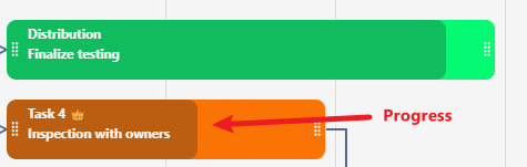
Child Color Field:
- Values: Text
- Description: Specifies the field used as the reference field value to relate to the Child Color Matrix configuration line # 66, such as Status__c.
- Use Case
- Assigning colors to child records based on a specific field to visualize categories or statuses. Using the Child Color Field to assign colors to child records allows for easy visual identification of categories or statuses, improving the overall user experience.
- Examples
- Use "Priority__c" to color-code child records. Set the Child Color Field to "Priority__c" to apply color coding to child records based on their priority, allowing users to identify high-priority tasks at a glance quickly.
- Use Case 2
- Visualizing progress using color-coding based on task completion status. The Child Color Field can be used to apply color-coding to child records based on their completion status, providing a visual representation of progress and helping users focus on unfinished tasks.
- Example 2
- Use "Status__c" to color-code child records. Set the Child Color Field to "Status__c" to apply color coding to child records based on their completion status, allowing users to identify completed, in-progress, and not-started tasks easily.
Child Color Matrix
- Values: Text- JSON
- Description: Defines the color (and optionally font color) applied to child records based on the value of the selected Child Color Field - #70. The field expects a valid JSON array of objects.
- Required Format:
[{'key': 'Field Value', 'value': 'Color'}]
Optional font color:
[{'key': 'Field Value', 'value': 'Color', 'font': 'Color'}]
Match by API Value (Advanced): Use the underlying API value for matching while showing the label in the legend:
[{'key': 'Displayed Label', 'value': '#FF0000', 'api': 'actual_api_value'}] - Escaping special characters:
Use a backslash before special characters in keys.
Example:aujourd\'huiorWomen\'s Category - Use Case
- Create color-coded visualizations of child records (e.g., tasks, issues, events) to instantly highlight status, priority, or category and reveal patterns at a glance.
- Example 1 – Priority coloring
[{'key': 'High', 'value': '#FF0000'}, {'key': 'Medium', 'value': '#FFA500'}, {'key': 'Low', 'value': '#00FF00'}]
- Use Case 2
- Improve readability on light backgrounds (e.g., yellow) by forcing dark text, making project boards and lists clearer and more professional.
- Example 2 – Status coloring with readable text
[
                                {'key': 'In Progress', 'value': 'yellow', 'font': 'black'},
                                {'key': 'Completed',   'value': '#00CC00'},
                                {'key': 'On Hold',      'value': '#FFCC00', 'font': 'black'},
                                {'key': 'Cancelled',    'value': '#FF3333'}
                              ]
Child Flow API:
- Values: Text
- Description: Specify the Screen Flow API name to start when clicking on the FLOW icon on the child popup. Make sure to create a PlannerTarget and PlannerId variables with Input checked, and the Planner will provide the record Id (PlannerId = { ChildId })
- Note:Config # 34 "Component Popup Configuration" needs to include FLOW to display the flow button in the popup box.
- In case of providing a Flow name without a popup field, clicking on the record will activate the flow insted the popup.
- Use Case
- Initiating a Screen Flow process from a child record. This allows you to create a complete process and open possibilities to starting a process related to the record.
- Examples
- Use "CreateCaseFlow" to launch a Screen Flow. This allows the collection of additional information and the creation of a case related to the record clicked
- Use Case 2
- Automating task creation from a child record. You can initiate a Screen Flow process that generates tasks related to the child record, improving workflow efficiency and automation.
- Example 2
- Use "CreateTaskFlow" to start a task creation process. Launching this Screen Flow allows users to input the necessary information to generate tasks associated with the child record, streamlining the task management process.
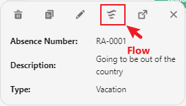
Extra Child sObject By:
- Values:No, PARENT, CHILD
- Description: Determines how the Extra Child sObject should be related to the Parent or Child Records, with options being "No", "PARENT", or "CHILD".
- Use Case
- Connecting an additional sObject to parent records. In a project management application, you may want to connect an extra child sObject to the parent record, such as linking both Events (child) and Tasks (extra child) to the User (parent).
- Examples
- Use "PARENT" to relate the Extra child to the parent object. Set the Extra Child sObject By value to "PARENT" to connect both Event (child) and Task (extra child) to the User (parent).
- Use Case 2
- Connecting an additional sObject to child records. In certain situations, you may need to connect the extra child sObject to the child record instead of the parent, creating a hierarchy of related records.
- Example 2
- Use "CHILD" to relate the Extra child to the child object. Set the Extra Child sObject By value to "CHILD" to connect the Task (extra child) to the Event (child), which is already related to the User (parent).
Extra Child sObject:
- Values:Text
- Description: Specifies the source of records for the Extra Child sObject, such as "Task".
- Use Case
- Including an additional set of related records in the visualization. Using the Extra Child sObject allows you to include an extra layer of related records in the visualization, providing a more comprehensive view of the data.
- Examples
- Use "Subtask__c" as the Extra Child sObject. By specifying "Subtask" as the Extra Child sObject, you can display subtasks along with the main tasks in the visualization, enabling users to see the relationships between tasks and their corresponding subtasks.
- Use Case 2
- Enhancing data analysis with a secondary set of related records. The Extra Child sObject can be used to supplement the primary data set with additional related records, facilitating deeper data analysis and decision-making..
- Example 2
- Use "Follow-upAction__c" as the Extra Child sObject. By setting "Follow-up Action" as the Extra Child sObject, you can include follow-up actions related to tasks in the visualization, providing users with a clearer understanding of the steps required to complete each task.
Extra Child Initial Filter:
- Values:No, PageId, UserId, User fields
- Description: Determines whether to use PageID or UserID to filter by Record Page or Logged-in user Id. Options include No, PageID, and UserID.
- Use Case
- Filtering Extra Child records based on the page's context. In an application, you can use the Extra Child Initial Filter to display relevant Extra Child records based on the current page's context, ensuring that users only see the information related to the specific record page they are viewing..
- Examples
- Use "PageID" to filter Extra Child records. By setting the Extra Child Initial Filter to "PageID," you can display Extra Child records associated with the specific record page, providing users with a tailored view of the data.
- Use Case 2
- Filtering Extra Child records based on the logged-in user. In an application, you can use the Extra Child Initial Filter to display relevant Extra Child records based on the logged-in user, ensuring that users only see the information relevant to them..
- Example 2
- Use "UserID" to filter Extra Child records. By setting the Extra Child Initial Filter to "UserID," you can display Extra Child records associated with the logged-in user, providing a personalized view of the data.
Extra Child Initial Filter Field:
- Values: Text
- Description: Specifies the field to be used as an initial filter for the Extra Child sObject with the Page Record Id or Logged-in User (Config # 70). This can be used to narrow down the displayed records based on a specific field value. You can use the Extra child object field and the user field to match, for example, the "Case_City_c, City " field to filter case records related to the City of the currently logged-in user.
- Use Case
- Filtering records based on a specific field value. An administrator may want to filter tasks based on the task owner in a project management application. By setting the Extra child's initial filter field to "OwnerId" and #70 to USERID, only tasks assigned to the selected owner will be displayed. This feature helps improve the application's usability by displaying only relevant records to the user.
- Examples
- Filtering tasks in a project management application based on the record detail page. Set the Extra child initial filter field to "Id" and #70 to PAGEID to filter the Extra child object based on the current record detail page. This feature helps improve the application's usability by displaying only relevant records to the Record Page.
- Use Case 2
- Filtering case records based on the city of the currently logged-in user. In a customer support application, you may want to filter case records related to the city of the currently logged-in user. By setting the Extra child's initial filter field to "Case_City_c, City" and #70 to USERID, only case records related to the user's city will be displayed. This feature helps improve the application's usability by providing users with relevant, location-based case records.
- Example 2
- Filtering opportunities in a sales application based on the account owner. Set the Extra child initial filter field to "Account.OwnerId" and #70 to USERID to filter the Extra child object based on the opportunities assigned to the account owner. This feature helps improve the application's usability by displaying only relevant opportunities to the account owner, streamlining their sales process.
Extra Child Custom Relationship:
- Values:YES, NO
- Description: Determines if an Extra Child sObject should use a custom relationship with the parent or child sObject, with options being "YES" or "NO".
- Use Case
- Creating a custom relationship between an additional set of related records and the parent or child records. In a project management application, you might want to create a custom relationship between a parent task and additional related records, such as comments or attachments, to provide more context and information to team members
- Examples
- Use "YES" to create a custom relationship. Set the Extra Child Custom Relationship value to "YES" to establish a custom relationship between the parent task and the additional related records, such as comments or attachments.
- Use Case 2
- Preventing the creation of a custom relationship between an additional set of related records and the parent or child records. Sometimes, you might want to avoid creating a custom relationship to simplify the data model or adhere to specific requirements within your organization
- Example 2
- Use "NO" to avoid creating a custom relationship. Set the Extra Child Custom Relationship value to "NO" to prevent the establishment of a custom relationship between the parent task and the additional related records, such as comments or attachments.
Extra Child Custom Relationship Field:
- Values:Text
- Description: Defines the lookup field to be used as a relationship in situations where the specified parent or child has no direct relationship to the extra child, like OwnerId.
- Use Case
- Establishing a custom relationship between the extra child sObject and the parent or child sObject when no direct relationship exists. In some scenarios, it may be necessary to establish a relationship between the extra child sObject and the parent or child sObject when a direct relationship is not available.
- Examples
- Use "Manager__c" as the lookup field. By specifying "Manager__c" as the lookup field, you can create a custom relationship between the extra child sObject and the parent or child sObject.
- Use Case 2
- Enhancing data organization and structure in the system. Using the extra child custom relationship field can help improve the organization of data in the system by linking records that may not have a direct relationship, making it easier to manage and access related records.
- Example 2
- Use "ProjectLead__c" as the lookup field. By setting the extra child custom relationship field to "ProjectLead__c," you can create a custom relationship between the extra child sObject and the parent or child sObject, enabling users to view and manage project leads associated with specific records easily.
Extra Child Grid Timeline Field:
- Values: Text
- Description: Specifies the Extra child field used to build the horizontal timeline (or swimlane headers) when the Extra child grid is in Grid or Kanban mode. The unique values of this field become the columns/headers.
- Display picklist labels instead of API names:
Append%to the field API name to show the picklist label instead of the stored API value.
Example:Status__c%→ displays "In Progress", "Completed", etc.
Without the % → displays the raw API value (e.g., "in_progress"). - Customize column header appearance:
Use the format:FieldAPIName:bgColor:fontSize:fontColor
All parts after the field name are optional (partial customization is allowed):Status__c:#3686C9:20:black→ blue background, 20px font, black textStageName:#28a745::white→ green background, default size, white textPriority__c::18:→ only increase font size to 18px
- Use Case
- Visualize task or project progress across statuses in a project management app — instantly see how many tasks are To Do, In Progress, or Done.
- Example 1 – Task status timeline
Status__c%:#3686C9:18:white
Shows human-readable status labels with a branded blue header and white text.
- Use Case 2
- Monitor a sales pipeline by stage — sales teams can quickly spot bottlenecks (e.g., too many deals stuck in "Negotiation").
- Example 2 – Opportunity stages
StageName:#10B981:20:white
Displays stages like "Prospecting", "Proposal", "Closed Won" with green headers and large, readable text.
- Tip: You can combine both features — e.g.,
Status__c%:#6366F1:18:shows picklist labels with a custom purple header and 18px font.
Extra Child Custom Matrix Relationship:
- Values:YES, NO
- Description: Indicates whether to use a Matrix sObject to create a custom relationship with the parent sObject in the Matrix Chart type. Options include YES and NO.
- Use Case
- Visualizing parent and extra child records in a matrix chart with custom relationships. By enabling the Extra Child Custom Matrix Relationship option, you can create custom relationships between parent and extra child sObjects in a Matrix Chart, providing a flexible way to visualize data and connections between records.
- Examples
- YES: Selecting "YES" for the Extra Child Custom Matrix Relationship will create a custom relationship between the parent and extra child sObjects in the Matrix Chart, enhancing the chart's utility and adaptability.
- Use Case 2
- Analyzing data across multiple hierarchies. With Extra Child Custom Matrix Relationship enabled, you can explore relationships between parent sObjects and multiple layers of child sObjects. This provides a deeper understanding of complex data structures and helps identify patterns or trends across multiple levels of your data hierarch
- Example 2
- YES: Choosing "YES" for the Extra Child Custom Matrix Relationship allows you to examine relationships between a parent sObject and extra child sObjects in the Matrix Chart, offering greater insight into the interconnectedness of the data and facilitating more comprehensive data analysis.
Extra Child Custom Matrix Relationship Field:
- Values:Text
- Description: Specifies the Matrix sObject to create a custom relationship with the Extra Child sObject, such as events and Matrix sObject User.
- Use Case
- Connecting a Matrix sObject to the Extra Child sObject to align data placement in the right column. By establishing a custom relationship between Matrix sObject and Extra Child sObject, you can ensure that data is displayed in the appropriate column, making it easier for users to understand and manage the information.
- Examples
- Assigned_User__c: Using this custom relationship field, you can link the Assigned User (Matrix sObject) to the corresponding Extra Child sObject, such as tasks or events, to display the user responsible for each task or event in the correct column.
- Use Case 2
- Enhancing data visualization and organization by connecting related sObjects. By creating custom relationships between Matrix sObject and Extra Child sObject, you can structure data more meaningfully, improving data visualization and organization within the application
- Example 2
- Project__c: In a project management application, you can use this custom relationship field to connect the Project (Matrix sObject) to its associated tasks or events (Extra Child sObjects), allowing users to view and manage tasks and events organized by their respective projects.
Extra Child Link Field:
- Values: Text
- Description: This field is used as a link or path reference between extra child records in the Gantt chart, supporting both predecessor and successor relationships. It helps to establish and visualize dependencies between tasks or records, enabling one-to-one, one-to-many, and many-to-one relationships for extra child records.
- Use Case
- Displaying dependencies between extra child records on a Gantt chart. Using the Extra Child Link Field, you can show the relationships and dependencies between tasks in a project, making it easier for users to understand the project structure and manage tasks efficiently.
- Examples
- "Extra_Predecessor_Task__c, Extra_Successor_Task__c": By setting the Extra Child Link Field to "Extra_Predecessor_Task__c, Extra_Successor_Task__c", you can display the dependencies between extra child tasks in a project based on their predecessor and successor tasks.
- Use Case 2
- Storing predecessor and successor IDs in text fields to link between the child and extra child records. Using text fields to store the predecessor and successor IDs allows for creating more complex dependencies, including links between child records and extra child records, providing a comprehensive view of task relationships within a project.
- Example 2
- "Extra_Predecessor_ID__c, Extra_Successor_ID__c": By setting the Extra Child Link Field to "Extra_Predecessor_ID__c, Extra_Successor_ID__c", you can store the predecessor and successor IDs in text fields, enabling the visualization of dependencies between child records and extra child records on a Gantt chart. This enhanced view of task relationships allows for improved project management and decision-making.
Extra Child Title Fields:
- Values:Text
- Description: Specifies the field names as a label displayed on the extra child records (separated by a comma and space), like Name, Status__c, and Completion__c. Text in RTF format can be used to display images and format the text.
- Custom Labels for Titles: Add a custom label before the field using the format name__c!Name
- Use Case
- Displaying extended information about extra child records on the Gantt chart or other visualizations. Extra Child Title Fields allow users to quickly identify additional details about each record, enhancing the navigation and analysis of project data..
- Examples
- “Task_Name, Resource_Allocation, Deadline" will display the task name, resource allocation, and deadline as labels on the extra child records, providing users with an overview of the task's extended details..
- Use Case 2
- Customizing extra child record labels to address specific industry requirements. By configuring the Extra Child Title Fields to display industry-specific information, administrators can adapt the visual representation of the data to serve their organization's needs better.
- Example 2
- "Project_ID, Safety_Rating, Environmental_Impact" will show the project ID, safety rating, and environmental impact on the extra child records, focusing on information that may be critical for organizations in industries with a strong emphasis on safety and environmental concerns.
Extra Child Popup Fields:
- Values: Text, Field API Name, Field_API_NAME^label, LookupFiel.ReleatedObjectFieldName, LookupField@Fieldset, LookupField@FieldsetName#FieldName
- Description: Determines the field names and labels to be used in the popup box when clicking on an extra child record. These fields can be edited if the read-only setting is set to "no" in config# 92, like Name, Status__c, Completion__c, or ServiceAppointment.Description, ServiceAppointment.Status (comma-separated and space). Customize labels in popups by overwriting the default label using the format "Field_Name^Label".
- * The popup feature allows you to work with related sObjects using lookup fields. It's essential to utilize the lookup field instead of the .Name attribute unless you intend for users to rename the related object. For instance, to display the owner's name in the title, you can use Owner.Name. However, in the popup, you should use OwnerId. This will show the owner's name and enable users to change the owners associated with records without altering the user's name in the user record itself.
- Use Case
- Displaying and editing details of an extra child record in a popup window with custom labels. By configuring the Extra Child Popup Fields and overwriting the default labels when necessary, users can view and edit relevant details of an extra child record directly in a popup window without navigating away from the current view.
- Examples
- "Extra_Task_Name^Task, Extra_Start_Date^Begin, Extra_End_Date^Finish, Extra_Status" will display these fields with custom labels in the popup window, allowing users to view and edit the task name, start date, end date, and status of an extra child record.
- Use Case 2
- Improving user productivity by quickly accessing essential information with personalized labels. Configuring the Extra Child Popup Fields to display the most relevant fields and overwriting the default labels when needed allows users to access and update important information quickly, streamlining their workflow and increasing efficiency.
- Example 2
- "Case.Subject, Case.Status, Account.Name, Account.Phone" will display the case subject, case status, account name, and account phone fields in the popup window, allowing support agents to quickly review and update customer information without navigating away from the case view.
Extra Child Summary Fields:
- Values:Text (number and currency type fields)
- Description: The summary field is displayed on the timeline, providing summary values per column (number, currency), like Amount_c and Total_cost_c. It summarizes numerical data from extra child records on the timeline.
- Use Case
- Summarizing numerical data from extra child records on the timeline. By using Extra Child Summary Fields, users can easily view aggregated data from extra child records, which can help analyze and make informed decisions based on the summarized data.
- Examples
- "Total_Hours, Budget" will display each column's total hours and budget summary, enabling users to track and manage project resources effectively.
- Use Case 2
- Comparing key metrics across different projects or groups. Extra Child Summary Fields can be used to compare important numerical values across multiple projects or groups, making it easier to identify trends, potential issues, or areas of improvement.
- Example 2
- "Revenue, Expenses" will display the revenue and expenses summary for each column, allowing users to compare financial performance across different projects or groups and make strategic decisions based on the insights.
Extra Child Group-By Field:
- Values: Text
- Description: This field allows for a secondary level of data organization within the primary groups formed by the Parent Group-By Field. It provides additional granularity and specificity within the broader categorizations.
- Customize colors for grouped records using FieldAPI and key-value pairs in Config.
- Example: Status__c, [Completed=green,Paused=yellow,Canceled=#ff0000] to visually differentiate records based on status.
- Use Case
- Sub-categorizing events in an event management application based on their type. In such an application, while the main grouping might be by month or location, the child group-by field can further categorize events within these primary groupings according to their specific types such as seminars, webinars, or workshops. This layered approach allows for a cleaner and more detailed overview of scheduled activities.
- Examples
- If you have already grouped tasks in a project management app by "Priority" using the Parent Group-By field, you can use the Child Group-By field with the value "EventType" to further categorize these tasks as "Meeting", "Review", or "Testing" within each priority group. This way, for all high-priority tasks, team members can see which ones are meetings, which ones are reviews, and so on. In an event scheduling application where the primary group (using Parent Group-By Field) is "Location" (e.g., Hall A, Hall B, Auditorium), you can use the Child Group-By field with "EventType" to differentiate between "Seminars", "Workshops", and "Product Launches" happening in each location. This allows attendees to quickly identify the kind of events happening in each location.
Extra Child Start Field:
- Values:Text
- Description: Specifies the field to set the start date of the specified extra child sObject (Date or DateTime fields), like Start_Date__c.
- Use Case
- Visualizing project milestones. The Extra Child Start Field allows users to visualize the starting date of milestones within a project, helping them understand the sequence and duration of key activities.
- Examples
- Using "Milestone_Start_Date__c" as the Extra Child Start Field to display the beginning date of project milestones in a project management application.
- Use Case 2
- Tracking campaign start dates. Users can efficiently monitor marketing campaigns by defining the start field for campaign start dates, ensuring timely execution and performance analysis.
- Example 2
- Setting the Extra Child Start Field to "Campaign.StartDate" in a marketing management application to display the start date of marketing campaigns.
Extra Child End Field:
- Values:Text
- Description: Specifies the field to be used as the end date of the specified extra child sObject (Date or DateTime field can be used), like "End_Date__c".
- Use Case
- Displaying the completion date of project phases in a Gantt chart or timeline. Using the Extra Child End Field, you can visualize the end dates of project phases, making tracking progress and identifying potential bottlenecks easier.
- Examples
- "Phase_End_Date__c" can be set as the Extra Child End Field to display the completion date of project phases in a Gantt chart or timeline.
- Use Case 2
- Evaluating the duration of support tickets. By specifying the Extra Child End Field for support ticket resolution, you can gain insights into the duration of ticket resolution and identify areas for improvement in customer support.
- Example 2
- "Ticket.Resolution_Date__c" can be set as the Extra Child End Field to display the resolution date of support tickets, allowing for a better understanding of the time taken to resolve customer issues.
Extra Child Filter Statement:
- Values:Text
- Description: Defines a filter statement to be used with the specified extra child sObject, such as "Status__c = 'Active' AND Priority__c = 'High'". The Extra Child Filter Statement allows users to filter extra child records based on specific criteria, enhancing the data presentation and analysis process.
- Use Case
- Filtering extra child records based on certain criteria. Using the Extra Child Filter Statement, you can apply filters to the extra child records to display only those that meet the specified conditions, making it easier for users to focus on the most relevant information.
- Examples
- "Status__c = 'In Progress' AND Priority__c = 'Urgent'" will display only the extra child records with the status "In Progress" and the priority "Urgent", helping users to concentrate on urgent tasks that are still in progress.
- Use Case 2
- Displaying high-priority tasks for a specific user. By applying a filter that combines both priority and user assignment criteria, you can help users focus on their high-priority tasks.
- Example 2
- "Priority__c = 'High' AND Assigned_To__c = 'User123'" will display only the extra child records with the priority "High" and assigned to the user "User123", allowing the user to easily identify and work on their high-priority tasks.
Extra Child Sort Field:
- Values:Text
- Description: This field is used to sort Extra Child records based on a specific field, such as by Name. It allows for organizing and presenting records in a structured manner on the timeline
- Use Case
- Ordering extra child records based on a specific field. Using the Extra Child Sort Field, you can arrange the records according to a chosen field, making it easier for users to locate and analyze specific data points.
- Examples
- "Due_Date__c" will sort extra child records based on their due date, helping users prioritize tasks and visualize deadlines on the timeline.
- Use Case 2
- Sorting extra child records alphabetically to facilitate navigation. By sorting records alphabetically, users can quickly locate the desired record and access relevant information more efficiently.
- Example 2
- "Name" will sort extra child records alphabetically by their names, making it easier for users to navigate the list and find specific records.
Extra Child Sort Direction:
- Values:ASC or DESC
- Description: Determines the sort direction of Extra Child records, with options being ASC (ascending) or DESC (descending).
- Use Case
- Sorting extra child records in ascending or descending order. The Extra Child Sort Direction allows users to organize extra child records according to their preferences, making navigating and analyzing the data easier.
- Examples
- "DESC" will sort the extra child records in descending order, displaying records with higher values or later dates first, depending on the sorting criteria.
Extra Child Progress Field:
- Values:Text
- Description: Field to be used to set the progress of the extra child record (Limit to 0.0 – 1.0 or percent field). This will display a gradient color to represent progress
- Use Case
- Tracking task completion in a project management application. In a project management application, you can use the extra child progress field to monitor the progress of individual tasks, helping team members and managers visualize the completion status of each task.
- Examples
- Use "Completion__c" as the extra child progress field. By setting the extra child progress field to "Completion__c," users can input the completion status of
Extra Child Color Field:
- Values:Text
- Description: Specifies the field used as the reference field value to relate to the Extra Child Color Matrix configuration line #88.
- Use Case
- Use colors for additional child records according to specific field values, making categories or statuses visually clear. Using the Extra Child Color Field to assign colors to extra child records allows for easy visual identification of categories or statuses, improving the overall user experience.
- Examples
- Use "Priority__c" to color-code extra child records. Set the Extra Child Color Field to "Priority__c" to apply color coding to extra child records based on their priority, allowing users to identify high-priority tasks at a glance quickly.
- Use Case 2
- Display task progress with colors based on completion. Use the extra color field for child records to show their status, helping users focus on unfinished tasks.
- Example 2
- Use "Status__c" to color-code extra child records. Set the Extra Child Color Field to "Status__c" to apply color coding to extra child records based on their completion status, allowing users to identify completed, in-progress, and not-started tasks easily.
Extra Child Color Matrix:
- Values: Text- JSON
- Description: Defines the color (and optionally font color) applied to Extra child records based on the value of the selected Extra Child Color Field - #93. The field expects a valid JSON array of objects.
- Required Format:
[{'key': 'Field Value', 'value': 'Color'}]
Optional font color:
[{'key': 'Field Value', 'value': 'Color', 'font': 'Color'}]
Match by API Value (Advanced): Use the underlying API value for matching while showing the label in the legend:
[{'key': 'Displayed Label', 'value': '#FF0000', 'api': 'actual_api_value'}] - Escaping special characters:
Use a backslash before special characters in keys.
Example:aujourd\'huiorWomen\'s Category - Use Case
- Create color-coded visualizations of Extra child records (e.g., tasks, issues, events) to instantly highlight status, priority, or category and reveal patterns at a glance.
- Example 1 – Priority coloring
[{'key': 'High', 'value': '#FF0000'}, {'key': 'Medium', 'value': '#FFA500'}, {'key': 'Low', 'value': '#00FF00'}]
- Use Case 2
- Improve readability on light backgrounds (e.g., yellow) by forcing dark text, making project boards and lists clearer and more professional.
- Example 2 – Status coloring with readable text
[
                                {'key': 'In Progress', 'value': 'yellow', 'font': 'black'},
                                {'key': 'Completed',   'value': '#00CC00'},
                                {'key': 'On Hold',      'value': '#FFCC00', 'font': 'black'},
                                {'key': 'Cancelled',    'value': '#FF3333'}
                              ]
Extra Child Flow API:
- Values:Text
- Description: Specify the Screen Flow API name to start when clicking on the FLOW icon on the extra child popup. Make sure to create a PlannerTarget and PlannerId variable with Input checked, and the Planner will provide the record Id (PlannerId = { Extra ChildId })
- Note: Config # 34 "Component Popup Configuration" needs to include FLOW to display the flow button in the popup box.
- Use Case
- Initiating a Screen Flow process from an extra child record. This allows you to create a complete process and opens possibilities for starting a process related to the record.
- Examples
- Use "CreateCaseFlow" to launch a Screen Flow. This allows the collection of additional information and the creation of a case related to the clicked record.
- Automating task creation from an extra child record. You can initiate a Screen Flow process that generates tasks related to the extra child record, improving workflow
Childs Can Be Created:
- Values:BOTH, No, CHILD, EXTRA CHILD
- Description: Allow Extra Child record creation using double-click on the grid, using the popup field to create the record
- Use Case
- Providing users the ability to create new Child and Extra Child records directly from the Planner interface by double-clicking on the grid. This feature enables users to add Extra Child quickly records to their projects, saving time and increasing efficiency in the project management process.
- Examples
- Value: "BOTH"
- Use Case 2
- Allowing users to create Extra Child records while preventing the creation of regular Child records. In some project management scenarios, users may only need to create Extra Child records, and this option allows them to do so without cluttering the interface with unnecessary features.
- Example 2
- Value: "EXTRA CHILD"
Child Can Overlap:
- Values:YES, NO
- Description: Allow the child record to overlap with another child record (require Scheduler Component Type).
- Use Case
- Allowing multiple child records to occupy the same time slot or grid allocation. This feature is useful when resources or events co-occur, enabling users to efficiently manage and allocate resources or events that share the same time frame.
- Examples
- Disallow overlapping child records. To prevent child records from overlapping, set the value to "NO" to prevent child records from overlapping. This ensures that each child record occupies a unique time slot or grid allocation, avoiding conflicts or resource overbooking
Child Read Only:
- Values:
- YES: No editing or dragging is allowed.
- NO: Full edit and modify rights.
- Review: The user can drag and resize, but the record is not saved.
- Confirm: The user can modify data but receives save confirmation before saving.
- Save Later: The user can modify multiple records and press save on the planner's top to save and refresh the screen.
- Description: Controls user permissions for interacting with child records on the Gantt chart.
- Use Case
- Restricting user permissions for child records in a project management application. By setting the Child Read-Only value to "YES," you can prevent users from editing or dragging child records, ensuring that only authorized personnel can change the tasks.
- Examples
- Setting Child Read Only to "NO". Users will have full edit and modification rights, allowing them to edit records instantly.
- Use Case 2
- Implementing a review and approval process for modifying child records. By selecting "Confirm" or "Review" as the Child Read Only value, you can create a workflow where users can propose changes to the records, but these changes are not saved until they are reviewed or confirmed by an authorized person.
- Example 2
- Setting Child Read Only to "Save Later". Users can modify multiple records and then press save on top of the planner to save and refresh the screen, streamlining the process of updating records and reducing the risk of unsaved changes