

User guide · Chapter 17
Screen Flow Components
Native Rent User Guide 1.2. Last updated on the Planner source page: July 1, 2025. Copied into the Native Rent User Guide under /rent on 2026-10-26 (America/Chicago).
Source (original, do not remove yet): https://www.nativeerp.com/NativePlanner/guide/Components.html
Overview And Architecture
The Native Screen Flow Components pack adds five free, lightweight components that you can drag and drop into any Flow Screen. They are designed to integrate with the Top Screen Flow that launches Native Planner, giving admins extra knobs to pre-filter the Planner view, drive navigation, and create automation-friendly entry points.
The typical pattern is:
- Top Screen gathers filter values (avatars, picklists, lookups, etc.).
- Planner waiting-screen/orchestrator reads those values from flow variables.
- The Planner component uses them in its
whereClause,groupBy, or custom metadata to shape the final schedule view.
This approach keeps your Planner Lightning page clean while giving Flow the power to:
- Offer role-based or dynamic filter sets.
- Store user preferences (e.g., default group filter) in a custom object and hydrate the flow when it starts.
- Chain automated actions (e.g., open/refresh planner every morning with yesterday-to-today range).
Common Use Cases
User Picker (Navatar Group)
Let schedulers click one or more user avatars to instantly filter the Planner to tasks owned by those users.

Record Filter (Lookup)
Expose a Lookup to Accounts, Projects, or any object. When a record is selected the flow sets a variable (e.g., vSelectedAccountId) that feeds the Planner’s filter_accountId attribute.

Status And Priority (Picklist)
Drop a Native Flow Picklist twice: one for Status__c, another for Priority__c. Pass both values into the Planner query so dispatchers can stack filters without leaving the flow.
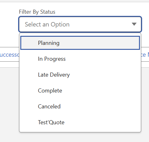
Auto-Launch And Refresh (Timer)
Use Native Flow Timer to wait a few milliseconds after a screen loads, then navigate automatically to the next screen where the Planner lives. Great for kiosk use cases or when you need to fetch dates from a record first.
Navatar Group
A horizontally scrolling avatar bar that lets users pick one or more people (or other photo-enabled objects) to drive user-centric filtering.
- API Name: Flow variable reference to store selected IDs.
- Avatar Group Size:
small | medium | large. - Avatar Variant:
circle | square. - Avatars: Record Collection (e.g., Get Records > User).
- Group Title: Optional heading displayed above the avatar row.
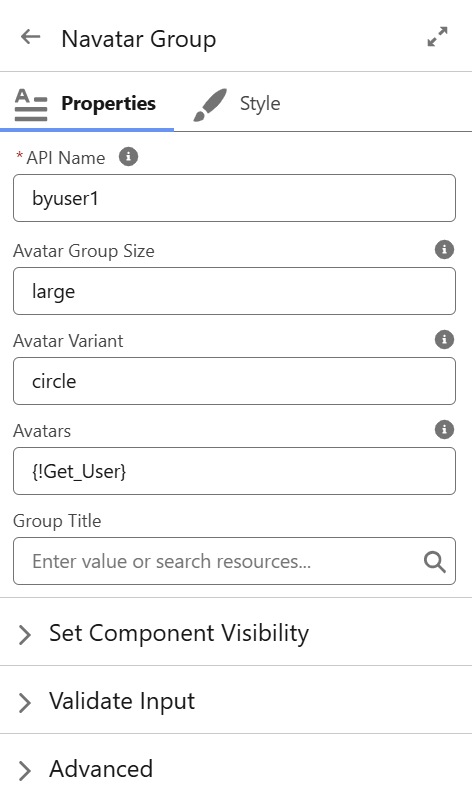
Tip: Bind the component’s output collection to a text variable (vSelectedUserIds) and feed it straight into your Planner custom filter so only tasks owned by those users appear.
Native Flow Picklist
A stylable dropdown for choosing a single value (or optionally multiple if "Navigation: None" is used and you handle Next via another button).
- API Name: Variable to store the chosen value.
- Label: Field label shown above the picklist.
- Choices: Either hard-coded choices or a Picklist Choice Set.
- Navigation:
Next | None.
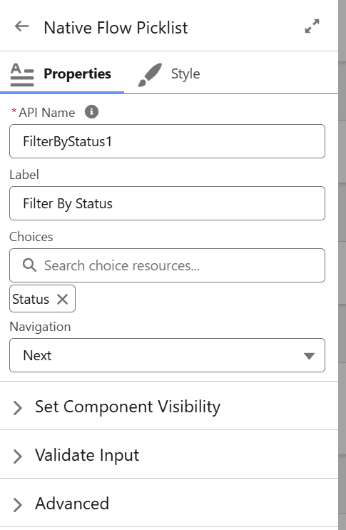
Pattern: Add multiple Picklists on one screen (Status, Priority, Region). Use a single Native Flow Button set to "Next" to navigate forward only when all are selected.
Native Flow Button

Universal action component for Flow screens. It renders as a Salesforce button, avatar button, or visual picker tile.
| Config | Description / Options |
|---|---|
| API Name | Variable that reflects the user selection (single or collection). |
| Mode | Collection | Unique (multi-select vs radio). |
| Type | Button | Avatar | Visual Picker |
| Group | Wrap items inside an "slds-button-group" style ("Yes") or free layout ("No"). |
| Collections | Record collection used to build the buttons. |
| Variant | Neutral | Brand | Destructive | Success (plus Circle | Square if Avatar Type) |
| Align | Center | Left | Right |
| Navigation | Next | Back | Finish | None |
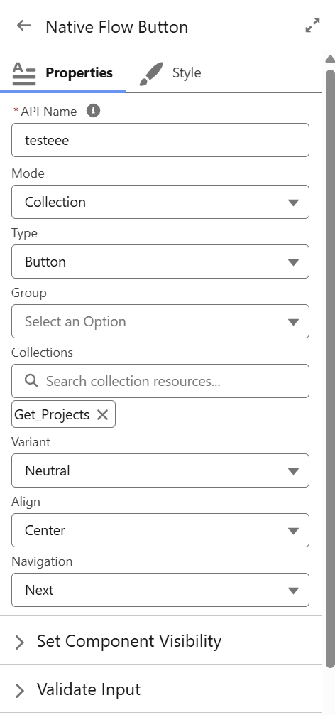
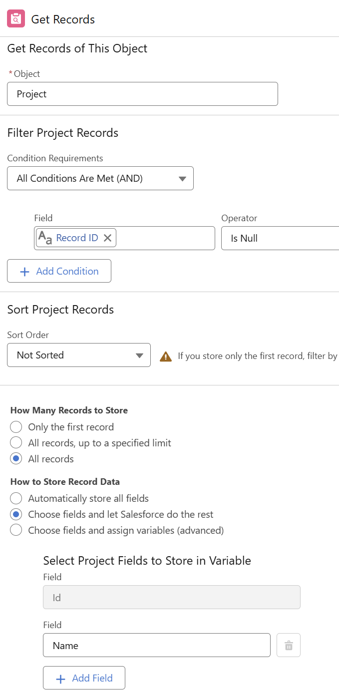
- Get Project for the buttons: add a filter to remove inactive records and limit the list.
- Make sure to use Choose fields and let Salesforce do the rest.
- Select the Name as 2nd field (see image).
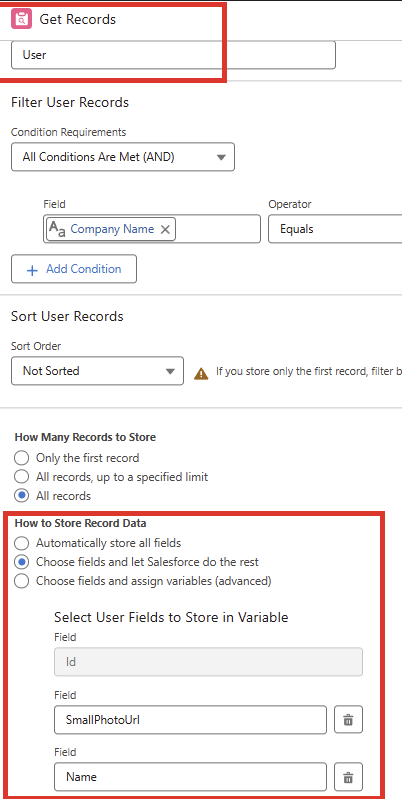
- User Avatar: Get Users: add a filter to remove inactive users and limit the users list.
- Make sure to use Choose fields and let Salesforce do the rest.
- Select SmallPhotoUrl as 2nd and Name as 3rd field (see image).
Great for compact "filter chips" (Mode: Collection + Type: Button) or image-rich menu tiles (Type: Visual Picker).
Native Flow Lookup
A Lightning lookup field embedded directly in a Screen Flow.
- API Name: Stores the selected record’s Id.
- Label: Display label.
- Collection: Record Collection (for narrow pick-lists) or leave blank for global lookup.
- Operator:
equals | not equal | starts with | contains(controls how the value is applied in your SOQL filter). - Navigation:
Next | None.
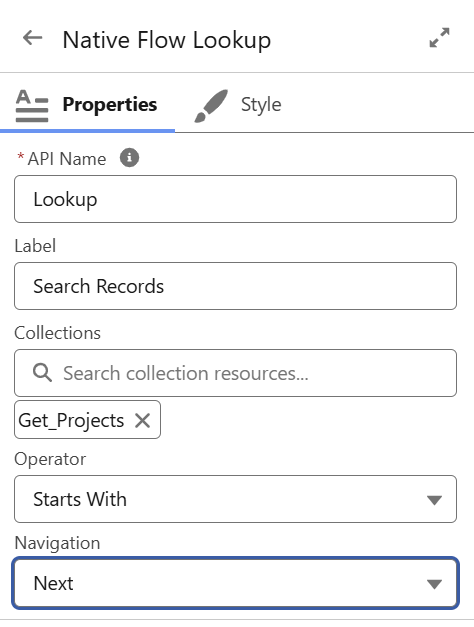
.png.png; file used is Native Flow Lookup.png.)Example: Filter Planner by Project__c where ProjectId = {!vSelectedProjectId}.
- Get Project for the collection: add a filter to remove inactive records and limit the list.
- Make sure to use Choose fields and let Salesforce do the rest.
- Select the Name as 2nd field.
Native Flow Timer
Invisible component that waits a set amount of time, then automatically clicks the defined navigation button.
- API Name: Variable to store whether the timer has fired (boolean).
- Delay: Milliseconds to wait before firing.
- Navigation:
Next | Back | Finish | None. - Repeat:
True | False(loop back and fire again if you revisit the screen).
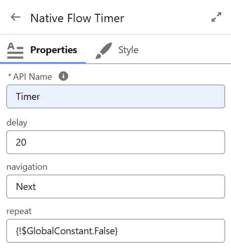
Pause 20 ms, auto-open Planner. Combine with a second Timer on the Planner screen (Delay=60000, Navigation=Back) to refresh every minute.
Native Mobile Data Table
Native Rent 1.987.0.1 (package version 04ta500000E50grAAB) includes the Native Mobile Data Table features described in this chapter.
What It Is
- Native Mobile Data Table (
nrMobileDataTable) is a Flow Screen component. It shows a list of records that users can select. - It replaces the standard Flow Data Table, which does not work well on Salesforce Mobile.
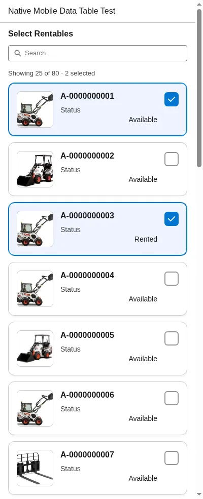
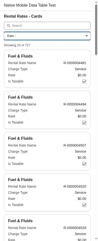
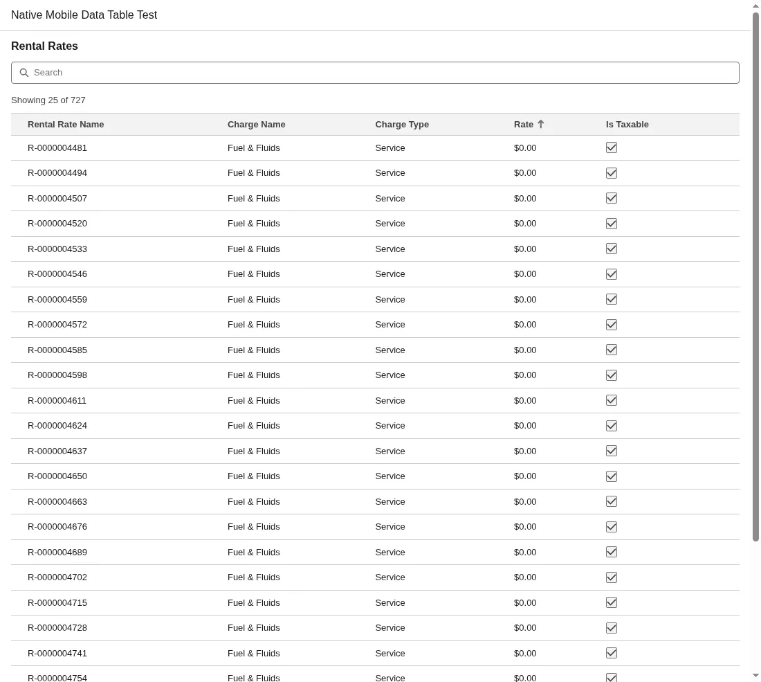
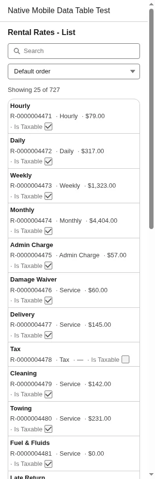
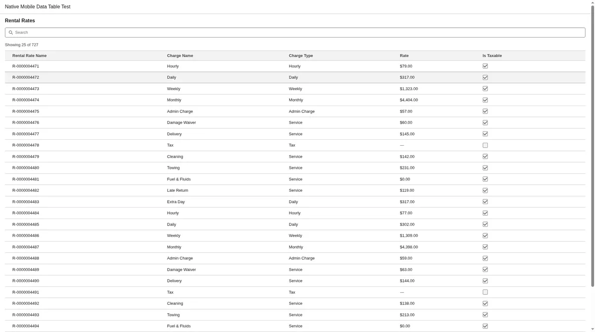
- On phones and tablets it shows cards. On desktop it shows a table. You can also force cards, a table, or a compact list.
- It uses only the records the Flow passes in. It does not query again.
- It runs no Apex unless you fill in Field Set Name.
- Inline editing is off by default (Edit Mode none). v2a adds optional pencil and input modes.
Add It To A Flow Screen
- Add a Get Records element that returns All records. Include every field you want to show.
- Add a Screen element. Drag Native Mobile Data Table onto it.
- In the property editor, pick the Object. This sets Object API Name too.
- Pick the Records collection.
- Choose the columns, or type a Field Set Name. Optional: type custom headers in Column Labels.
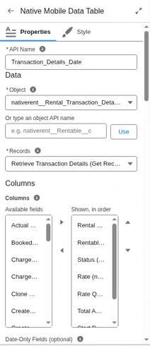
- Optional: to show a Date/Time field as a date only, type its API name in Date-Only Fields, under Columns.
- Set Selection Mode. Set Card Title Field and Card Detail Fields if the defaults do not fit.
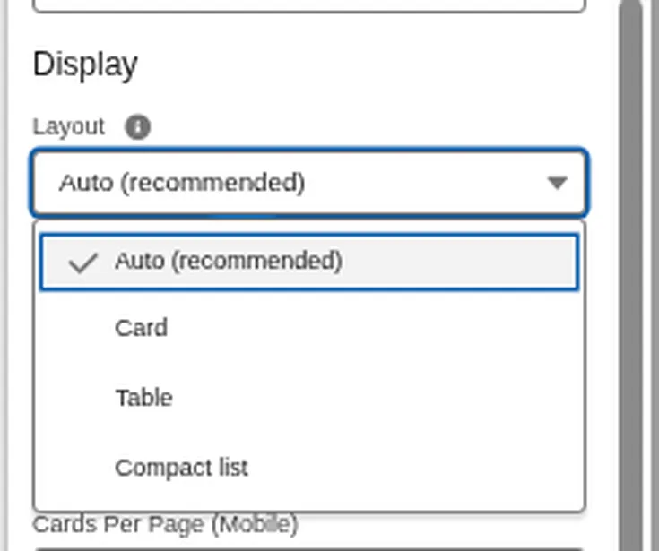
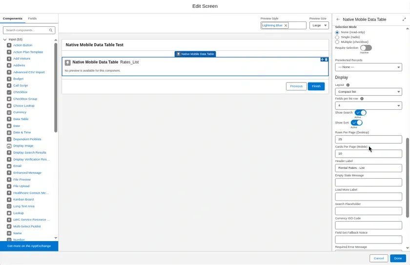
- Under Display, set Layout. For Compact list, set Fields Per List Row. Set Font Size if you want smaller or larger text.
- Turn on Show Search and Show Sort if you want them. Set page sizes and labels.
- Store Selected Records or Selected Record in a variable. To keep the selection when the user goes back, pass the same variable into Selected Records.
- Test on desktop and on a phone.
Show A Date/Time Field As A Date
- Date-Only Fields (
dateOnlyFields) is an optional, comma-separated list of Date/Time field API names, for examplenativerent__Start_Date_Time__c. - Each listed Date/Time field shows as a date with no time, in table columns and on cards.
- The date is taken in the user's time zone, the same way the full date and time is shown.
- Only Date/Time fields change. Other field types in the list are ignored.
- Names are not case sensitive, and the
nativerent__prefix is optional. - Sorting still uses the full date and time.
- Leave it blank to show date and time as before.
Flow Builder Editor
- Native Mobile Data Table has its own settings panel in Flow Builder. It runs no Apex unless you fill in Field Set Name.
- Object: pick an object already used in the flow, from a record variable or a Get Records element. Or type an object API name and click Use. This sets the record type and Object API Name together.
- Changing the Object clears Records, Field API Names, Card Title Field, Card Detail Fields and Card Image Field, because fields from another object no longer apply.
- Records: pick a record collection variable or a Get Records element (All records) of that object.
- Columns: move fields from Available fields to Shown, in order, and reorder them. Each field shows as Label (API name).
- Each lookup also offers an entry with a › sign, for example Rentable › Name. Pick it to show the related record's name. Get Records must return that field, or the Id shows instead.
- Under Columns come Date-Only Fields, Column Labels and Field Set Name. Field Set Name is typed, because Field Sets cannot be listed in the panel.
- Card Title Field, Card Detail Fields and Card Image Field are picked from the same field list. Card Detail Fields allows up to 4.
- Saved field names the panel does not recognize are kept, not dropped.
- When you click Done, the panel checks that an Object and Records are chosen, that Columns or a Field Set Name is set, and that Card Detail Fields has 4 fields or fewer.
Column Labels
- Column Labels (
columnLabels) is optional. It sits under Columns in the settings panel. - Type headers separated by commas, in the same order as the columns (or the Field Set order), for example
Name,,Daily Rate. - Spaces around each entry are removed. A blank entry keeps the field's own label. Extra entries are ignored, and missing ones keep the field label.
- The panel lists each column with the header it will get, for example 1. Name → Rentable.
- The custom header is used in table headers, on card and list labels and in the sort picker.
Choosing A Layout
- Auto (the default): cards on phones. On tablets and desktop, cards when the component is 768px wide or less, and a table otherwise. It switches when the width changes.
- Card: always cards, even on desktop. Good for picking by picture.
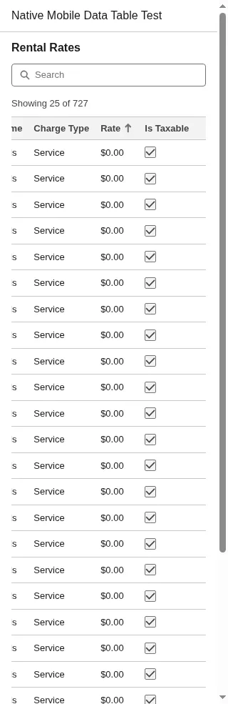
- Table: always a table. Good for many columns. On phones the table scrolls sideways inside its own box, not the page.
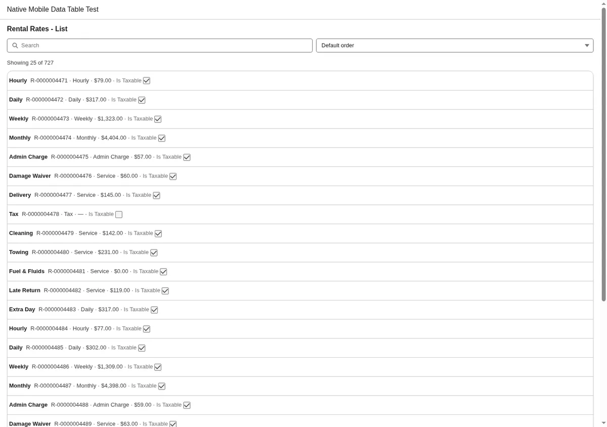
- Compact list: one line per record with the selection control, an optional small picture, the title and the detail values.
- Layout values are not case sensitive. A blank or unknown value uses Auto.
- Page size follows the screen, not the layout. Cards Per Page (Mobile) applies on phones and narrow screens, Rows Per Page (Desktop) otherwise.
Fields Per List Row
- Fields Per List Row (
listFieldCount) applies to the Compact list only. It sets how many detail values each row shows after the title, from 1 to 4. Blank or invalid uses 2. - The values come from Card Detail Fields when set, otherwise from the columns after the title.
- When a row shows more than 2 values and the component is 480px wide or narrower, the values wrap onto a second line instead of being cut off.
- Text values that do not fit end with an ellipsis. Numbers, currency, dates and checkboxes are not shortened.
Card Details and Font Size
Card detail and font-size options:
- When Card Detail Fields is blank, cards show every column after the title. When it is set, cards show at most 4 of those fields.
- The editor help for Card Detail Fields now says: "Leave blank to show all remaining columns." It still starts with "Comma-separated fields shown on cards (up to 4)."
- Cards are more compact. Labels and values sit in two columns.
- Font Size (
fontSize) is a new property. Pick small, medium or large. The default is medium. Blank or unknown values use medium. - Set Font Size in the Display section of the editor.
- Font Size scales card text. Small and large also scale table and list text. Medium leaves table and list text as before.
Density
Density options:
- Density (
density) is a new property. Pick Comfortable, Compact or Dense. The default is Comfortable. - Set Density in the Display section of the editor. It works together with Font Size.
- No Density option hides a field.
- Comfortable looks the same as before. Existing screens are unchanged.
- Compact uses tighter spacing. Labels are 12px, uppercase and muted.
- Card values are right-aligned in every density. Compact and Dense use evenly spaced digits so numbers line up. Dense cards with two fields per row are left-aligned.
- Dense uses the tightest spacing. Long values wrap inside their column, so Dense cards can be taller. Amounts normally stay on one line.
- Dense also uses a flatter card and a smaller title.
- When the component is 320px wide or more, Dense cards show two fields per row. Each label sits above its value.
- In two-column Dense cards, each label and value stay together at the top of the cell. Long URLs wrap within the column. A very long single value, such as a long ID on a narrow phone, can break in the middle.
- Long text wraps to about 3 lines and shows a Show more / Show less button. This applies to Dense cards, Dense list rows and Compact cards.
- Long text means Text Area and Long Text Area fields, Rich Text and HTML formula fields, or any text over 120 characters.
- On Compact and Dense cards, long text and rich text fields span the full card width. The Show more button sits below the text, not over it.
- The button only shows when the text runs past 3 lines or is over 120 characters.
- Tapping Show more never selects the row.
- Comfortable is unchanged. In tables, Compact and Dense only tighten header spacing.
- In Compact and Dense, text never goes below 12px.
- The whole card or row is the tap area. List rows, the table selection column, the Show more button and Compact or Dense cards are at least 44px.
Known limits
- The Compact list layout has no Show more. Long text ends in an ellipsis with no way to expand it.
- Dense list rows are taller than before (104px, up from 88px).
- Cards with long text are about 8px taller.
- The Show more and Show less labels are in English only.
- At 400% zoom, table headers can be cut off. This was true before this release.
Inline editing and column types
Inline editing and column-type options:
- Edit Mode (
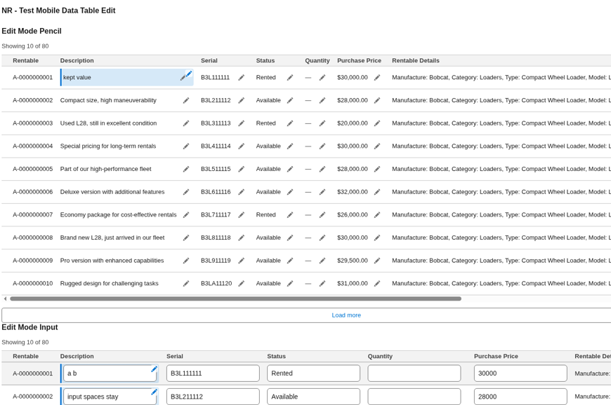
editMode) is none by default. With none (or blank), cards, list, and table behave as before. Fully backward compatible. - Pencil mode shows a pencil icon next to each editable field. Tap the pencil to edit that field. The check mark saves the field locally. The X cancels and discards the buffer.
- Input mode (Display as Input) shows editable fields as inputs. Drafts update as the user types. There is no Save/Cancel chrome.
- Editable Fields (
editableFields) is a comma-separated list of field API names that may be edited when Edit Mode is pencil or input. - Formula, lookup, rich text, and location fields are never editable, even if listed.
- Column Types (
columnTypes) is optional. UseField:typepairs, for exampleAmount__c:currency,Start__c:dateLocal,Email__c:email. Blank keeps the inferred types. - Standard types: text, number, currency, percent, date, dateLocal, email, phone, url, location, boolean, richText.
- Visual and interactive type names (for later phases) are accepted and render as text in v2a.
- Edited Records (
editedRecords) outputs only records with at least one valid changed field. Each item keeps Id and merges the changed fields onto the original record. Invalid drafts are omitted. - The Flow must save with an Update Records element that uses Edited Records. The component does not write to the database. Use Flows, not custom code.
- Clearing a filled Description on a card sends a blank value (null) for that field from the component. A database save still depends on your Flow Update Records step.
- An invalid value, for example letters in a number field, shows an error and blocks Next. It is never written to Edited Records. The original value is kept.
- Valid Edited Records values are proper types: numbers, ISO date or date-time strings, true or false, and null when blank.
- Field API names resolve with or without the
nativerent__prefix. This applies to columns, Editable Fields, Column Types, and Color Field. - The Compact list layout is display-only in v2a. Inline editing works on cards and table.
- After a local save, an edited field on a card or desktop table cell shows a soft brand tint, a 3px brand accent bar, and a small pencil icon. Screen readers hear Edited. There is no Edited word pill.
- The Compact list has no edited marker. It stays display-only, so there is nothing to mark as edited there.
- Selection, edited, and error markers stay visible when a row or card has a background color.
- On cards, edit controls are at least 44px. Numeric fields use
inputmode=decimalso invalid keystrokes stay visible for validation. - The Flow Builder panel has an Inline editing (v2a) section after Selection.
- When Draft State is unmapped, valid edits can restore from Edited Records if that collection is passed back in. Invalid typed text is lost when the component reloads.
- In the pencil editor, Enter commits the value locally the same way the check mark does. Escape cancels. Space types normally. These keys do not trigger row selection.
Behavior limits
See Current behavior and limits below for reload behavior and the remaining device and rich text limits.
How to save edits in a Flow
- Set Edit Mode to pencil or input, and list the Editable Fields.
- Optional: set Column Types for any field that should not use the inferred type.
- Store Edited Records in a record collection variable.
- When editing is on, map Draft State (
draftState) to the same Text variable in both Input and Output. Do not leave it unbound, so edits survive a blocked Next. Admins do not need to read or change its content. - After the screen, add an Update Records element that updates from that Edited Records collection.
- Leave Edit Mode at none when the screen should stay read-only.
Row and card colors
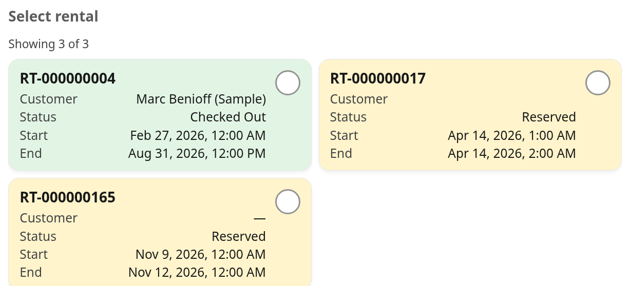
The component applies status colors to whole table rows, cards, and list items, not only the Status cell. The table crop below shows the Status and date columns. Whole-row coloring is the product behavior.
Row and card color options:
- Color Field (
colorField) is the field API name whose value picks a background from Color Map. Leave blank to keep default styling. - Color Map (
colorMap) is optional Native Planner color matrix JSON. Example:[{'key':'Open','value':'#8DC63F','font':'white'},{'key':'Closed','value':'#F15A29'}]. - Single or double quotes are accepted. Optional
fontsets the text color. Optionalapimatches the field API value whilekeyis a legend label. - Matching is case sensitive on the raw field value. Booleans match as true or false.
- Colors apply to table rows, cards, and list items.
- Unmatched values, blank Color Field, blank Color Map, or invalid JSON keep the default styling. Invalid JSON is ignored and the table still renders.
- Selection borders, edited markers, and error markers stay visible on top of the color. Links keep the brand color so they stay readable.
- Blank Color Field and Color Map leave prior behavior unchanged. Fully backward compatible.
- The Flow Builder panel has a Row / card color section for Color Field and Color Map.

Current behavior and limits
No new properties or configuration are introduced by this behavior set.
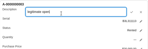
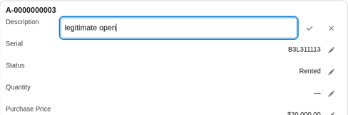
- Opening a pencil editor places the cursor in its input. Enter commits locally, Escape cancels, and Space types normally.
- With Draft State mapped to the same Text variable for Input and Output, a changed open pencil editor restores its value and focus after the screen reloads. Saved and cancelled editors stay closed. Committed drafts are kept.
- Input-mode Text keeps leading, trailing, and repeated spaces while you edit. Output and saved state are normalized. After a reload, normalized Text is restored, not the session-only trailing spaces.
- Clearing a filled Description on a card sends the same record Id with Description set to null from the component. This does not prove a later Flow save, database update, or every field type.
- On desktop compact cards, Space and Enter on the pencil, check mark, and X open, commit, and cancel. Dense-card Space on check and X works the same. These desktop results are not a phone keyboard test.
- Card-body Space and Enter toggle selection. Compact-card Show more keeps the selected records and count for desktop click, Space, and Enter. Action-button keys do not change card selection in the tested cases. This is not claimed for every action-button case.
- Dense list Show more and Show less keep selection in desktop and 320px browser checks. Compact list desktop and 400% checks show ellipsized rows. List remains display-only for inline editing.
- Rendered rich text in expanded Description fields has not been tested yet. Expanding literal HTML text is not the same as rendered rich text.
- Device coverage beyond desktop browser checks is limited. Other phones, Android, and tablets are not fully covered yet. Desktop browser checks do not replace device testing.
Color Field and Color Map set the whole row, card, or list background. They do not create per-cell status badges. The edited tint and accent mark only the changed card field or table cell.
With Draft State mapped for Input and Output, changed open editors restore. Saved and cancelled editors stay closed and committed drafts remain. These images illustrate the changed-open sequence only.
Rich Text Fields
- Rich Text Area fields keep their formatting, such as bold text, lists and pictures, in all layouts. This works for Field API Names and Field Set columns.
- Tables show about 3 lines. Cards show about 5 lines. The rest is hidden, not cut from the text.
- The Compact list shows one line, and pictures inside the rich text are hidden there.
- Search, sort, card titles and screen reader labels use the plain text, without the formatting.
- Formula text fields that return HTML, such as a HYPERLINK formula, show as formatted rich text in all layouts, not as raw HTML tags. The same line limits apply, and search and sort use the plain text.
- A rich text value that is only an image, such as a formula IMAGE() for a QR code, renders as an image on cards and table. It does not show as a blank or an em dash.
- Rich text that also has visible text still shows as formatted rich text.
- Plain text and long text fields show as before.
Checkbox Fields
- Checkbox fields, including formula fields that return a checkbox value, show as a read-only box with a check mark when true. They do not show true or false. A blank value shows as unchecked.
- This works in every layout, including the Compact list detail line.
- The box is not an input, so it cannot be confused with row selection. Screen readers read Checked or Unchecked.
- Search treats each box as the word Checked or Unchecked. Typing unchecked finds unchecked records. Typing checked also matches Unchecked.
- When sorting from low to high, unchecked and blank come before checked.
Use Case Examples
Every example uses Layout table and Show Sort on.
No runtime screenshot exists yet for these screens, so none is shown.
Names to use: the real property names are fieldNames (not fields), layoutMode (not layout), listFieldCount (not fieldsPerRow), objectApiName, columnLabels and dateOnlyFields.
Review rental lines, dates without times
Select Rental Transaction For Contact v12 and For Rentable v6, screen element Transaction_Details_Date.
| Property | Value |
|---|---|
T (Object) | Rental Transaction Detail |
records | Retrieve_Transaction_Details |
objectApiName | nativerent__Rental_Transaction_Detail__c |
fieldNames | Name,nativerent__RentableName__c,nativerent__Status__c,nativerent__Rate__c,nativerent__Quantity__c,nativerent__Total_Amount__c,nativerent__Start_Date__c,nativerent__End_Date__c |
columnLabels | Line,Rentable,Status,Rate,Quantity,Total Amount,Start Date,End Date |
dateOnlyFields | nativerent__Start_Date__c,nativerent__End_Date__c |
selectionMode | none |
layoutMode | table |
showSort | true |
headerLabel | Rental Lines |
A read-only list of the rental's lines. Start and End show as dates only. The same flows have a second table, Transaction_Details, with the same settings but no Date-Only Fields, for date and time mode.
Pick one rate, selection required
NR Edit Rental Transaction, screen element RentableRatesFound.
| Property | Value |
|---|---|
T (Object) | Rental Rate |
records | Get_Other_Rentable_Rates |
objectApiName | nativerent__Rental_Rate__c |
fieldNames | nativerent__Charge_Name__c,nativerent__Charge_Type__c,nativerent__Rate__c |
columnLabels | Charge Name,Charge Type,Rate |
selectionMode | single |
required | true |
layoutMode | table |
showSort | true |
headerLabel | Rentable Rates Found |
The user must pick one rate before Next. The flow reads the pick from Selected Record (output stored automatically).
Pick several add-ons, with search and a starting selection
NR Edit Rental Transaction, screen element IncludeAddOn.
| Property | Value |
|---|---|
T (Object) | Rentable |
records | Add_Onwithout_Conflict |
objectApiName | nativerent__Rentable__c |
fieldNames | Name,nativerent__Name__c,nativerent__Rentable_Details__c,nativerent__Best_Rate__c,nativerent__Non_serialized__c |
columnLabels | Rentable,Name,Rentable Details,Best Rate,Non-serialized |
selectionMode | multi |
preselectedRecords | Current_AddOn_Items |
showSearch | true |
layoutMode | table |
showSort | true |
headerLabel | Add-On Available For Rent |
Checkboxes for several Rentables. The add-ons already on the rental start selected. The flow reads Selected Records.
Match a contact on a standard object
Native Barcode Scanner Template, screen element ContactsFound.
| Property | Value |
|---|---|
T (Object) | Contact |
records | Search_For_Contacts |
objectApiName | Contact |
fieldNames | Name,Email,Phone,Birthdate |
columnLabels | Full Name,Email,Phone,Birthdate |
selectionMode | single |
layoutMode | table |
showSort | true |
headerLabel | Matching Contacts |
Shows the contacts that match a scan so the user can pick one. It works the same on standard objects.
Properties
The component has 38 properties plus the Object type T. All of them are in this table.
| API name | Label | Type | Default | What it does |
|---|---|---|---|---|
T | Object | sObject type (propertyType) | None | The object of the records. Pick it in Flow Builder. It must match Records. |
records | Records | Record collection {T[]}, required | None | The record collection to show, for example from Get Records. The component does not query again. |
objectApiName | Object API Name | String, required | None | API name of the same object as Records, for example nativerent__Rentable__c. Used for field labels and types. |
fieldNames | Field API Names | String | None | Comma-separated columns, for example Name,nativerent__Status__c. Ignored when a Field Set loads. |
fieldSetName | Field Set Name | String | None | Optional Field Set API name. It takes precedence over Field API Names. If it fails, the component falls back to Field API Names. Needs the Native Mobile Data Table permission set. |
columnLabels | Column Labels | String, input only | None | Optional. Comma-separated custom headers in the same order as Field API Names (or the Field Set order). Leave an entry blank to keep the field's label, for example Name,,Daily Rate. |
dateOnlyFields | Date-Only Fields | String, input only | None | Optional. Comma-separated Date/Time field API names to show as a date without the time, for example nativerent__Start_Date_Time__c. |
layoutMode | Layout | String | auto | auto, card, table or list. Auto shows cards on phones and narrow screens and a table otherwise. Table scrolls sideways inside itself on phones. List shows compact rows. |
listFieldCount | Fields Per List Row | Integer | 2 | Compact list layout only. How many detail fields each row shows, 1 to 4. Blank or invalid uses 2. Uses Card Detail Fields when set. |
selectionMode | Selection Mode | String | single | none, single (radio) or multi (checkbox). |
primaryField | Card Title Field | String | First column | Field used as the card title. |
secondaryFields | Card Detail Fields | String | All columns after the title | Comma-separated fields shown on cards. Up to 4. Leave blank to show all remaining columns. |
fontSize | Font Size | String, input only | medium | small, medium or large. Scales card text. Small and large also scale table and list text. |
density | Density | String | Comfortable | Comfortable, Compact or Dense. Tighter spacing. Never hides fields. |
imageField | Card Image Field | String | None | Optional. A URL field or a rich text image field, for example nativerent__Default_Image__c. |
preselectedRecords | Preselected Records | Record collection {T[]}, input only | None | Records selected at start, matched by Id. |
preselectedRecordIds | Preselected Record Ids | String, input only | None | Comma-separated record Ids selected at start. |
selectedRecords | Selected Records | Record collection {T[]}, output | None in js-meta ([] in README) | Output. All selected records. Pass the same variable back in to keep the selection when the user goes back. |
selectedRecord | Selected Record | Record {T}, output | None | Output. The first or only selected record. |
editedRecords | Edited Records | Record collection {T[]}, input and output | None | Output. Records with at least one valid inline edit. Each item is the original record with changed fields merged (Id kept). Invalid drafts are omitted and the original value is kept. Valid values are numbers, ISO dates, true/false, or null when blank. Empty when Edit Mode is none or nothing changed. The Flow saves with Update Records. The component does not write to the database. |
draftState | Draft State | Text (String), input and output | None | Optional. Internal edit state. When editing is on, map the same Text variable to both Input and Output. Do not leave Draft State unbound, so edits survive a blocked Next. Restores published drafts, invalid typed values, and field errors after a blocked Next reloads the component. Published changed open editor state is restored. Saved and cancelled editors stay closed. See Current behavior and limits. Admins do not need to read or change its content. |
editMode | Edit Mode | String, input only | none | none (read-only, same as prior versions), pencil (pencil icon; tap to edit one field with Save/Cancel), or input (Display as Input). Requires Editable Fields. |
editableFields | Editable Fields | String, input only | None | Comma-separated field API names that can be edited when Edit Mode is pencil or input, for example Rate__c,Available__c. Formula, lookup, rich text, and location fields are never editable. |
columnTypes | Column Types | String, input only | None | Optional. Comma-separated Field:type overrides, for example Amount__c:currency,Start__c:dateLocal,Email__c:email. Standard types: text, number, currency, percent, date, dateLocal, email, phone, url, location, boolean, richText. Visual and interactive type names are accepted for later phases and render as text in v2a. Blank keeps inferred types. |
colorField | Color Field | String, input only | None | Optional. Field API name whose value picks a background from Color Map (same idea as Native Planner Child Color Field). Blank turns row and card coloring off. |
colorMap | Color Map (JSON) | String, input only | None | Optional. Native Planner Child Color Matrix JSON, for example [{'key':'Open','value':'#8DC63F','font':'white'},{'key':'Closed','value':'#F15A29'}]. Single or double quotes. Optional font for text color and api to match an API value while key is a legend label. Blank turns coloring off. |
headerLabel | Header Label | String, input only | None | Heading above the list. Also the screen reader label for the list (README). |
emptyMessage | Empty State Message | String, input only | No records to display. | Shown when there are no rows or no search match. |
showSearch | Show Search | Boolean, input only | false | Shows a search box that filters the shown values on the device. |
searchPlaceholder | Search Placeholder | String, input only | Search | Placeholder text for the search box. |
showSort | Show Sort | Boolean, input only | false | Header sort on desktop tables. A sort picker on mobile, cards and list. |
maxHeight | Max Height | String, input only | None | Optional CSS length for a scroll area, for example 480px, 60vh or 30rem. |
initialRowCount | Cards Per Page (Mobile) | Integer, input only | 10 | Cards shown at first and added by each Load more on phone and tablet. |
pageSize | Rows Per Page (Desktop) | Integer, input only | 25 | Rows shown at first and added by each Load more on desktop. |
loadMoreLabel | Load More Label | String, input only | Load more | Label for the Load more button. |
required | Require Selection | Boolean, input only | false | Blocks Next until a row is selected. No effect in none mode (README). |
requiredMessage | Required Error Message | String, input only | Please select a record. | Validation message when Require Selection blocks Next. |
currencyCode | Currency ISO Code | String, input only | USD | Currency used to format all currency fields. |
fieldSetErrorLabel | Field Set Fallback Notice | String, input only | The Field Set could not be loaded; showing the default columns. | Notice shown when the Field Set cannot load. |
README and js-meta differences
- All 38 js-meta properties and the Object type T are in this guide. The README table is older and does not list Date-Only Fields, the editing properties, or Color Field / Color Map yet.
- selectedRecords default: README says []. js-meta sets no default.
- Card Title Field and Card Detail Fields: README gives defaults (first column, next columns) in the Default column. js-meta gives them only in the description.
- listFieldCount: README adds that it uses Card Detail Fields when set. The code does this. js-meta does not say this.
- fieldNames: README says relationship paths like
nativerent__Product__r.Nameare allowed. The code supports them. js-meta does not say this. - The README Limitations and Packaging sections say the component and its editor are not yet tested in an org. The component has been tested in a development org, and the editor shows in Flow Builder there.
Permission Set
- The permission set API name is
Native_Mobile_Data_Table. Its label is Native Mobile Data Table. - It grants access to the Apex class
NrMobileDataTableController. That class reads Field Set definitions only. - Users need it only when Field Set Name is filled in. Without it, the component falls back to Field API Names.
Mobile Tips
- Use Layout auto in most cases. It shows cards on phones and when the component is 768px wide or less.
- Keep cards short. Cards show a title and up to 4 detail fields.
- Tap anywhere on a card to select it.
- Use the Compact list for long lists where people pick by name. When a row shows more than 2 values and the component is 480px wide or narrower, values wrap to a second line. At 320px, Rate and checkbox values were not cut off in testing.
- Use the Table layout for many columns. On phones it scrolls sideways inside its own box, not the whole page.
- On mobile, Show Sort adds a sort picker above cards and list rows.
- Keep Cards Per Page (Mobile) low. Users tap Load more to see more.
- Checkbox fields show as a read-only check mark, not true or false. Searching for Unchecked finds unchecked records. Searching for checked also matches Unchecked.
- Tapping a lookup link opens the record and leaves the Flow screen.
Rendered rich text in expanded Description fields has not been tested yet. These plain-text images are not a rendered rich text example.


Screenshots
Screenshots come from the development org test flow Native_Mobile_Data_Table_Test.
Testing Notes
- Tested on one phone in the Salesforce mobile app. Other devices, Android, and tablets are not tested yet.
- Rich text image URLs in the mobile app.
- When the user goes back in the Flow (Previous), the selection is kept in table and card modes. Any search text is cleared.
- Field Set fallback for a user without the permission set is not fully covered in current testing.
- Keyboard: Tab moves through search, rows or cards and buttons. Space selects a row or card. On sortable tables, Enter or Space on a column header sorts it. The selected count is announced as it changes. Screen reader behavior is not tested yet.
- At 320px wide the page does not scroll sideways. A wide table scrolls inside its own box.
- Date-Only Fields: the input is in the Flow Builder property editor in the dev org (2026-11-03). A date-only column has not been checked on a running screen yet, on desktop or in the mobile app.
- Rich Text, Column Labels and Date-Only Fields are not yet checked on a running Flow screen, on desktop or in the mobile app.
- Formula text fields that return HTML (such as HYPERLINK) are not yet checked on a running Flow screen, on desktop or in the mobile app.
- The settings panel is set up under the packaged name
nativerent-nr-mobile-data-table-cpe. A Flow Builder screenshot from the development org on 2026-11-03 shows the panel open. It is not yet checked in a customer org after install. - The Mobile Data Table test tab, test flow, test page and its test code are not part of the package. Subscribers do not get them.
Source: Native Planner guide Components.html (July 1, 2025). Published under /rent User Guide chapter 17 on 2026-10-26 (America/Chicago).