

User guide · Chapter 18
Native Screen Flow Components
These components will ship in an upcoming Native Rent package version.
Overview
Native Rent includes four screen components for Flow Builder. Use them to present choices, search for a record, or move the flow on after a delay.
| Component | API name | Use it for |
|---|---|---|
| NC Buttons & Tiles | nativerent:ncButtons | Visual choices: icon tiles, image cards, list rows, button rows, small buttons, or a dropdown. |
| NC Picklist | nativerent:ncPicklist | Form-style choice fields: a dropdown, a radio or checkbox list, or buttons, including small buttons. |
| NC Lookup | nativerent:ncLookup | Type-ahead search for one record. |
| NC Timer | nativerent:ncTimer | Moving the flow on automatically after a delay. A hidden mode can run the timer with nothing visible on the screen. |
The labels in the Component column are the metadata MasterLabel values. In Flow Builder, search for NC Buttons & Tiles, NC Picklist, NC Lookup, or NC Timer in the Custom components list.
Each component has its own setup panel, with help text and a live preview of the component with your settings. Flow resources are filled in when the flow runs, so the preview cannot show them. For NC Lookup, the preview appears once you set an object or a record collection. With a record collection, the preview stays empty, because the records are loaded when the flow runs. The NC Timer preview never moves the flow on.
The Basic section holds the settings most screens need:
- NC Buttons & Tiles and NC Picklist: Style, Label, the data source, and Required.
- NC Lookup: Style, Label, Object, and Required.
- NC Timer: Style, Seconds, Then, and Message.
Advanced sections start collapsed. Open them for the rest of the properties.
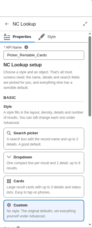
A Style fills only the settings you leave blank. You can still change each one under Advanced. Leave Style blank, or choose Custom, to keep the original defaults.
The property tables in this chapter are grouped by topic for reading. They are not the same as the Basic and Advanced sections in the setup panel. For words that cover more than one setting, see Terms used in this chapter.
All four components:
- Appear in the Screen element's component list under Custom. Search for the component name, for example NC Buttons & Tiles.
- Work on Flow screens only, not on record pages.
- Adapt to phones and desktop. With Layout set to
auto, the component picks a layout from the device and from the width it actually has on the screen. - Use larger touch targets on phones and on narrow layouts. On NC Buttons & Tiles, NC Picklist, and NC Lookup, Density set to
compacttightens spacing only when the component is wide and used with a mouse. NC Timer has no Density property. - Follow the org theme and dark mode unless you set colors. Colors you set are checked for contrast.
- Show built-in texts in the running user's language. Translations are built into the components. See Translations.
- Need no Apex. Record searches and queries use the Salesforce UI API, which enforces sharing, object access, and field permissions of the running user.
Which component to use
| You want | Use |
|---|---|
| A few options shown as large, tappable choices, with icons or images | NC Buttons & Tiles |
| Compact icon-only or short-label buttons, with the full label as a tooltip | NC Buttons & Tiles (Style Small buttons, or Layout iconbuttons) or NC Picklist (Layout iconbuttons) |
| A normal form field that looks like the other fields on the screen | NC Picklist |
| A choice of one record from many, searched by typing | NC Lookup |
| A choice of records you already have in the flow | NC Buttons & Tiles or NC Picklist, with Data Source set to records. For larger collections, use NC Lookup with Data Source set to records. |
| A confirmation screen that continues by itself, or a timed "thank you" screen | NC Timer |
| An action that runs after a delay, with nothing visible on the screen | NC Timer, with Layout hidden, or with the Silent timer style |
NC Buttons & Tiles
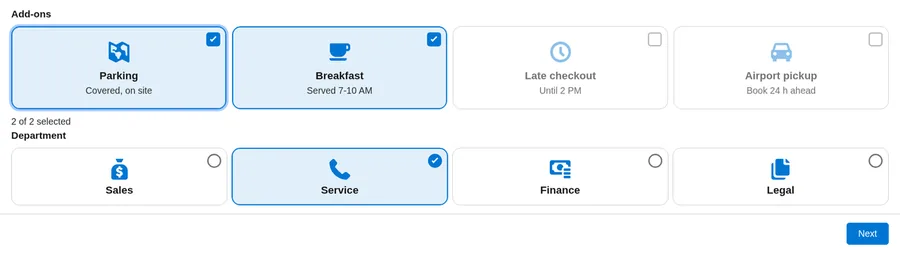
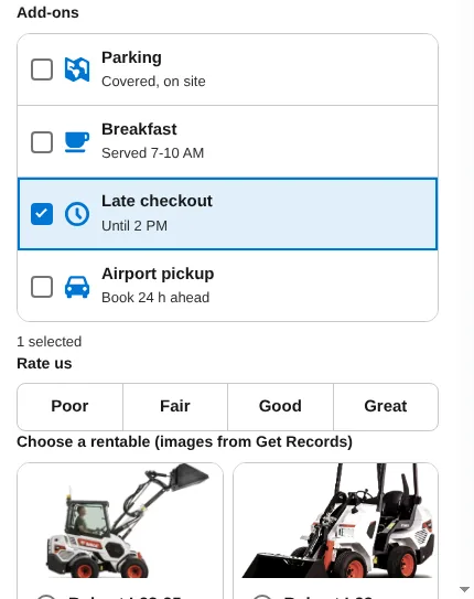
NC Buttons & Tiles shows options as tiles, cards, list rows, buttons, small buttons, or a dropdown. People can pick one option or several. Choices can come from typed text, a text collection, a record collection, a picklist field, or a query.
Use it when the choice should be easy to tap and when icons or images help, for example a plan, add-ons, or a size.
Add it to a screen
- Open the flow in Flow Builder and add or open a Screen element.
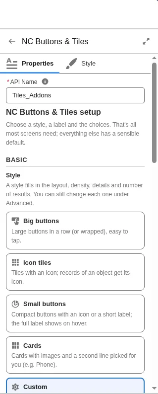
- Add NC Buttons & Tiles. The setup panel opens.
- In Basic, choose a Style if you want one: Big buttons, Icon tiles, Cards, or Small buttons. A style fills only the settings you leave blank. Leave Style blank, or choose Custom, to keep the original defaults.
- Set Label. Choose where the choices come from. Turn on Required if the user must pick a value.
- A live preview shows the component with your settings.
- Leave Data Source set to
auto, and the component uses whichever of the following you fill in:
| Source | Fill in | Example |
|---|---|---|
| text | Choices, and optionally Choice Values, Choice Descriptions, Choice Icons, and Choice Image URLs, all comma-separated in the same order | Small,Medium,Large. Write \, for a comma inside a label. |
| collection | Choice Labels (Collection), and optionally the matching Values and Descriptions collections | A Text collection built with an Assignment or a Loop. |
| records | Records (a record collection from Get Records), plus Record Label Field, Record Value Field, and Record Description Field. First set Record Object. | Rentables from a Get Records element. |
| picklist | Object API Name and Picklist Field API Name. Optionally Record Type Id and Controlling Field Value for a dependent picklist. | Account / Industry |
| query | Object API Name, and optionally Filter Field, Filter Operator, and Filter Value (two filters, joined with AND), Order By Field, Sort Direction, and Maximum Record Choices (default 200) | A Rentable object, with Filter Field Status__c equal to Available. |
- Set Selection Mode to
singleormulti. Optional: Minimum Selections, Maximum Selections, and Default Value. - Leave Layout set to
auto, or picktiles,cards,list,buttons,dropdown, oriconbuttons(Small buttons). Auto uses cards when there are images or descriptions, tiles when there are icons, buttons for up to 5 short labels, a dropdown for more than 12 single-select choices that have no images, and list rows or cards on phones and in a narrow column. On a phone, Auto does not use tiles. Auto never picks Small buttons. Small buttons show an icon or a short label, and the full label as a tooltip. You can also set Columns (Desktop) (0 means automatic, up to 6), Columns (Phone) (1 or 2), and Image Shape. - Open Advanced for selection details, colors, navigation, and the other properties.
- Under Store Output Values, map Value (the selected value), Values (Collection), and Selected Label. For record sources, also map Selected Record or Selected Records. Map the same Value variable in and out to keep the choice when the user goes back.
Properties
| Property | API name | Default | Description |
|---|---|---|---|
| Style | stylePreset | Optional. A style fills only the settings you leave blank. You can still change each one under Advanced. Leave it blank, or choose Custom, to keep the original defaults.buttons (Big buttons): Layout buttons, Text Size large.icons (Icon tiles): Layout tiles, Color Map Style stripe, and, with a query source, the object's icon on choices that have no icon of their own.cards (Cards): Layout cards, Image Shape landscape, Color Map Style stripe, and, with a records or query source, one detail field as the second line.smallbuttons (Small buttons): Layout iconbuttons. | |
| Label | label | Question or field label shown above the component. | |
| Help Text | helpText | Optional hint shown under the label, for example Pick the plan that fits your team. | |
| Data Source | source | auto | Where the choices come from: auto, text, collection, records, picklist, or query. With auto, the component uses the first of these that you filled in:1. records: Records is set.2. collection: Choice Labels (Collection) has values.3. picklist: Object API Name and Picklist Field API Name are set.4. query: only Object API Name is set.5. text: Choices.Example: if you fill in Records and Choices, Records wins. Set Data Source to text to use Choices. |
| Choices | choiceLabels | Text source: comma-separated labels. Use \, for a comma inside a label. | |
| Choice Values | choiceValues | Text source, optional: comma-separated values in the same order. A blank entry uses the label. | |
| Choice Descriptions | choiceDescriptions | Text source, optional: comma-separated second lines in the same order. | |
| Choice Icons | choiceIcons | Text source, optional: comma-separated SLDS icon names, for example utility:home,utility:company. | |
| Choice Image URLs | choiceImages | Text source, optional: one image per choice, separated by commas, in the same order as Choices, for example /resource/PlanImages/starter.png,/resource/PlanImages/team.png. Only https:// links or same-org paths (/resource/..., /sfc/...). http:// links are not shown. | |
| Choice Labels (Collection) | choiceLabelsCollection | Collection source: a Text collection variable. | |
| Choice Values (Collection) | choiceValuesCollection | Collection source, optional: values in the same order as the labels. | |
| Choice Descriptions (Collection) | choiceDescriptionsCollection | Collection source, optional: second lines in the same order. | |
| Record Object | None (object type) | Records source, and the Selected Record outputs: the object of the record collection. Example: Records comes from a Get Records element on Contact, so Record Object is Contact. The setup panel fills it in when you pick Records or set Object API Name. | |
| Records | records | Records source: a record collection from the flow. Shown as they are, with no extra query. | |
| Record Label Field | recordLabelField | Records or query: field for the label. Default is Name (for a query, the object's name field). Relationship paths such as Account.Name work for records. | |
| Record Value Field | recordValueField | Records or query, optional: field for the value. Default is Id. | |
| Record Description Field | recordDescriptionField | Records or query, optional: field for the second line. | |
| Record Image URL Field | recordImageField | Records or query, optional: a text or URL field with an image URL, in the same formats as Choice Image URLs. | |
| Record Icon Field | recordIconField | Records or query, optional: field holding an SLDS icon name per record. | |
| Label Format | labelFormat | Records or query, optional: builds the label from fields. Put each field's API name in braces, and type any other text as it should appear, for example {Name} ({Code__c}). Overrides Record Label Field. Plain text only. HTML is shown as text. | |
| Description Format | descriptionFormat | Records or query, optional: builds the second line the same way, for example {City__c} - {Capacity__c} seats. If a field is blank, a spaced separator such as - left at the start or end of the line is dropped, and empty brackets are removed. Plain text only. | |
| Object API Name | objectApiName | Picklist or query source: the API name of the object, for example Account. Custom object API names end in __c. | |
| Picklist Field API Name | fieldApiName | Picklist source: the API name of the picklist or multi-select picklist field, for example Industry. | |
| Record Type Id | recordTypeId | Picklist source, optional: shows only the picklist values allowed for this record type. Enter a record type Id (it starts with 012) or a resource, for example {!Get_Record_Type.Id}. Blank, or a value that is not a record type Id, uses the object's default record type. | |
| Controlling Field Value | controllingValue | Picklist source, optional: for a dependent picklist, the current value of its controlling field, for example {!varRegion}. Only the values allowed for it are shown. A value that matches no controlling value shows no choices. | |
| Filter Field | filterField | Query source, optional: the API name of the field to filter on, for example Status__c. One relationship step is allowed, for example Account.Type. | |
| Filter Operator | filterOperator | eq | eq (equals), ne (not equal), in (in a list), nin (not in a list), like (text pattern), gt (greater than), gte (greater than or equal), lt (less than), or lte (less than or equal). See Filter Value for how to write the value. |
| Filter Value | filterValue | Query source: the value to compare with Filter Field. Type it, or use a resource such as {!recordId}. Values are passed as query variables. How to write it:eq, ne, gt, gte, lt, lte: one value, for example Available or 100.in, nin: values separated by commas, for example Available,Reserved. Use \, for a comma inside a value.like: use % for any text. Exc% finds values that start with Exc. %tor finds values that end with tor.Checkbox field: true or false. | |
| Filter Field 2 | filterField2 | Second filter, joined with AND. | |
| Filter Operator 2 | filterOperator2 | eq | Same operators as Filter Operator. |
| Filter Value 2 | filterValue2 | Value for Filter Field 2, written the same way as Filter Value. | |
| Order By Field | orderBy | Query source, optional: the API name of the field to sort by, for example CreatedDate. If blank, the choices are sorted by Record Label Field, or by the object's name field when Label Format is set. | |
| Sort Direction | sortDirection | asc | asc (A to Z, lowest first) or desc (Z to A, highest first). |
| Maximum Record Choices | maxChoices | 200 | Query source. From 1 to 2,000. |
| Icon (All Choices) | iconName | Optional SLDS icon for every choice that has no icon or image of its own, for example standard:account. | |
| Selection Mode | selectionMode | single | single or multi. |
| Required | required | false | Require a choice before Next or Finish. |
| Required Message | requiredMessage | Shown when the user presses Next with nothing picked (Required is on, or Minimum Selections is set), for example Choose a plan to continue. Blank uses the translated default. | |
| Minimum Selections | minSelections | 0 | Multi only. 0 means no minimum. The component accepts up to 1,000. Example: Minimum 1 and Maximum 2 for "Pick up to two add-ons". |
| Maximum Selections | maxSelections | 0 | Multi only. 0 means no limit. The component accepts up to 1,000. |
| Disabled | disabled | false | Shows the choices and the current selection read-only: the user cannot change them. Example: show a plan picked on an earlier screen as a reminder. |
| Default Value | defaultValue | The choice selected when the screen opens and Value is blank. Enter the value, not the label. Single select: Medium (or M if Choice Values is S,M,L).Records or query source: the record Id, or the Record Value Field value. Multi select: values separated by commas, Parking,Breakfast, or by semicolons, Parking;Breakfast.Picklist source: leave it blank to use the field's default value. | |
| Dropdown Placeholder | placeholder | Dropdown layout: text shown before a choice is made, for example Select a size. Blank uses the translated default. | |
| Include --None-- | includeNone | false | Dropdown layout, when Required is off: adds an empty first option, so the user can clear the choice. |
| Layout | layout | auto | auto, tiles, cards, list, buttons, dropdown, or iconbuttons (Small buttons). Auto never picks Small buttons. A requested dropdown becomes a list when Selection Mode is multi. |
| Density | density | comfortable | comfortable or compact. Compact applies only when the component is wide and used with a mouse. On phones and on narrow layouts, the component keeps larger touch targets. |
| Columns (Desktop) | columns | 0 | 0 means automatic. You can set 1 to 6. Extra columns are not left empty when there are fewer choices. Not used for list or buttons. |
| Columns (Phone) | phoneColumns | 1 | Tiles or cards per row on a phone or a narrow screen: 1 or 2. Use 2 for short labels with images. |
| Image Shape | imageAspect | landscape | The shape of choice images: landscape (wider than tall), square, or portrait (taller than wide). |
| Accent Color | accentColor | Color for selection and focus, for example #0B5CAB. See Colors and formatting. | |
| Background Color | backgroundColor | Optional color behind the whole component, for example #F3F3F3. Leave blank to follow the theme and dark mode. | |
| Tile Color | tileColor | Optional color of each choice (tile, card, row, or button), for example #FFFFFF. Leave blank to follow the theme and dark mode. | |
| Text Color | textColor | Optional, for example #181818. Used only if it reaches 4.5:1 contrast. | |
| Text Size | size | medium | small (87.5%), medium (100%), large (112.5%), or xlarge (125%) of the normal text size. Example: large for a kiosk screen. |
| Corner Shape | shape | rounded | rounded (default), square (slightly rounded corners), or pill (the roundest corners). |
| Alignment | align | start | start, center, or end. Lines up the icon and text inside each choice, and the row of buttons in the buttons and Small buttons layouts. Example: center for big Yes and No buttons. In a right-to-left language, start is the right side. |
| Color Map Field | colorField | Optional field whose value is looked up in the Color Map (records or query), for example Status__c. If blank, the choice value and then the label are used. | |
| Color Map | colorMap | Optional colors by value. See Colors and formatting. | |
| Color Map Style | colorCue | stripe | stripe, tint, fill, or dot. Use tint if users work in dark mode. |
| Navigate After Selection | navigateOnSelect | none | none, next, back, finish, or pause. See Navigation and the screen footer. |
| Show Continue Button | showContinueButton | false | Shows a button that moves the flow on. With Navigate After Selection set, multi select always shows the button. |
| Continue Button Label | continueLabel | Your own text for the Continue button, for example Book now. Blank uses the translated Next, Previous, Finish, or Pause label. | |
| Available Actions | availableActions | Set by Flow. Do not map. | |
| Value | value | The picked value, not the label. Example: Choices Small,Medium,Large with Choice Values S,M,L.Single select: L.Multi select: comma-separated, S,L. With a picklist source, semicolon-separated, ready for a multi-select picklist field.Map the same variable in and out to keep the choice on Back. | |
| Values (Collection) | values | Output: the selected values as a collection. | |
| Selected Label | selectedLabel | Output: the label the user saw, for example Large. In multi select, the labels separated by a comma and a space, Small, Large. | |
| Selected Record | selectedRecord | Output, records or query source: the picked record. In multi select, the first picked record. | |
| Selected Records | selectedRecords | Output, records or query source: all picked records, as a record collection. |
NC Picklist
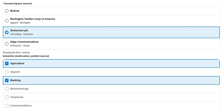
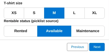
NC Picklist shows options as a dropdown, a radio or checkbox list, or buttons, including small buttons. People can pick one option or several. Choices can come from the same sources as NC Buttons & Tiles (typed text, a collection, records, a picklist field, or a query). NC Picklist has no image properties.
Use it when the choice should look like the other fields on the screen.
Add it to a screen
- Open the flow in Flow Builder and add or open a Screen element.
- Add NC Picklist. The setup panel opens.
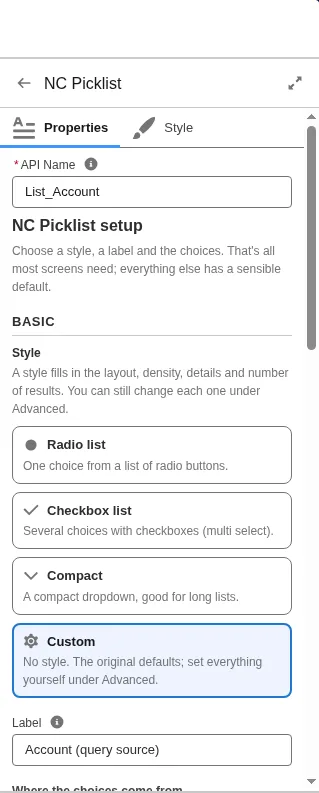
- In Basic, choose a Style if you want one: Radio list, Checkbox list, or Compact. A style fills only the settings you leave blank. Leave Style blank, or choose Custom, to keep the original defaults.
- Set Label. Choose where the choices come from, the same way as NC Buttons & Tiles (auto, text, collection, records, picklist, or query). NC Picklist has no Choice Image URLs or Record Image URL Field. Turn on Required if the user must pick a value.
- A live preview shows the component with your settings.
- Set Selection Mode to
singleormulti. Optional: Minimum Selections, Maximum Selections, and Default Value. - Leave Layout set to
auto, or pickdropdown,list,buttons, oriconbuttons(Small buttons). Auto uses a list for multi select. For a single selection, Auto uses a dropdown when there are more than 5 options, on every device, including phones. For 5 or fewer short labels with no descriptions, Auto uses buttons when they fit, or a list. Auto never picks Small buttons. Small buttons show an icon or a short label, and the full label as a tooltip. - Open Advanced for selection details, colors, navigation, and the other properties.
- Map Value, Values (Collection), and Selected Label. For record sources, also map Selected Record or Selected Records. Map the same Value variable in and out to keep the choice when the user goes back.
Properties
NC Picklist has the same properties as NC Buttons & Tiles, except Choice Image URLs, Record Image URL Field, Columns (Desktop), Columns (Phone), and Image Shape. Layout values are auto, dropdown, list, buttons, and iconbuttons (Small buttons). A requested dropdown becomes a list when Selection Mode is multi.
| Property | API name | Default | Description |
|---|---|---|---|
| Style | stylePreset | Optional. A style fills only the settings you leave blank. You can still change each one under Advanced. Leave it blank, or choose Custom, to keep the original defaults.radio (Radio list): Layout list, Selection Mode single.checkbox (Checkbox list): Layout list, Selection Mode multi.compact (Compact): Layout dropdown, Density compact. | |
| Label | label | Question or field label shown above the component. | |
| Help Text | helpText | Optional hint shown under the label, for example Pick the plan that fits your team. | |
| Data Source | source | auto | auto, text, collection, records, picklist, or query. Auto follows the same order as NC Buttons & Tiles. |
| Choices | choiceLabels | Text source: comma-separated labels. Use \, for a comma inside a label. | |
| Choice Values | choiceValues | Text source, optional: values in the same order. A blank entry uses the label. | |
| Choice Descriptions | choiceDescriptions | Text source, optional: second lines in the same order. | |
| Choice Icons | choiceIcons | Text source, optional: SLDS icon names in the same order. | |
| Choice Labels (Collection) | choiceLabelsCollection | Collection source: a Text collection variable. | |
| Choice Values (Collection) | choiceValuesCollection | Collection source, optional: values in the same order. | |
| Choice Descriptions (Collection) | choiceDescriptionsCollection | Collection source, optional: second lines in the same order. | |
| Record Object | None (object type) | Records source, and the Selected Record outputs: the object of the record collection, for example Contact. The setup panel fills it in when you pick Records or set Object API Name. | |
| Records | records | Records source: a record collection from the flow. | |
| Record Label Field | recordLabelField | Records or query: field for the label. Default is Name. | |
| Record Value Field | recordValueField | Records or query, optional. Default is Id. | |
| Record Description Field | recordDescriptionField | Records or query, optional: field for the second line. | |
| Record Icon Field | recordIconField | Records or query, optional: field holding an SLDS icon name per record. | |
| Label Format | labelFormat | Records or query, optional: builds the label from fields. Put each field's API name in braces, and type any other text as it should appear, for example {Name} ({Code__c}). Overrides Record Label Field. Plain text only. HTML is shown as text. | |
| Description Format | descriptionFormat | Records or query, optional: builds the second line the same way, for example {City__c} - {Capacity__c} seats. If a field is blank, a spaced separator such as - left at the start or end of the line is dropped, and empty brackets are removed. Plain text only. | |
| Object API Name | objectApiName | Picklist or query source: the API name of the object, for example Account. Custom object API names end in __c. | |
| Picklist Field API Name | fieldApiName | Picklist source: the API name of the picklist or multi-select picklist field, for example Industry. | |
| Record Type Id | recordTypeId | Picklist source, optional: shows only the picklist values allowed for this record type. Enter a record type Id (it starts with 012) or a resource, for example {!Get_Record_Type.Id}. Blank, or a value that is not a record type Id, uses the object's default record type. | |
| Controlling Field Value | controllingValue | Picklist source, optional: for a dependent picklist, the current value of its controlling field, for example {!varRegion}. Only the values allowed for it are shown. A value that matches no controlling value shows no choices. | |
| Filter Field / Operator / Value | filterField, filterOperator, filterValue | operator eq | First query filter. Filter Field is the API name of the field, for example Status__c or Account.Type. The operators and the way to write each value are the same as on NC Buttons & Tiles. See Filter Operator and Filter Value in its properties. |
| Filter Field 2 / Operator 2 / Value 2 | filterField2, filterOperator2, filterValue2 | operator eq | Second query filter, joined with AND. |
| Order By Field | orderBy | Query source, optional: the API name of the field to sort by, for example CreatedDate. If blank, the choices are sorted by Record Label Field, or by the object's name field when Label Format is set. | |
| Sort Direction | sortDirection | asc | asc (A to Z, lowest first) or desc (Z to A, highest first). |
| Maximum Record Choices | maxChoices | 200 | Query source. From 1 to 2,000. |
| Icon (All Choices) | iconName | Optional SLDS icon for every choice without its own icon, for example standard:account. | |
| Selection Mode | selectionMode | single | single or multi. |
| Required | required | false | Require a choice before Next or Finish. |
| Required Message | requiredMessage | Shown when the user presses Next with nothing picked (Required is on, or Minimum Selections is set), for example Choose a plan to continue. Blank uses the translated default. | |
| Minimum Selections | minSelections | 0 | Multi only. 0 means no minimum. Example: Minimum 1 and Maximum 2 for "Pick up to two add-ons". |
| Maximum Selections | maxSelections | 0 | Multi only. 0 means no limit. |
| Disabled | disabled | false | Shows the choices and the current selection read-only: the user cannot change them. Example: show a plan picked on an earlier screen as a reminder. |
| Default Value | defaultValue | The choice selected when the screen opens and Value is blank. Enter the value, not the label. Single select: Medium (or M if Choice Values is S,M,L).Records or query source: the record Id, or the Record Value Field value. Multi select: values separated by commas, Parking,Breakfast, or by semicolons, Parking;Breakfast.Picklist source: leave it blank to use the field's default value. | |
| Dropdown Placeholder | placeholder | Dropdown layout: text shown before a choice is made, for example Select a size. Blank uses the translated default. | |
| Include --None-- | includeNone | false | Dropdown layout, when Required is off: adds an empty first option, so the user can clear the choice. |
| Layout | layout | auto | auto, dropdown, list, buttons, or iconbuttons (Small buttons). Auto never picks Small buttons. |
| Density | density | comfortable | comfortable or compact. Compact applies only when the component is wide and used with a mouse. On phones and on narrow layouts, the component keeps larger touch targets. |
| Accent Color, Background Color, Tile Color, Text Color | accentColor, backgroundColor, tileColor, textColor | See Colors and formatting. | |
| Text Size | size | medium | small (87.5%), medium (100%), large (112.5%), or xlarge (125%) of the normal text size. Example: large for a kiosk screen. |
| Corner Shape | shape | rounded | rounded (default), square (slightly rounded corners), or pill (the roundest corners). |
| Alignment | align | start | start, center, or end. Lines up the icon and text inside each choice, and the row of buttons in the buttons and Small buttons layouts. Example: center for big Yes and No buttons. In a right-to-left language, start is the right side. |
| Color Map Field, Color Map, Color Map Style | colorField, colorMap, colorCue | style stripe | Style: stripe, tint, fill, or dot. |
| Navigate After Selection | navigateOnSelect | none | none, next, back, finish, or pause. |
| Show Continue Button | showContinueButton | false | With Navigate After Selection set, multi select always shows the button. |
| Continue Button Label | continueLabel | Your own text for the Continue button, for example Book now. Blank uses the translated action label. | |
| Available Actions | availableActions | Set by Flow. Do not map. | |
| Value | value | The picked value, not the label. Example: Choices Small,Medium,Large with Choice Values S,M,L.Single select: L.Multi select: comma-separated, S,L. With a picklist source, semicolon-separated, ready for a multi-select picklist field.Map the same variable in and out to keep the choice on Back. | |
| Values (Collection) | values | Output collection of selected values. | |
| Selected Label | selectedLabel | Output: the label the user saw, for example Large. In multi select, the labels separated by a comma and a space, Small, Large. | |
| Selected Record / Selected Records | selectedRecord, selectedRecords | Outputs, records or query source. Selected Record is the picked record (in multi select, the first one). Selected Records holds all picked records. |
NC Lookup
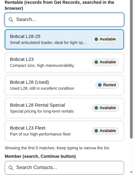
NC Lookup is a type-ahead search for one record. People type, see matching results, and pick one. Search can run against the org, or against a record collection you already have in the flow.
Use it when the list is long, or when the user should find a record by typing part of the name.
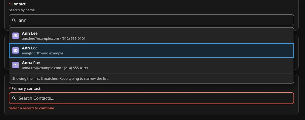
If you set only the object, NC Lookup uses the object's name field as the title. If you also choose a Style, it picks detail and search fields for you. For Contact, that is Name, Email, and Phone. You can still set each field yourself.
Add it to a screen
- Open the flow in Flow Builder and add or open a Screen element.
- Add NC Lookup. The setup panel opens.
- In Basic, choose a Style if you want one: Search picker, Dropdown, or Cards. A style fills only the settings you leave blank. Leave Style blank, or choose Custom, to keep the original defaults.
- Set Object, for example
Contact. Set Label. Turn on Required if the user must pick a record. - With the object set, and a Style chosen, the component picks the title, detail, and search fields. For Contact, that is Name, Email, and Phone. A "Picked for you" summary lists those fields. You can change them under Advanced.
- A live preview appears once you set an object or a record collection. You can search in the preview to try records you can see. With a record collection, the preview stays empty, because the records are loaded when the flow runs.
- Choose a data source:
- Search the org (
search): the default when you set Object. Optional settings under Advanced include Title Field, Detail Fields, Search In Fields, Match Mode (contains, orstartswithfor a very large object), up to two filters, Maximum Results (default 10, from 1 to 50), and Minimum Characters (default 2). - Use a record collection (
records): set Records and Record Object. It filters the records already in the flow, in the browser, and does not search the org.
- Search the org (
- Open Advanced for field mapping, filters, colors, navigation, and the other properties.
- Map Selected Record Id, Selected Label, and Selected Record. Map Selected Record Id in and out to keep the choice when the user goes back.
Properties
| Property | API name | Default | Description |
|---|---|---|---|
| Style | stylePreset | Optional. A style fills only the settings you leave blank. You can still change each one under Advanced. Leave it blank, or choose Custom, to keep the original defaults.search (Search picker): Layout auto, up to 2 detail fields, Maximum Results 10, Color Map Style stripe.dropdown (Dropdown): Layout dropdown, Density compact, 1 detail field, Maximum Results 8, Color Map Style dot.cards (Cards): Layout cards, up to 3 detail fields, Maximum Results 6, Color Map Style dot.With any style, the component also picks search fields when Search In Fields is blank. | |
| Label | label | Field label shown above the component. | |
| Placeholder | placeholder | Text in the empty search field, for example Search rentables.... Blank uses the translated "Search {object}..." text, or "Search..." for a records source. | |
| Help Text | helpText | Optional hint shown under the label, for example Start typing a customer name. | |
| Data Source | source | auto | auto, search, or records. Auto uses records when Records is set, otherwise search. |
| Record Object | None (object type) | The object of the Records collection and of the Selected Record output, for example Contact. The setup panel fills it in when you set Object. | |
| Records | records | Records source: a record collection from the flow, searched in the browser. | |
| Object | objectApiName | Search source: the API name of the object to search, for example Contact. | |
| Title Field | displayField | Field shown as the result title, for example Name. If you leave this blank, the component uses the object's name field (for Contact, the full name). | |
| Detail Fields | secondaryFields | Optional comma-separated fields for the second line, for example Email,Phone. If you leave this blank and set a Style, the component picks them for you, for example Email and Phone on Contact. | |
| Label Format | labelFormat | Optional template for the title. Put each field's API name in braces, and type any other text as it should appear, for example {Name} ({Code__c}). Plain text only. | |
| Secondary Format | secondaryFormat | Optional template for the second line, built the same way, for example {Email} - {Phone}. If a field is blank, a spaced separator such as - left at the start or end of the line is dropped, and empty brackets are removed. Plain text only. | |
| Search In Fields | searchFields | Optional comma-separated text fields to search, for example Name,Email. If you leave this blank, the component searches the title field. With a Style, it also adds text detail fields such as Email, up to 3 fields in total. | |
| Match Mode | matchMode | contains | contains (default) finds the typed text anywhere: cav finds Excavator. startswith finds only values that begin with it: Exc finds Excavator, cav does not. startswith is faster on a very large object. |
| Filter Field / Operator / Value | filterField, filterOperator, filterValue | operator eq | First filter, for the search source. Filter Field is the API name of the field, for example Status__c or Account.Type. The operators and the way to write each value are the same as on NC Buttons & Tiles. See Filter Operator and Filter Value in its properties. |
| Filter Field 2 / Operator 2 / Value 2 | filterField2, filterOperator2, filterValue2 | operator eq | Second filter, joined with AND. |
| Order By Field | orderBy | Search source, optional: the API name of the field to sort the results by, for example CreatedDate. If blank, the results are sorted by the title field. | |
| Sort Direction | sortDirection | asc | asc (A to Z, lowest first) or desc (Z to A, highest first). |
| Maximum Results | maxResults | 10 | From 1 to 50. |
| Minimum Characters | minChars | How many characters the user types before results show, from 0 to 10. If blank, 2 for search and 0 for records (the list opens on click, tap, typing, or the Up or Down arrow key, not on focus). Example: 3 for an object with many records. | |
| Search Icon | iconName | Optional SLDS icon in the empty search field. Default is utility:search. It has the same API name, iconName, as Icon (All Choices) on NC Buttons & Tiles and NC Picklist. | |
| Object Icon | objectIconName | Icon on results and on the selection, for example standard:account. If blank, the component uses the standard object icon, or standard:record. | |
| Required | required | false | Require a record before Next or Finish. |
| Required Message | requiredMessage | Shown when the user presses Next without picking a record, for example Choose a rentable to continue. Blank uses the translated default. | |
| Disabled | disabled | false | Shows the field and the picked record read-only: the user cannot search, clear, or change it. |
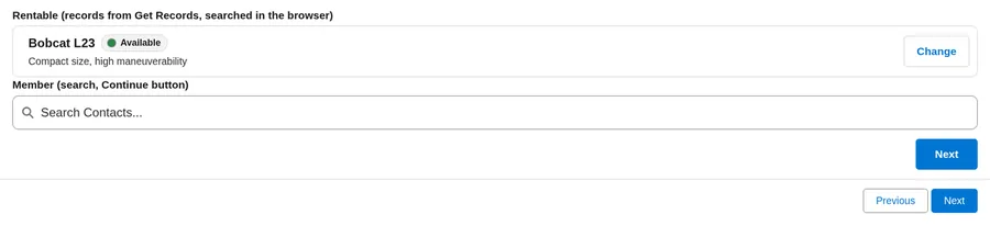
| Layout | layout | auto | How the results appear.auto: dropdown on wide screens, inline on phones and in narrow columns.dropdown: the results float over the content below the field.inline: the results push the content below them down, so they are never cut off.cards: the results show as cards, and the picked record becomes a card with a Change button. |
| Density | density | comfortable | comfortable or compact. Compact applies only when the component is wide and used with a mouse. On phones and on narrow layouts, the component keeps larger touch targets. |
| Accent Color | accentColor | See Colors and formatting. NC Lookup has no Tile Color or Alignment property. | |
| Background Color | backgroundColor | Optional color behind the whole component, for example #F3F3F3. Leave blank to follow the theme and dark mode. | |
| Text Color | textColor | Optional. Used only if it reaches 4.5:1 contrast. | |
| Text Size | size | medium | small (87.5%), medium (100%), large (112.5%), or xlarge (125%) of the normal text size. Example: large for a kiosk screen. |
| Corner Shape | shape | rounded | rounded (default), square (slightly rounded corners), or pill (the roundest corners). |
| Color Map Field | colorField | Optional field whose value is looked up in the Color Map, for example Status__c. | |
| Color Map | colorMap | Optional colors by value. | |
| Color Map Style | colorCue | stripe | stripe, dot, or tint. There is no fill style on NC Lookup. |
| Navigate After Selection | navigateOnSelect | none | none, next, back, finish, or pause. |
| Show Continue Button | showContinueButton | false | Shows a button that moves the flow on after the selection. |
| Continue Button Label | continueLabel | Your own text for the Continue button, for example Book now. Blank uses the translated action label. | |
| Available Actions | availableActions | Set by Flow. Do not map. | |
| Selected Record Id | value | The Id of the picked record. It has the same API name, value, as Value on the other components. To show a record as already picked, map a Text variable that holds a record Id in, for example {!varContactId}, and store the output in the same variable. | |
| Selected Label | selectedLabel | Output: the title of the picked record as it was shown, for example the contact's name. | |
| Selected Record | selectedRecord | Output: the selected record, including the Id and the fields shown. |
NC Timer
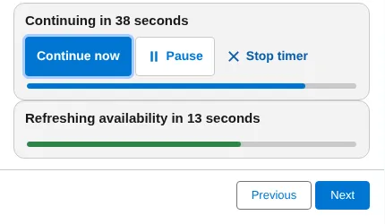
NC Timer moves the flow on after a delay. Use it for a confirmation or "thank you" screen that should continue by itself, or (with Layout hidden, or the Silent timer style) for a delay with nothing visible on the screen.

Add it to a screen
- Open the flow in Flow Builder and add or open a Screen element.
- Add NC Timer. The setup panel opens.
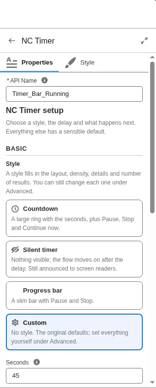
- In Basic, choose a Style if you want one: Countdown, Silent timer, or Progress bar. A style fills only the settings you leave blank. Leave Style blank, or choose Custom, to keep the original defaults.
- Set Seconds (1 to 3,600, default 10). Set Then (After the Timer) to what should happen when the countdown ends:
next,back,finish,pause, ornone. Optionally set Message. In the message,{0}is replaced with the seconds left. In the compact and large layouts, leave{0}out, because the ring shows the seconds. - A live preview shows the timer with your settings. The preview never moves the flow on.
- Open Advanced for pause, stop, continue, announcements, look, and outputs.
- If the screen should have no footer buttons, turn off the footer's Previous, Next, Finish, and Pause buttons in the Screen properties, and use the timer (and, if you want, Continue now) to move on.
- Map Completed if you turn off Run Every Visit, so the timer runs only the first time the screen is shown. Map Stopped by User if you need to know that the user pressed Stop timer. Map Timer Fired if you need to know that the countdown ran out and the Then (After the Timer) action ran. Timer Fired is true only in that case. It is false if the user pressed Stop timer, pressed Continue now, or moved on before the countdown ended.
Properties
| Property | API name | Default | Description |
|---|---|---|---|
| Style | stylePreset | Optional. A style fills only the settings you leave blank. You can still change each one under Advanced. Leave it blank, or choose Custom, to keep the original defaults.countdown (Countdown): Layout large, with Pause, Stop timer, and Continue now.silent (Silent timer): Layout hidden, with no buttons.progress (Progress bar): Layout bar, with Pause and Stop timer, and no Continue now.All three turn on Announce to Screen Readers. | |
| Seconds | seconds | 10 | Delay in seconds, from 1 to 3,600. |
| After the Timer | afterAction | next | next, back, finish, pause, or none. Next becomes Finish on the last screen. none only sets Completed. In the setup panel, this setting is labeled Then. |
| Run Every Visit | repeat | true | On (default): the timer starts each time the screen is shown, including after Previous. Off: it runs only the first time. When you turn it off, also create a Boolean variable, for example varTimerDone, set Completed to it, and store Completed in the same variable. Use case: a welcome screen that moves on by itself the first time, but not when the user comes back to it. |
| Layout | layout | auto | How the timer looks.auto: bar on wide screens, compact on phones and in narrow columns.bar: the message, the buttons, and a thin progress bar.compact: one line with a countdown ring that shows the seconds, a short message, and small buttons.large: a big centered ring with the message and buttons, for a kiosk, check-in, or confirmation screen.hidden: nothing is visible, but the timer still runs and moves the flow on, for example on a "Saving..." screen. |
| Announce to Screen Readers | announce | true | Polite announcements at the start, at 60, 30, 10, and 5 seconds, and at the end. This also applies in the hidden layout. |
| Message | message | Optional text next to the countdown. Put {0} where the seconds go, for example Saving your booking in {0} seconds. In the compact and large layouts the ring already shows the seconds, so leave {0} out, for example Thanks! Starting over shortly. Blank uses the built-in text, for example Continuing in {0} seconds, or Continuing automatically in the ring layouts. | |
| Allow Pause | allowPause | true | Shows Pause and Resume. |
| Allow Stop | allowStop | true | Shows Stop timer. |
| Allow Continue Now | allowContinueNow | false | Shows a Continue now button, so the user can skip the wait. It runs the Then (After the Timer) action at once, for example moves to the next screen. Not shown when After the Timer is none. |
| Accent Color | accentColor | Color for the countdown and focus. NC Timer has no Tile Color, Color Map, or Density property. | |
| Background Color | backgroundColor | Optional color of the timer panel. | |
| Text Color | textColor | Optional. Used only if it reaches 4.5:1 contrast. | |
| Text Size | size | medium | small (87.5%), medium (100%), large (112.5%), or xlarge (125%) of the normal text size. Example: large for a kiosk screen. |
| Corner Shape | shape | rounded | rounded (default), square (slightly rounded corners), or pill (the roundest corners). |
| Alignment | align | start | start, center, or end. Lines up the timer message. In a right-to-left language, start is the right side. |
| Available Actions | availableActions | Set by Flow. Do not map. | |
| Completed | completed | True once the timer ran out, or when the user pressed Continue now. Map it in and out of the same Boolean variable when Run Every Visit is off. | |
| Stopped by User | stoppedByUser | Output: true if the user pressed Stop timer. | |
| Timer Fired | timerFired | Output: true when the countdown ran out and the Then (After the Timer) action ran (also with none and in the hidden layout). False if the user pressed Stop timer, pressed Continue now, or moved on before the countdown ended. |
Shared behavior
Terms used in this chapter
Some words in this chapter cover more than one setting. This table uses one term for each idea and says which property it means on each component. Setting names are written as they appear in the property list, and the values you type or pick are in code style, for example Layout auto.
| Term | Meaning |
|---|---|
| Value | The stored choice: the choice's value, not its label. For a picklist source, that is the picklist value's API name. On NC Lookup the same property (API name value) is labeled Selected Record Id, and it holds the record Id. |
| Label and title | The text the user sees for a choice is its label. Record Label Field or Label Format sets it for records and queries. On NC Lookup, each result shows a title instead, set by Title Field or Label Format. On NC Buttons & Tiles, NC Picklist, and NC Lookup, Selected Label returns the text of the pick. The Label property is something else: the question or field label above the component. |
| Second line | The smaller line under a choice or a result. NC Buttons & Tiles and NC Picklist fill it from Choice Descriptions, Record Description Field, or Description Format. NC Lookup fills it from Detail Fields or Secondary Format. |
| Record Object and Object | Record Object is the object of a record collection (Records) and of the Selected Record outputs. Object API Name (NC Buttons & Tiles, NC Picklist) and Object (NC Lookup, the same API name objectApiName) name the object to read from the org. |
| Reading records from the org | Data Source query (NC Buttons & Tiles, NC Picklist) and search (NC Lookup) both read records from the org, with the running user's access. A query loads the choices when the screen opens. A search runs as the user types. |
| Then (After the Timer) | The NC Timer setting for what happens when the countdown ends. The setup panel labels it Then. The property list labels it After the Timer (afterAction). |
| Small buttons | One look, two settings with different values. Layout iconbuttons (Small buttons) is the layout, on NC Buttons & Tiles and NC Picklist. Style smallbuttons (Small buttons) exists only on NC Buttons & Tiles, and fills in Layout iconbuttons. NC Picklist has no Small buttons style, so set its Layout to iconbuttons. |
| Big buttons and Icon tiles | Style names, not layouts. Style buttons (Big buttons) fills in Layout buttons and Text Size large. Style icons (Icon tiles) fills in Layout tiles. |
| Compact | Three separate settings use this word. NC Picklist Style compact (Compact) fills in Layout dropdown and Density compact. NC Lookup Style dropdown also fills in Density compact.Density compact (NC Buttons & Tiles, NC Picklist, NC Lookup) tightens spacing only when the component is wide and used with a mouse.NC Timer Layout compact is a one-line countdown with a ring. |
| Footer buttons | The footer's Previous, Next, Finish, and Pause buttons: Flow's standard screen buttons. You turn them on or off in the Screen properties. |
| Continue button and Continue now | Continue button: on NC Buttons & Tiles, NC Picklist, and NC Lookup. It appears only when Navigate After Selection is set (not none) and either Show Continue Button is on or, on NC Buttons & Tiles and NC Picklist, multi select is on. It runs Navigate After Selection. Continue now: on NC Timer. It appears with Allow Continue Now, and runs Then (After the Timer) at once. |
| Icon (All Choices) and Search Icon | They share the API name iconName but set different icons. Icon (All Choices), on NC Buttons & Tiles and NC Picklist, is for choices without their own icon. Search Icon, on NC Lookup, is the icon in the empty search field. |
Layout
With Layout set to auto, each component measures its own width and also checks whether the device is a phone.
- A phone counts as narrow. So does a narrow window or a narrow column, because each component measures the width it actually has on the screen.
- NC Lookup switches to its narrow layout at a wider width than NC Buttons & Tiles, NC Picklist, and NC Timer.
- A narrow component on a wide page still uses the narrow layout.
On NC Buttons & Tiles, NC Picklist, and NC Lookup, Density set to compact tightens spacing only when the component is wide and used with a mouse. On phones and on narrow layouts, the component uses larger touch targets. NC Timer has no Density property.
On phones, on narrow layouts, and on touch, a dropdown in NC Buttons & Tiles or NC Picklist uses the device's native select list.
Required messages
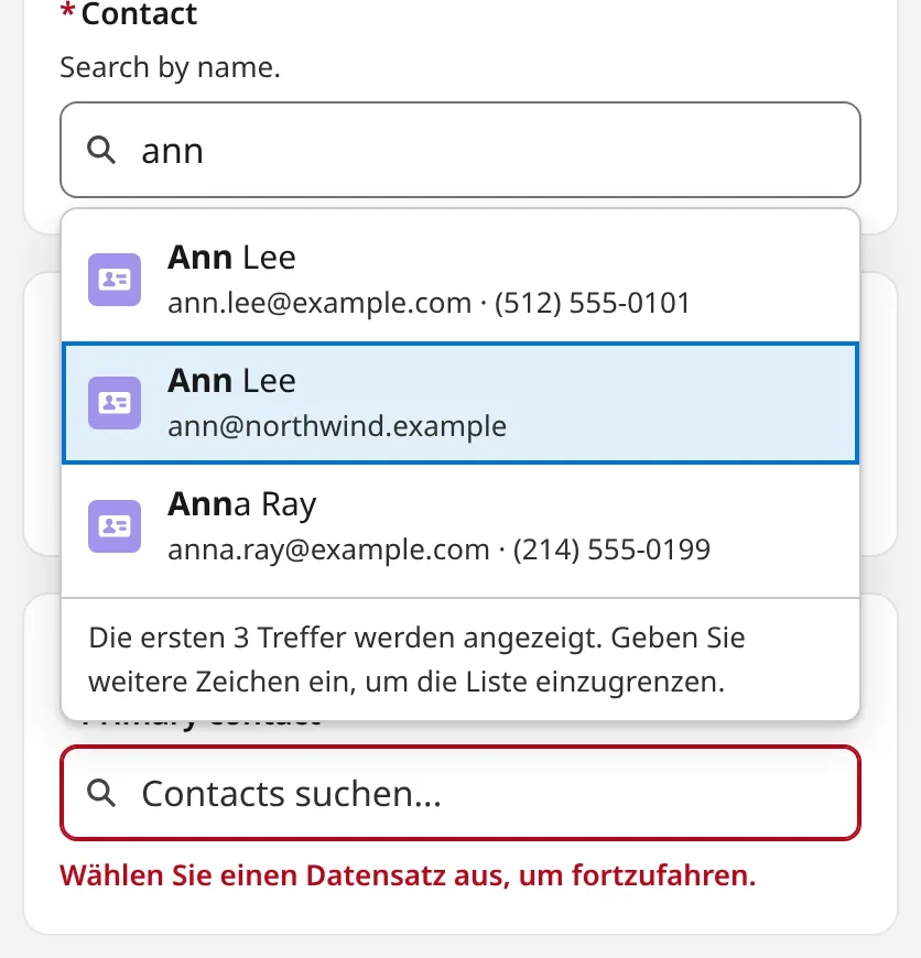
If Required is on and the user presses Next without a valid choice, the component shows its own required message in bold red text, and the field gets a red outline. The message clears when the user makes a valid pick. Flow does not add a second message.
Record search and detail lines
On NC Lookup, search matches the name field. On Contact, with Match Mode set to contains, typing a last name such as Fox finds Annie Fox.
If a detail or description line would have only a separator, for example when one of the fields is blank, the component leaves that separator out.
Colors and formatting
These properties are shared, with the exceptions noted above (NC Lookup has no Tile Color or Alignment; NC Timer has no Tile Color, Color Map, or Density).
| Property | What it does |
|---|---|
| Accent Color | Color for selection and focus, for example #0B5CAB. Hex, rgb(), or a color name. It must reach 3:1 contrast against the tile or panel. If it does not, the component lightens or darkens it, or keeps the theme color. Leave it blank to follow the org theme and dark mode. |
| Background Color / Tile Color / Text Color | Optional. Hex, rgb(), hsl(), or a color name, for example #F3F3F3, rgb(243,243,243), or white. Background Color is behind the whole component. Tile Color is each choice. Leave blank to follow the theme and dark mode. Text Color is used only if it is readable at 4.5:1 contrast. Otherwise the component picks a dark or white text color. In dark mode, a light tile or background color is mixed into the theme surface. |
| Text Size | small (87.5%), medium (default, 100%), large (112.5%), or xlarge (125%) of the normal text size. Example: large for a kiosk screen. |
| Corner Shape | rounded (default), square (slightly rounded corners), or pill (the roundest corners). |
| Alignment | start (default), center, or end. On NC Buttons & Tiles and NC Picklist, it lines up the icon and text inside each choice, and the row of buttons in the buttons and Small buttons layouts. On NC Timer, it lines up the message. In a right-to-left language, start is the right side. NC Lookup has no Alignment property. |
| Label Format / Description Format (NC Lookup also has Secondary Format) | Build a line from fields: put each field's API name in braces, and type any other text as it should appear. Examples: {Name} ({Code__c}) or {City__c} - {Capacity__c} seats. Plain text only. HTML is shown as text. |
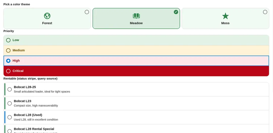
| Color Map | Give each choice its own color. Write one entry per value, with a semicolon or a new line between entries. Option 1, the simple format: Value:background color/text color (text color optional).Gold:#FFF4CC/#5C4400Silver:#EEEEEEOption 2, the Mobile Data Table format, so you can paste colors you already set up there (background, then a semicolon, then the text color): [{'key':'Gold','value':'#FFF4CC;#5C4400'},{'key':'Silver','value':'#EEEEEE'}] |
| Color Map Field | Optional field whose value is looked up in the Color Map (records or query), for example Status__c. If blank, the choice value and then the label are used. |
| Color Map Style | stripe (default), a colored bar on the edge. tint, a light background; use it if users work in dark mode. fill, a solid background (NC Buttons & Tiles and NC Picklist only). dot, a small colored dot. NC Lookup supports stripe, tint, and dot. |
| Icon (All Choices) / Object Icon / Search Icon | SLDS icon names, for example standard:account. |
Navigation and the screen footer
NC Buttons & Tiles, NC Picklist, and NC Lookup can move the flow on as soon as the user chooses. Set Navigate After Selection:
| Value | Effect |
|---|---|
none | Default. The user presses the footer's Next. |
next | Moves to the next screen. On the last screen, this becomes Finish. |
back | Goes to the previous screen. |
finish | Finishes the flow. |
pause | Pauses the flow, if pausing is allowed. |
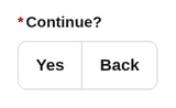
Next and Finish check Required first. The action runs only if the screen offers it.
To hide the footer:
- Open the Screen properties and turn off the footer's Previous, Next, Finish, and Pause buttons. The component then provides the only way forward.
- Turn on Show Continue Button if users should confirm first. The button label is translated, or you can set your own with Continue Button Label.
- When Navigate After Selection is set, multi select always shows the button, because the flow cannot know when the user has finished choosing.


Hidden timer mode: set Layout to hidden, or choose the Silent timer style. Nothing is visible, but the timer still runs and navigates. Screen-reader users hear polite announcements at the start, at 60, 30, 10, and 5 seconds, and at the end. Turn Announce to Screen Readers off for full silence. Use this for screens that only show a message, then continue.

Translations
Built-in texts appear in the running user's language (Personal Settings, Language). The translations ship inside the components. There is nothing to set up: no Translation Workbench, no languages to enable, and no flow changes.
The components include US English and 15 other languages: English (UK), German, Swedish, French, Spanish, Dutch, Portuguese (Brazil), Japanese, Hebrew, Slovak, Czech, Finnish, Hungarian, Greek, and Korean. English (UK) shows the same wording as US English. Any Portuguese user language, including Portuguese (Portugal), uses the Brazilian Portuguese texts. Dutch (Belgium) uses the Dutch texts, and Austrian and Swiss German use the German texts. Hebrew also matches the he language code. Every other language, including Italian, shows US English.
What is translated: buttons (Next, Previous, Finish, Pause, Continue, Change, Stop timer), placeholders (--None--, Search...), status and error messages, countdown texts, and screen-reader texts.
What is not translated: the texts you enter in Flow Builder (Label, Help Text, Choices, Message, Placeholder, Continue Button Label). Whatever you enter always replaces the built-in text. Translate your own texts with Flow's translation features, or map translated values from Custom Labels or fields.
In a right-to-left language such as Hebrew, the layout follows the page direction.
Long labels wrap onto more lines.
Limits
- NC Buttons & Tiles and NC Picklist load at most 2,000 records with a query source (default 200). For larger sets, use NC Lookup.
- NC Lookup returns at most 50 results per search and picks one record.
- Image URLs must be
https://or same-org paths (/resource/...,/sfc/...).http://,javascript:,data:, and protocol-relative URLs are not used. - Label and description templates are plain text. HTML is shown as text.
- Admin-entered texts are not translated automatically. See Translations.
- The components work on Flow screens only (
lightning__FlowScreen), not on record pages.